Functionally Formed
A Close Inspection of Sean Raders' Mental State
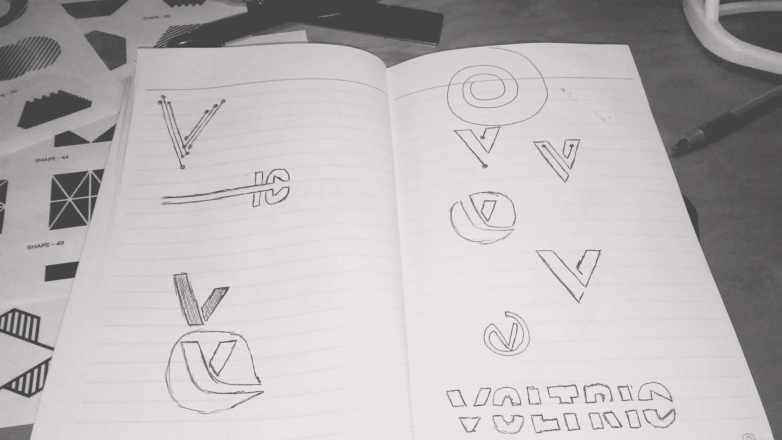
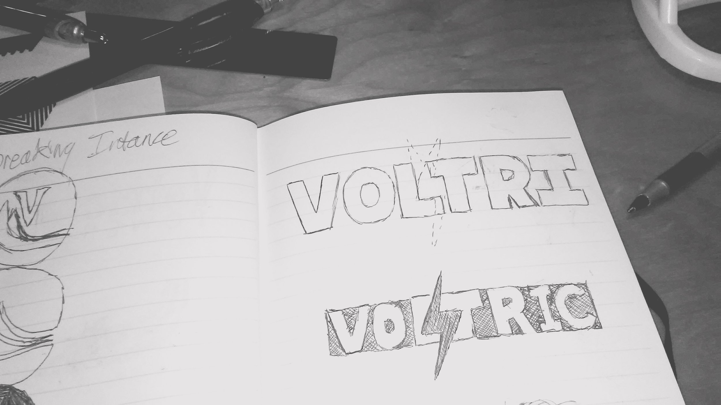
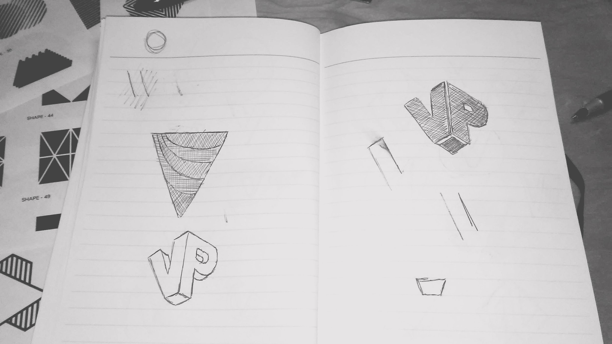
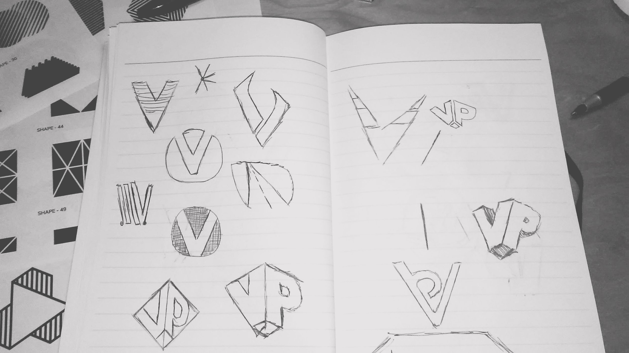
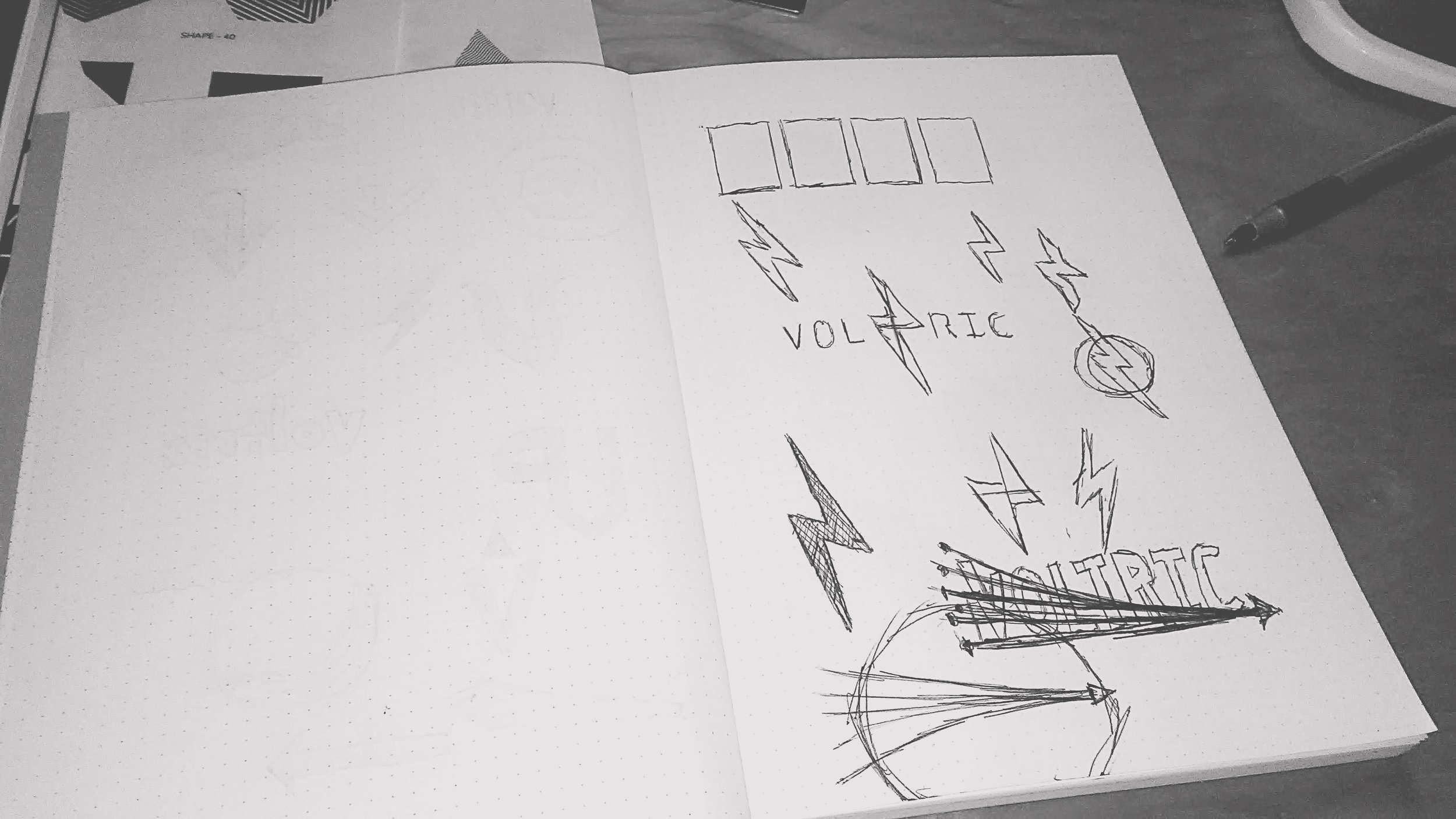
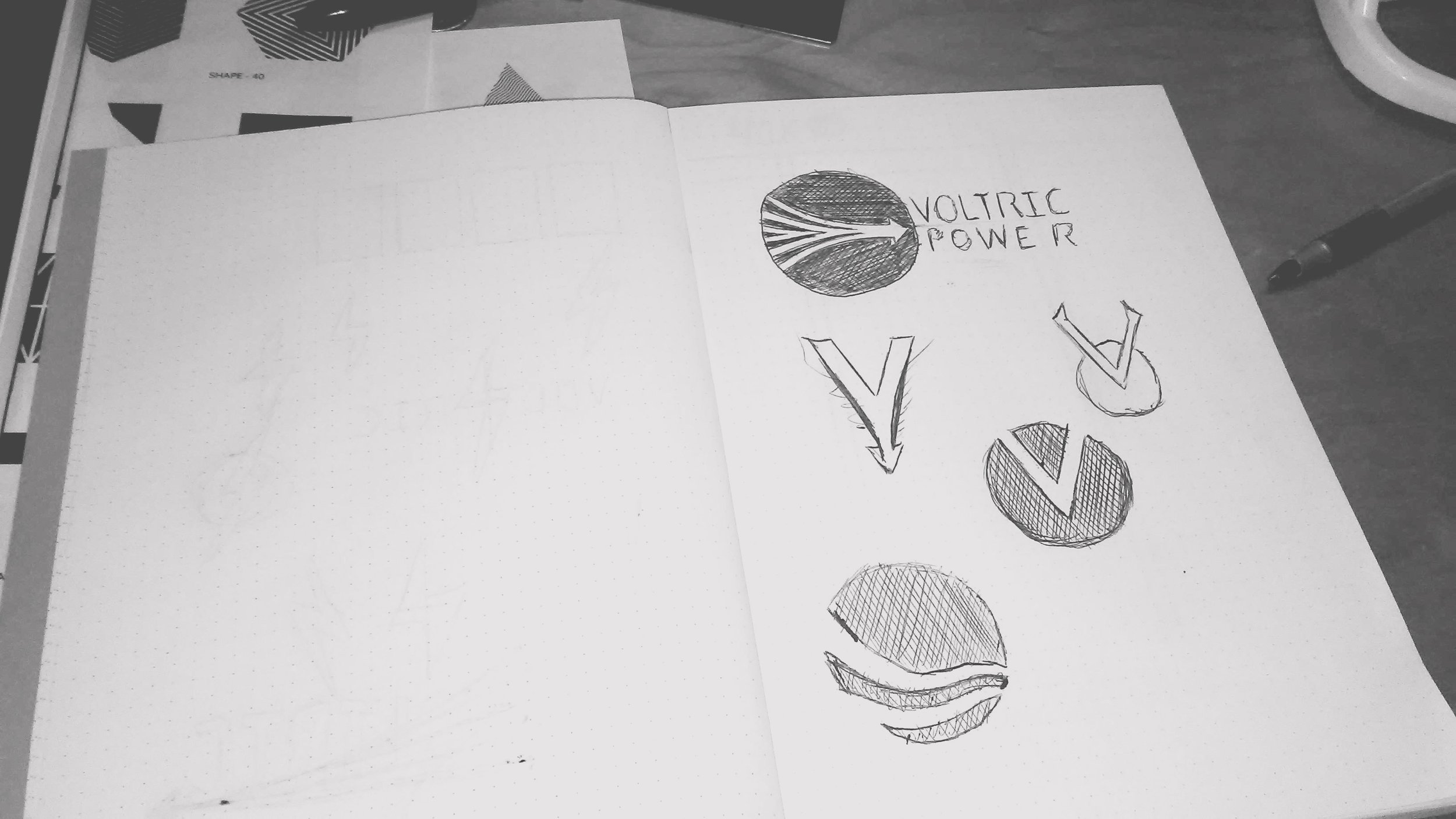
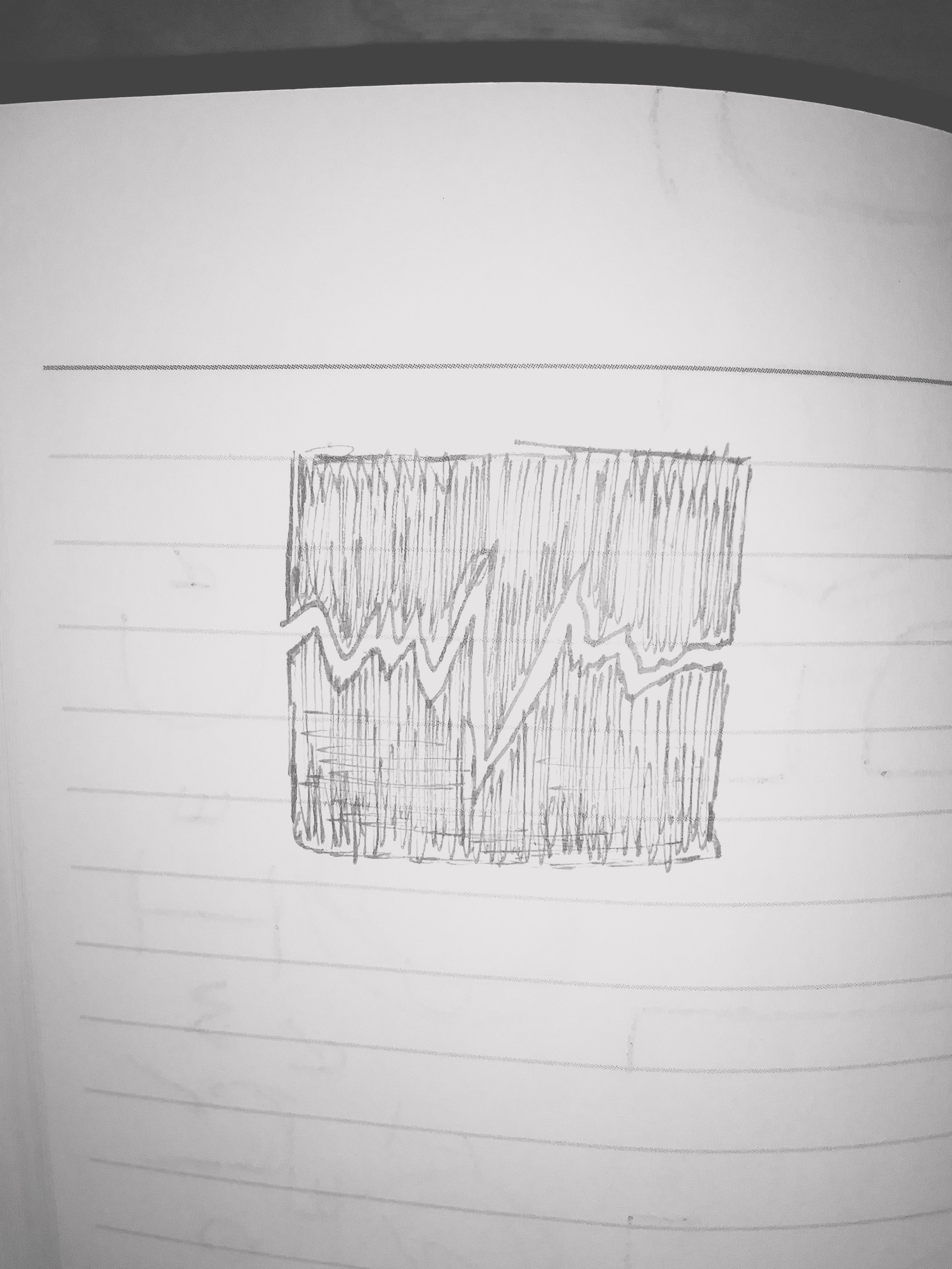
Initial Sketch Concepts
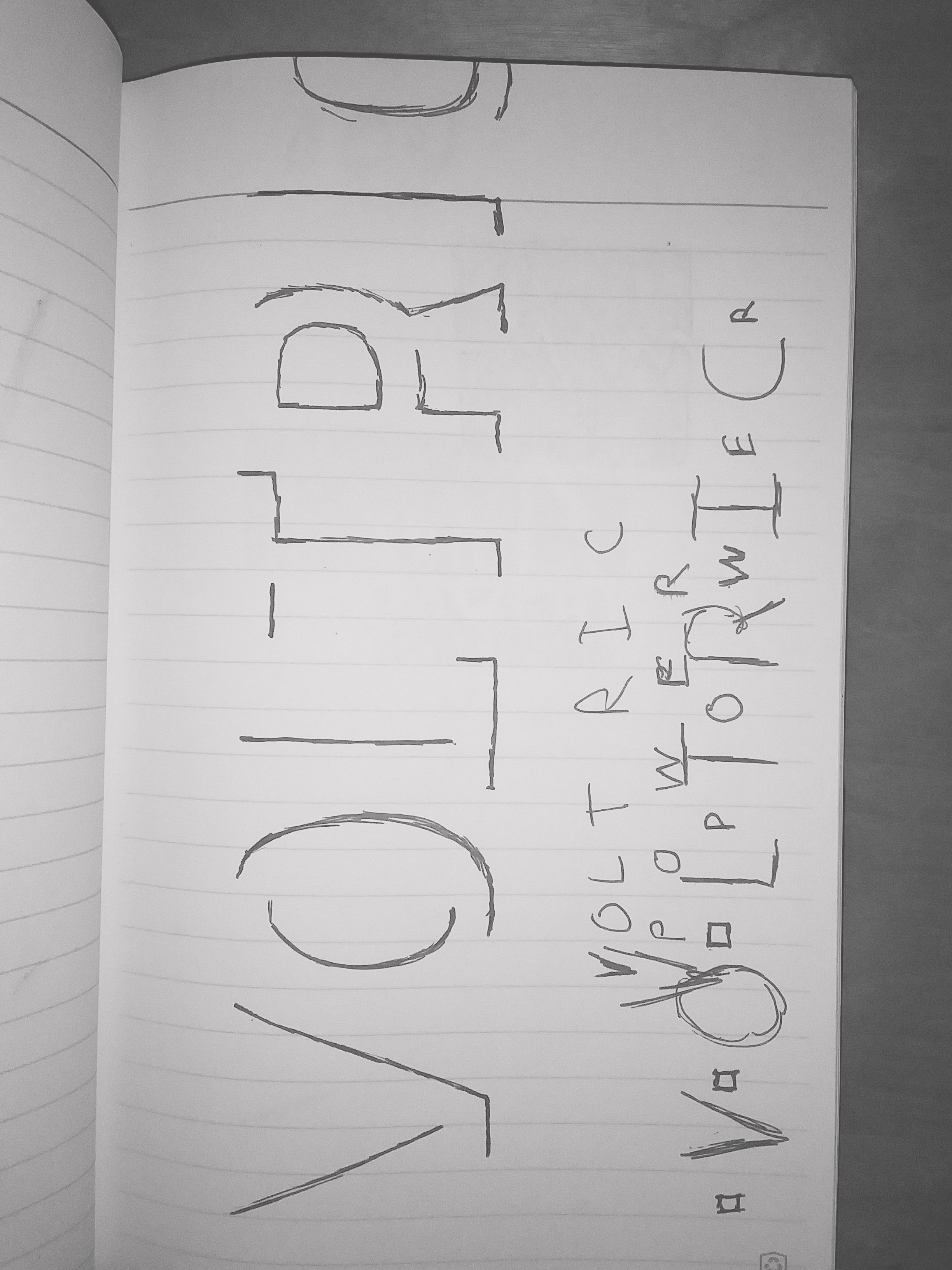
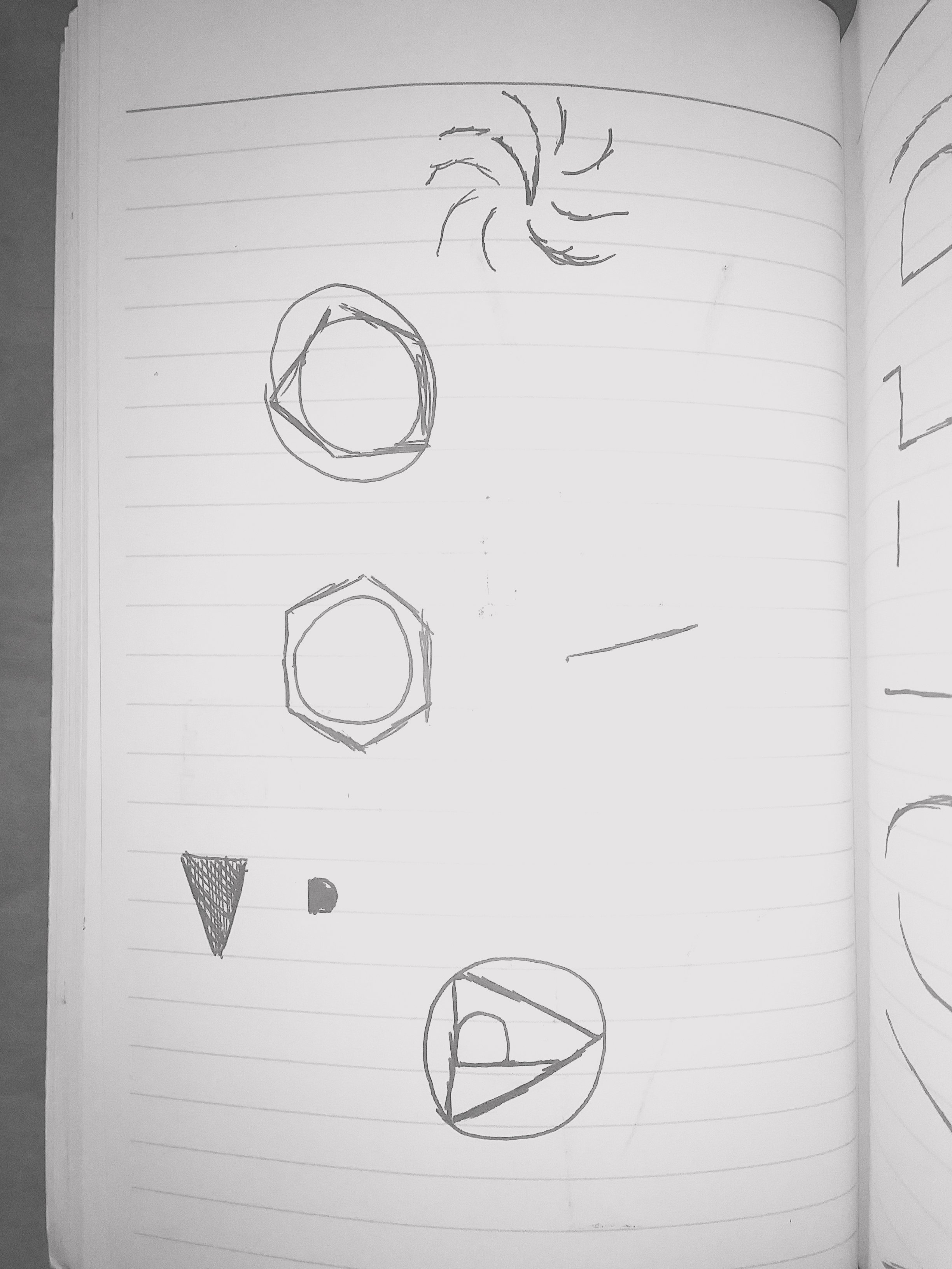
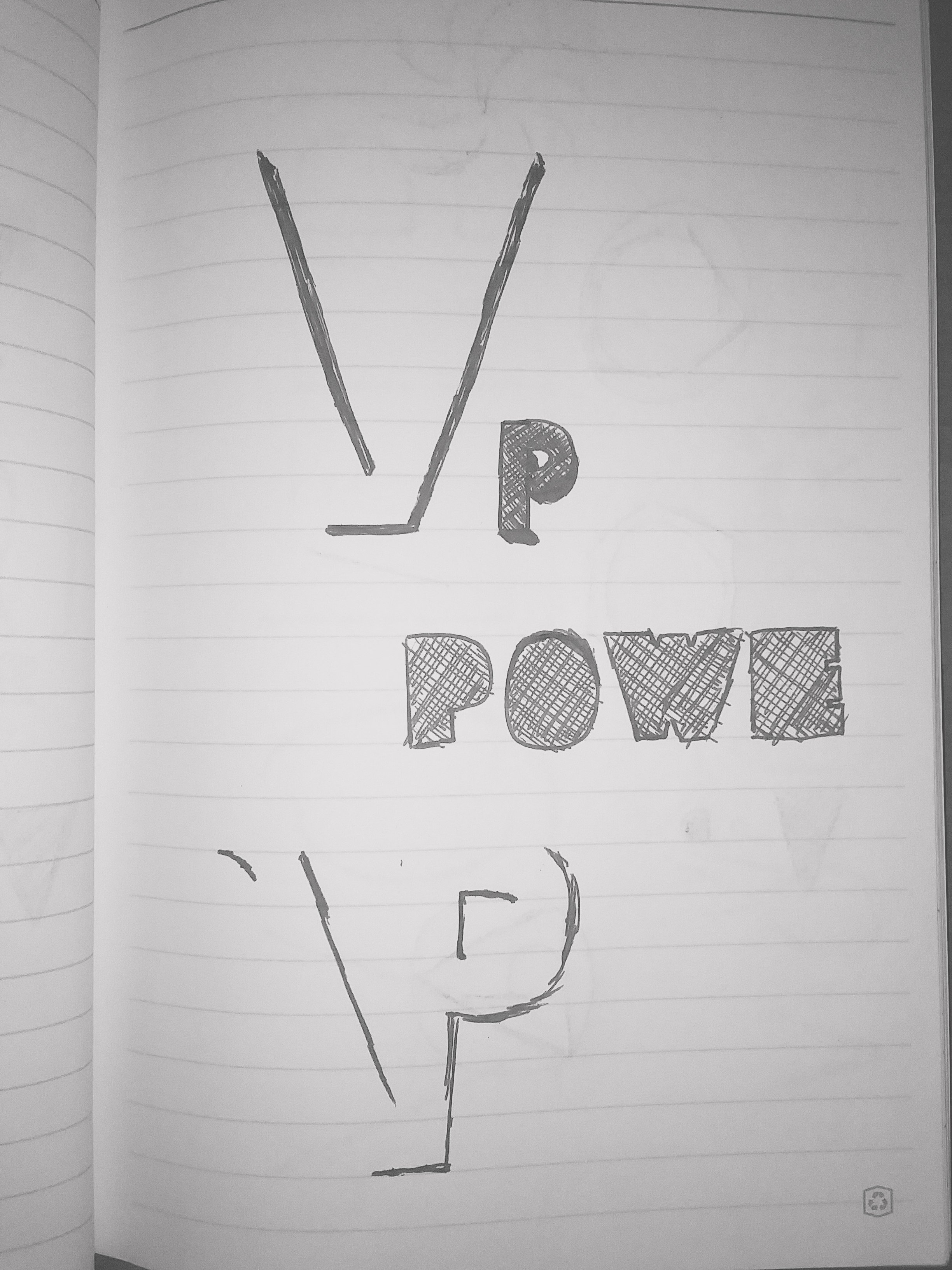
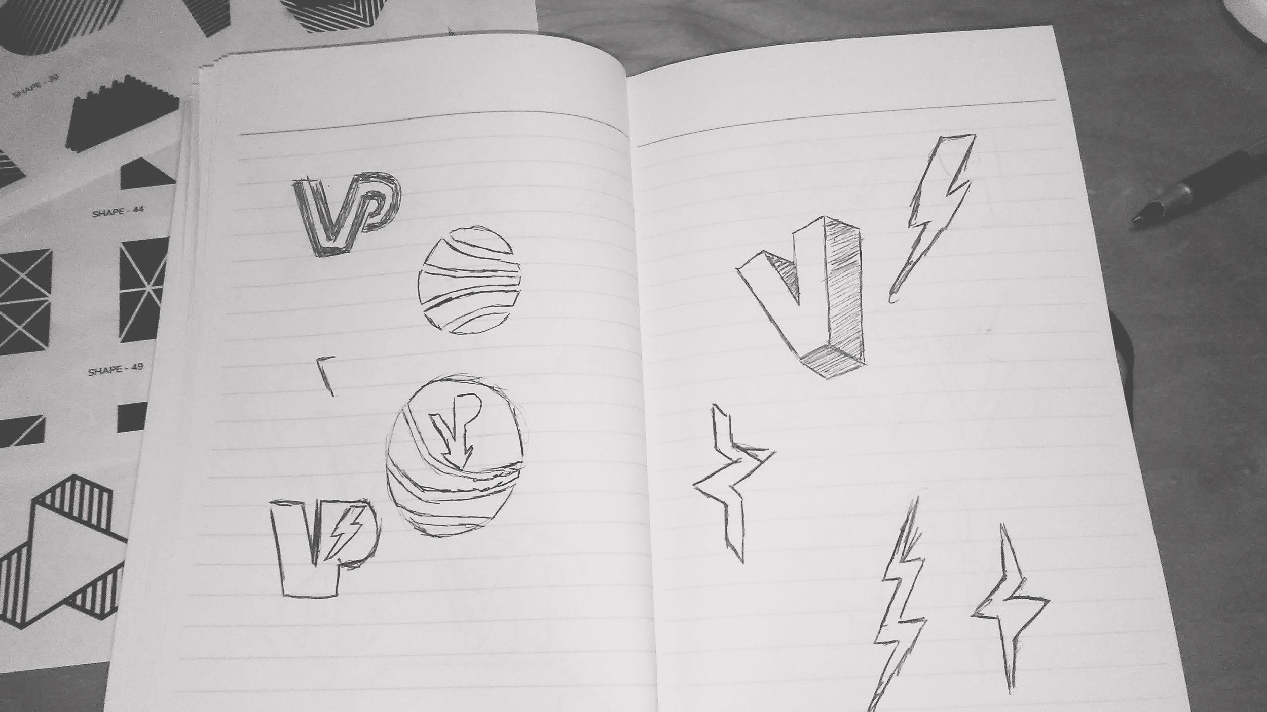
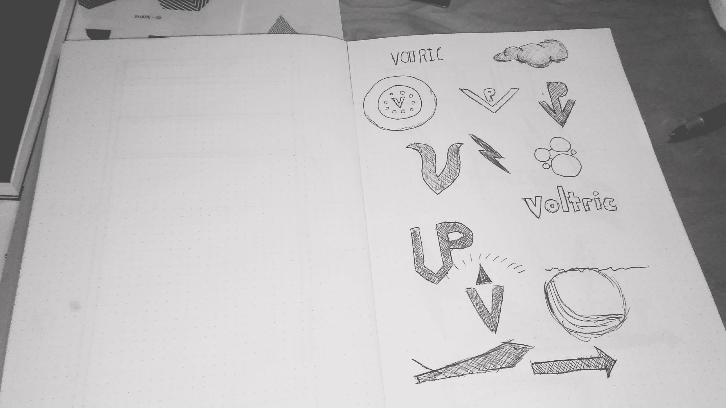
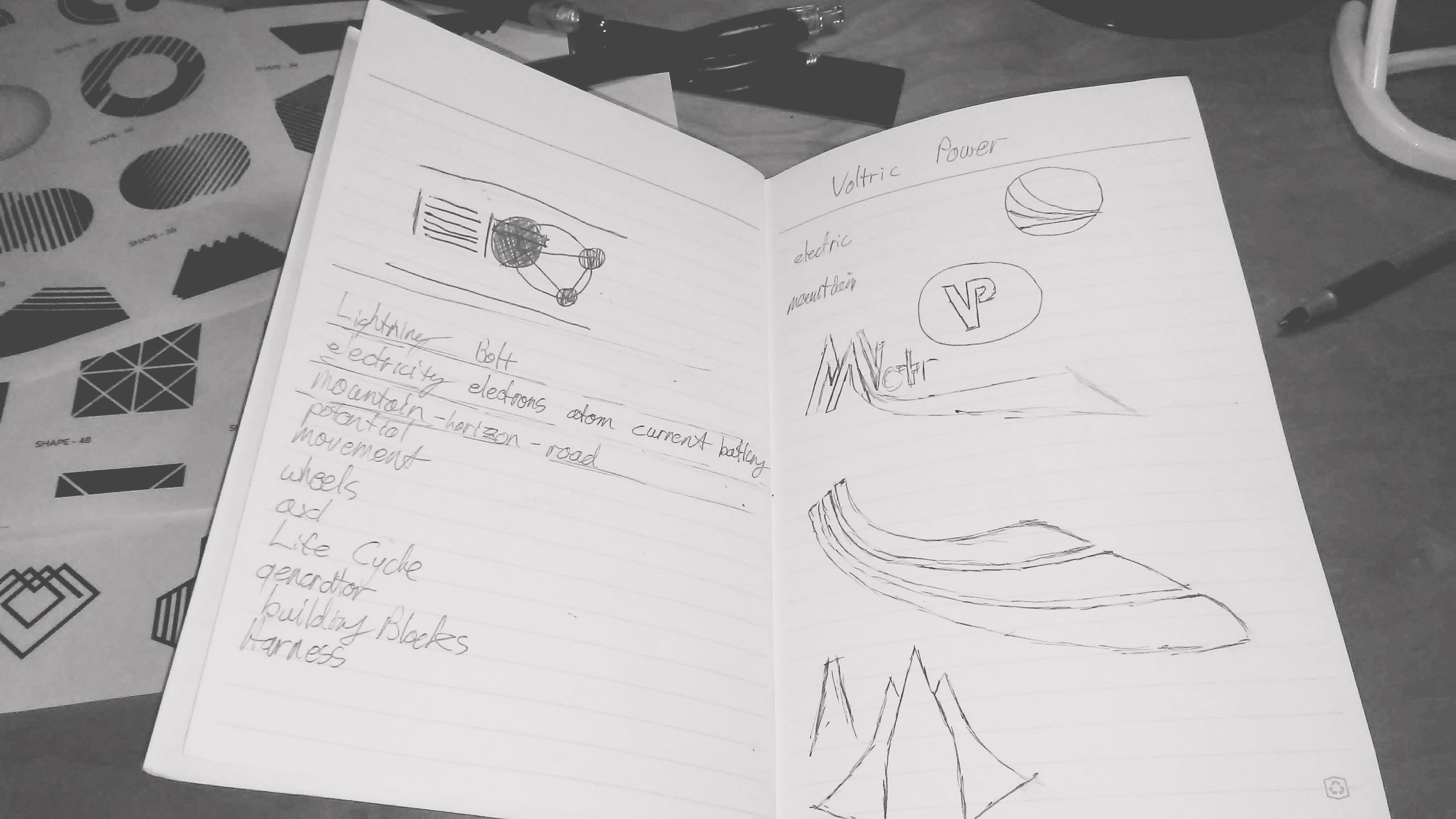
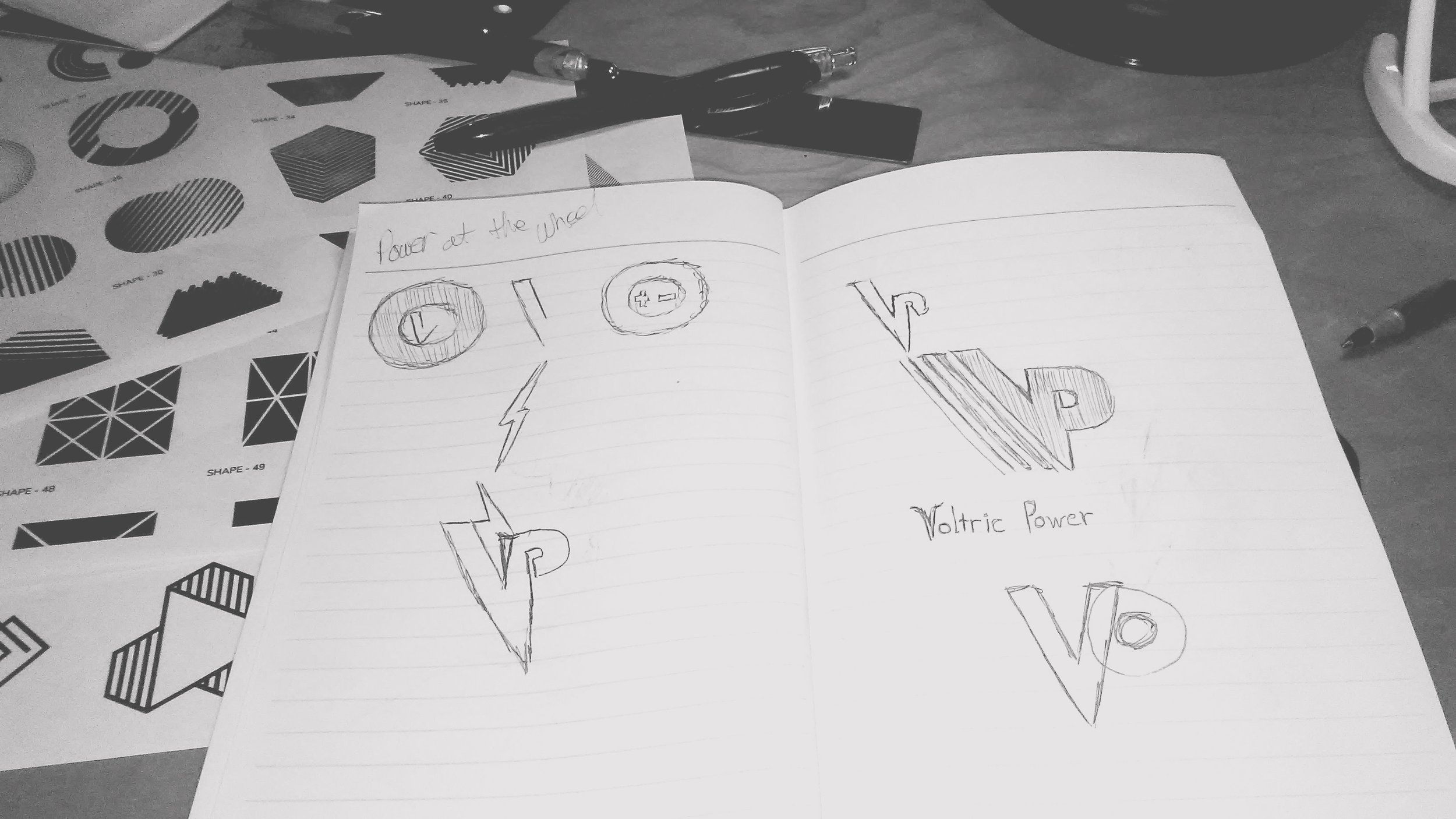
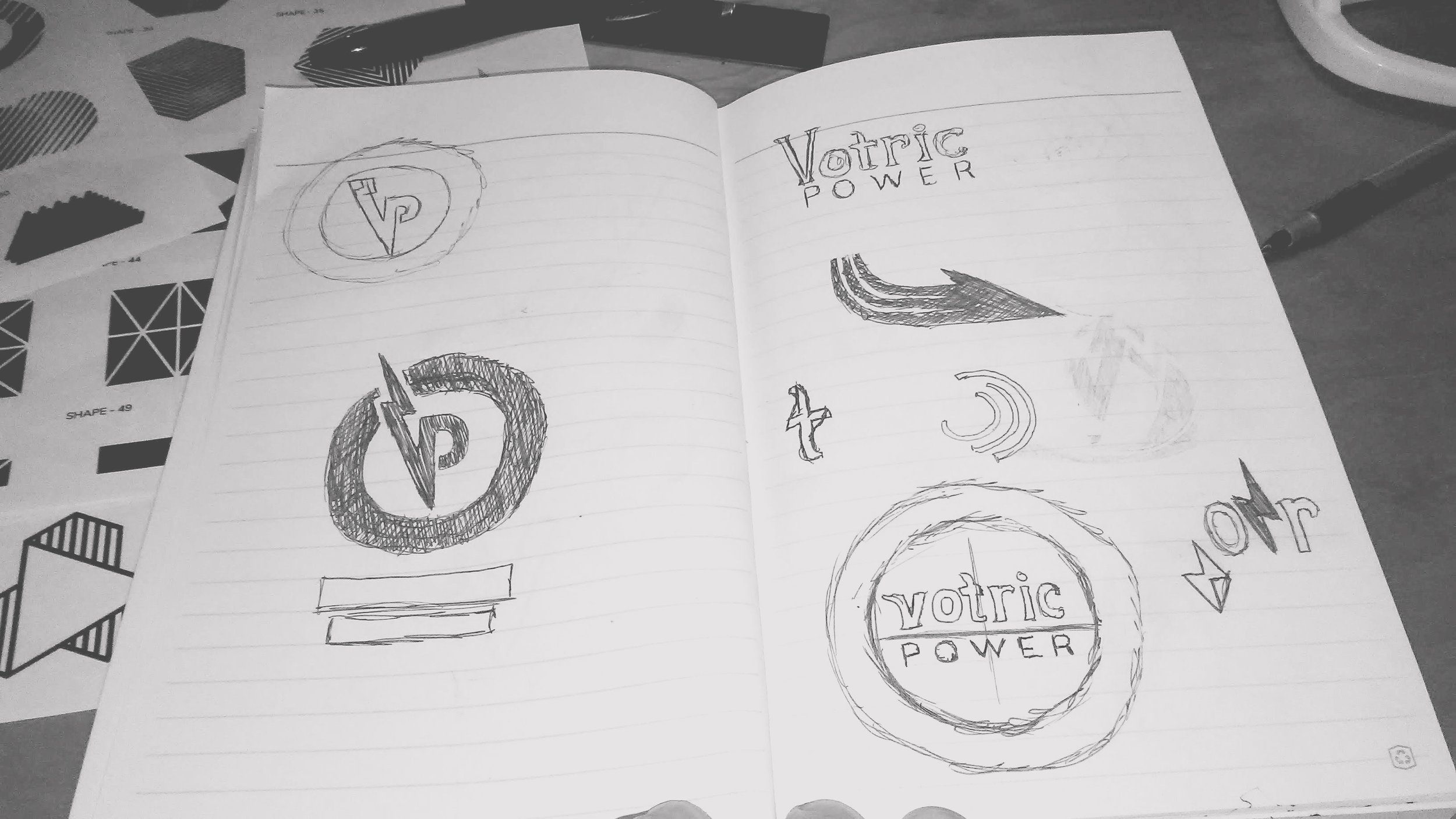
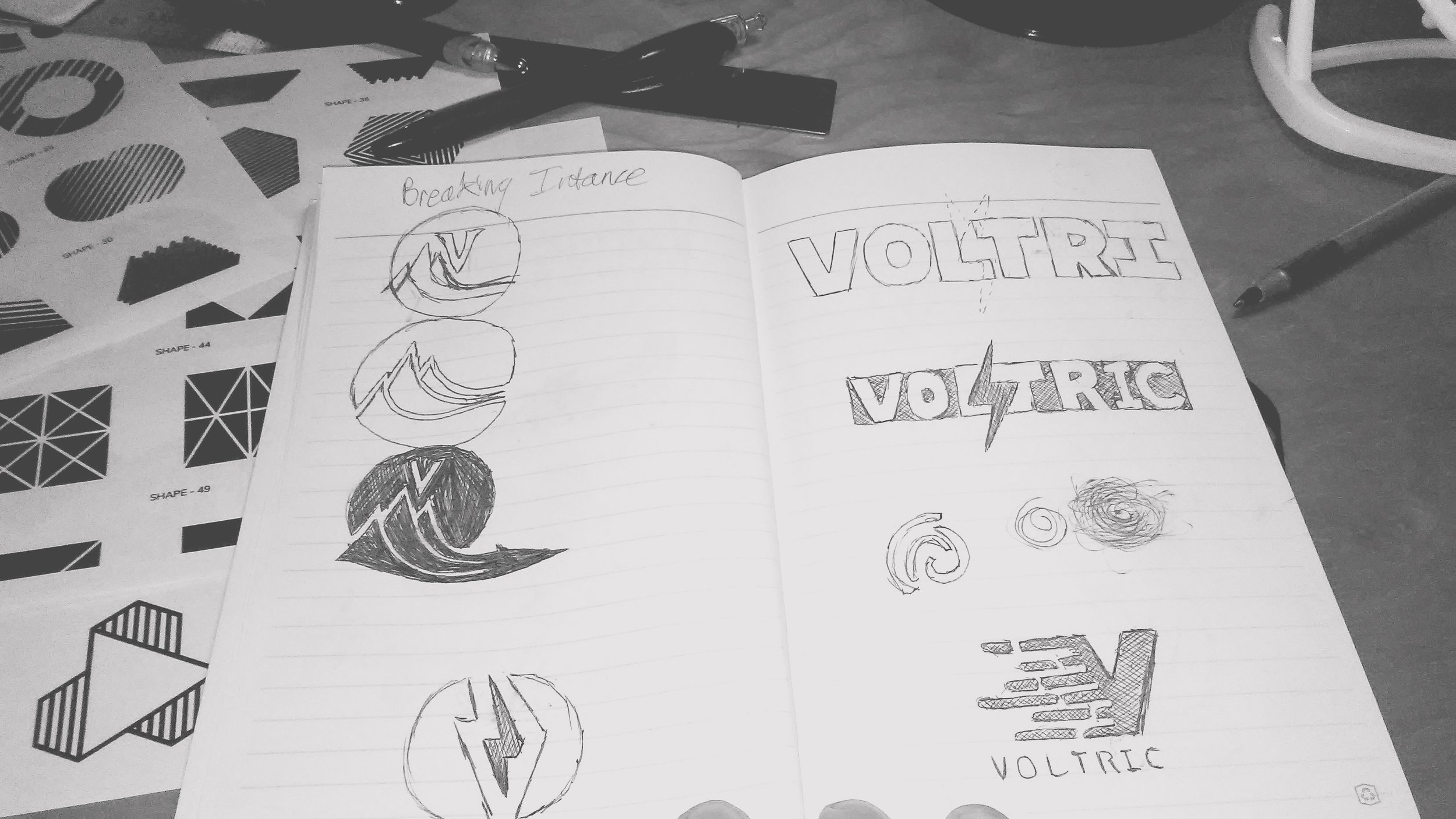
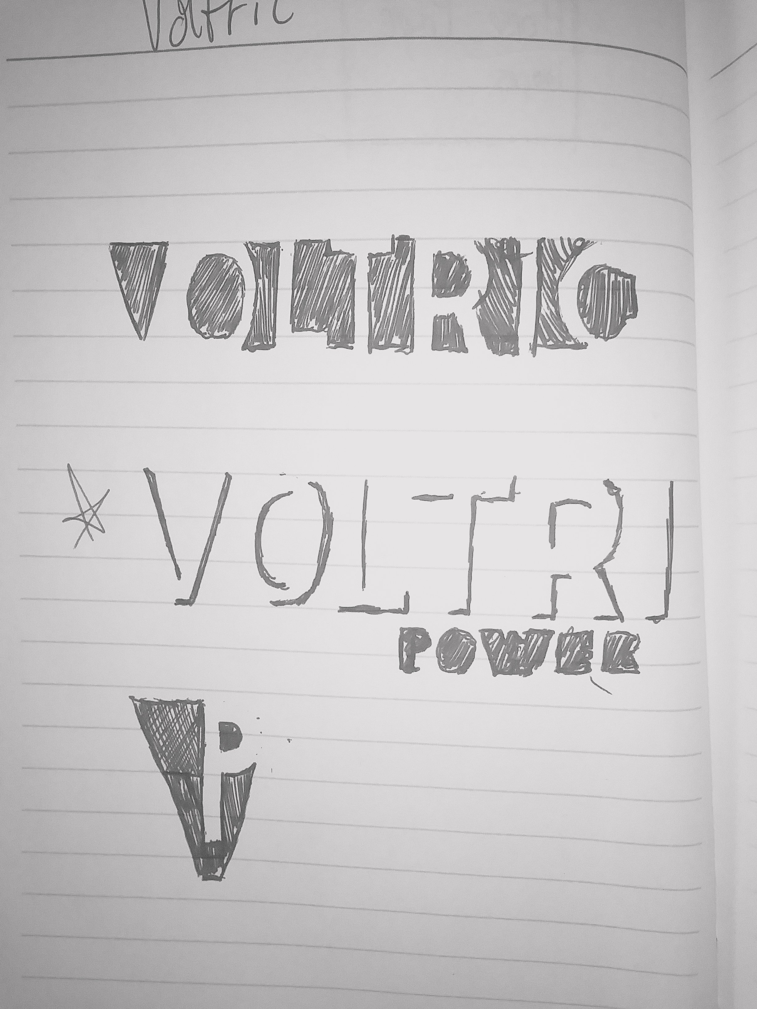
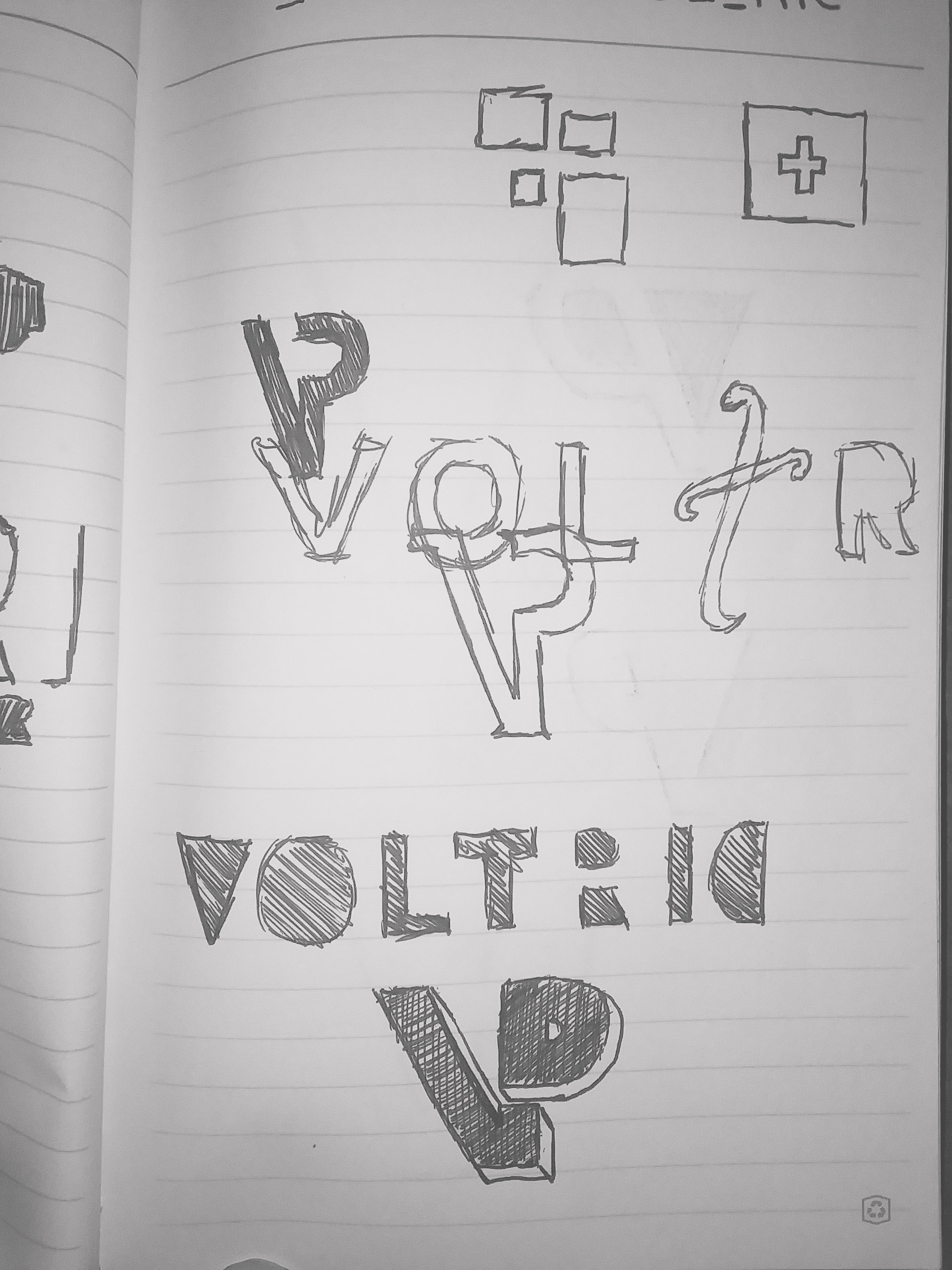
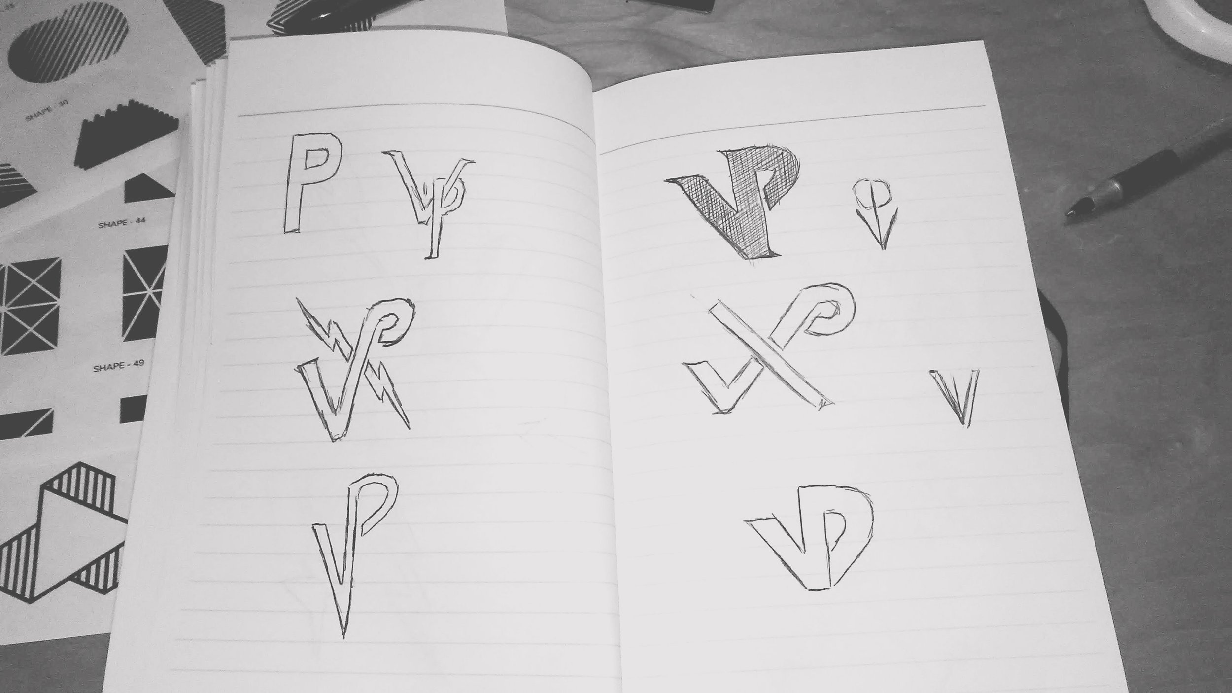
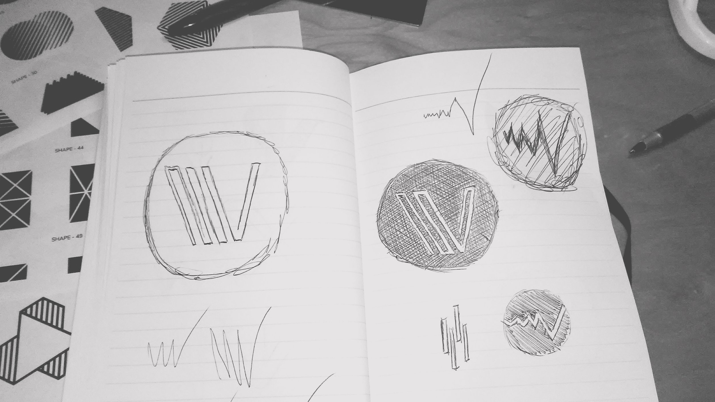
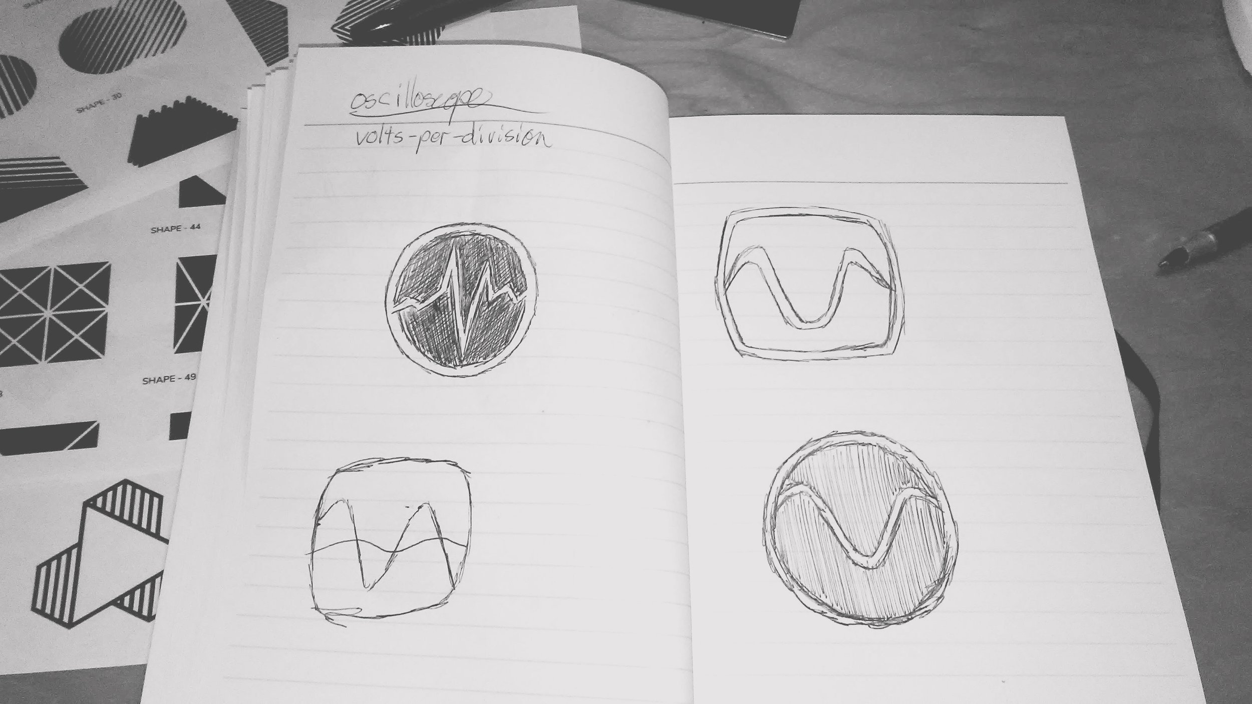
Pen to paper is how I start any project, whether its sketching imagery, or drawing out copy blocks, or brainstorming words and phrases. I created around 100 or so thumbnail sketches. Focusing on key elements that were called out in our kickoff: electricity, power, movement and propulsion. The goal of the exercise is to not spend more than 30 seconds on a sketch, get the idea out and move on.
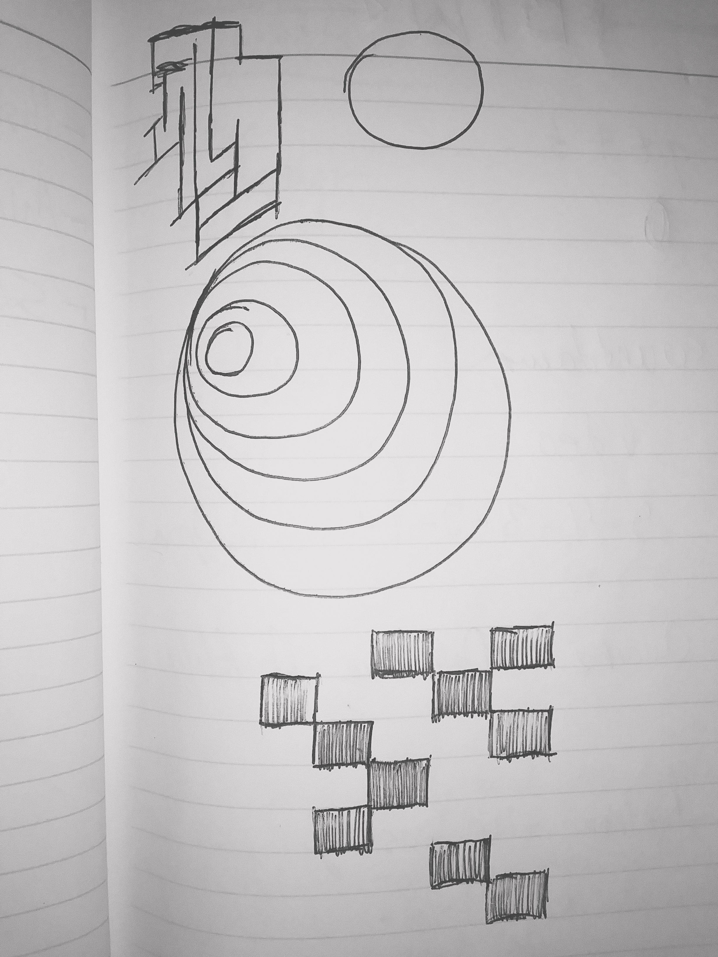
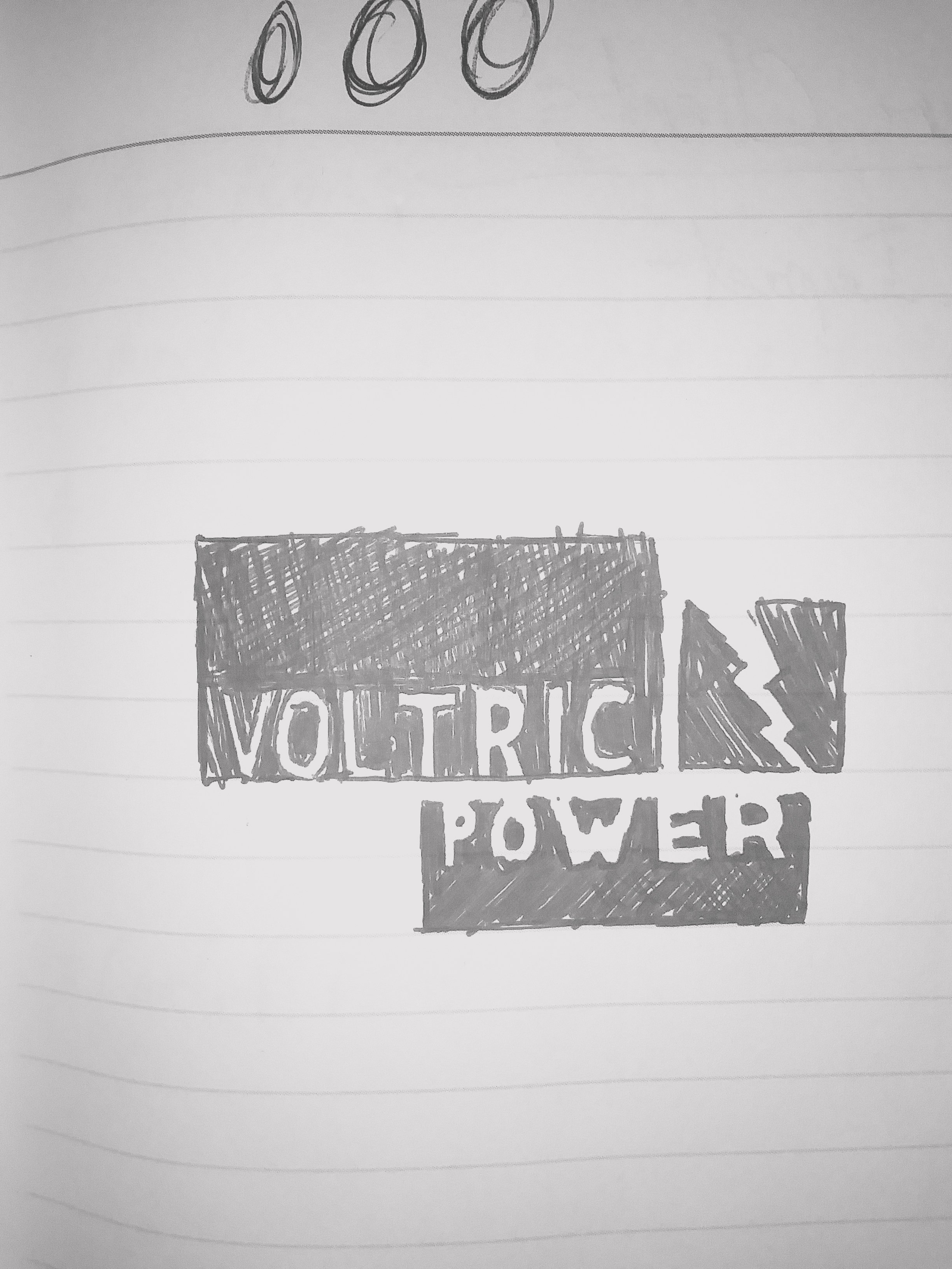

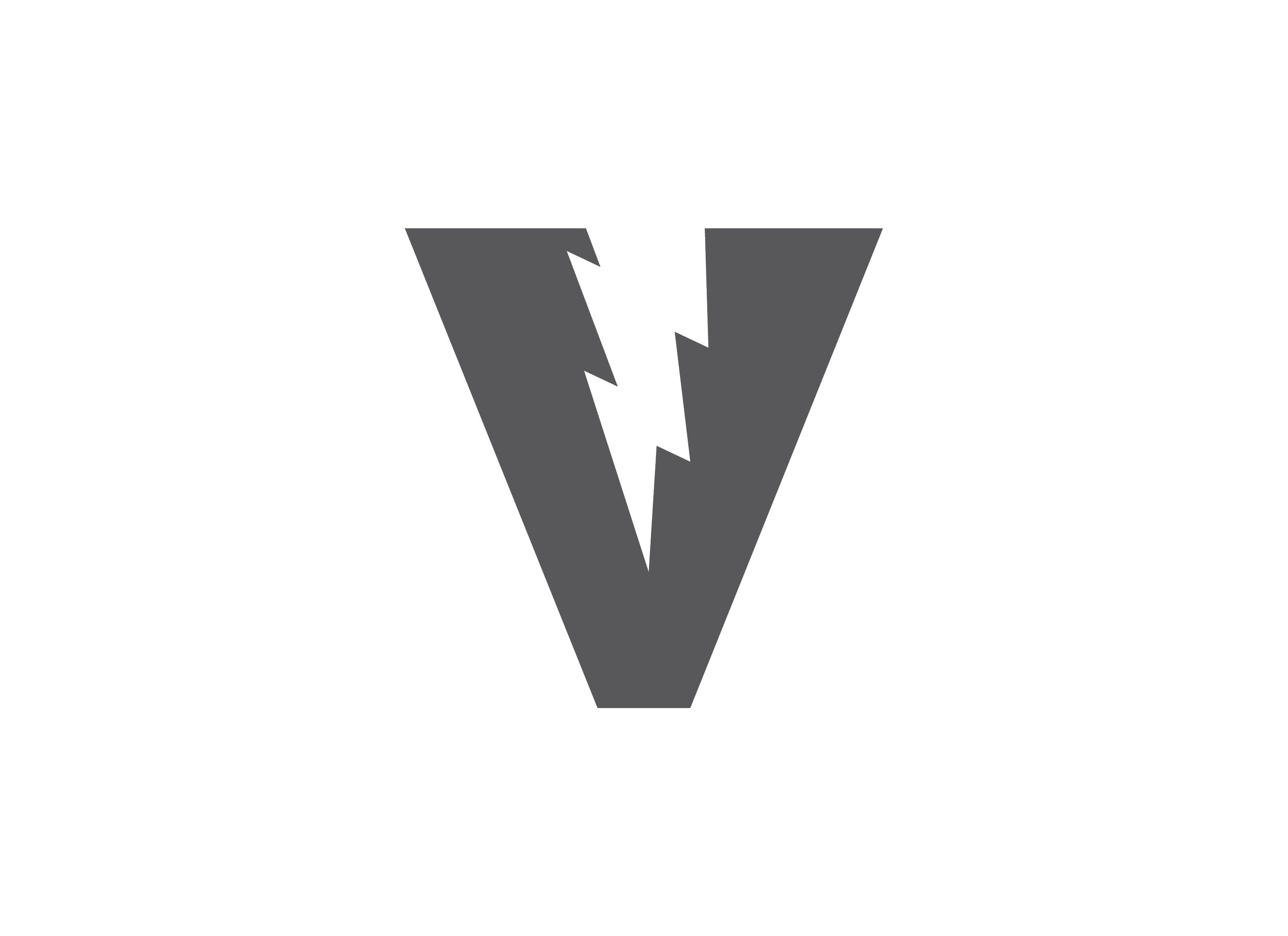


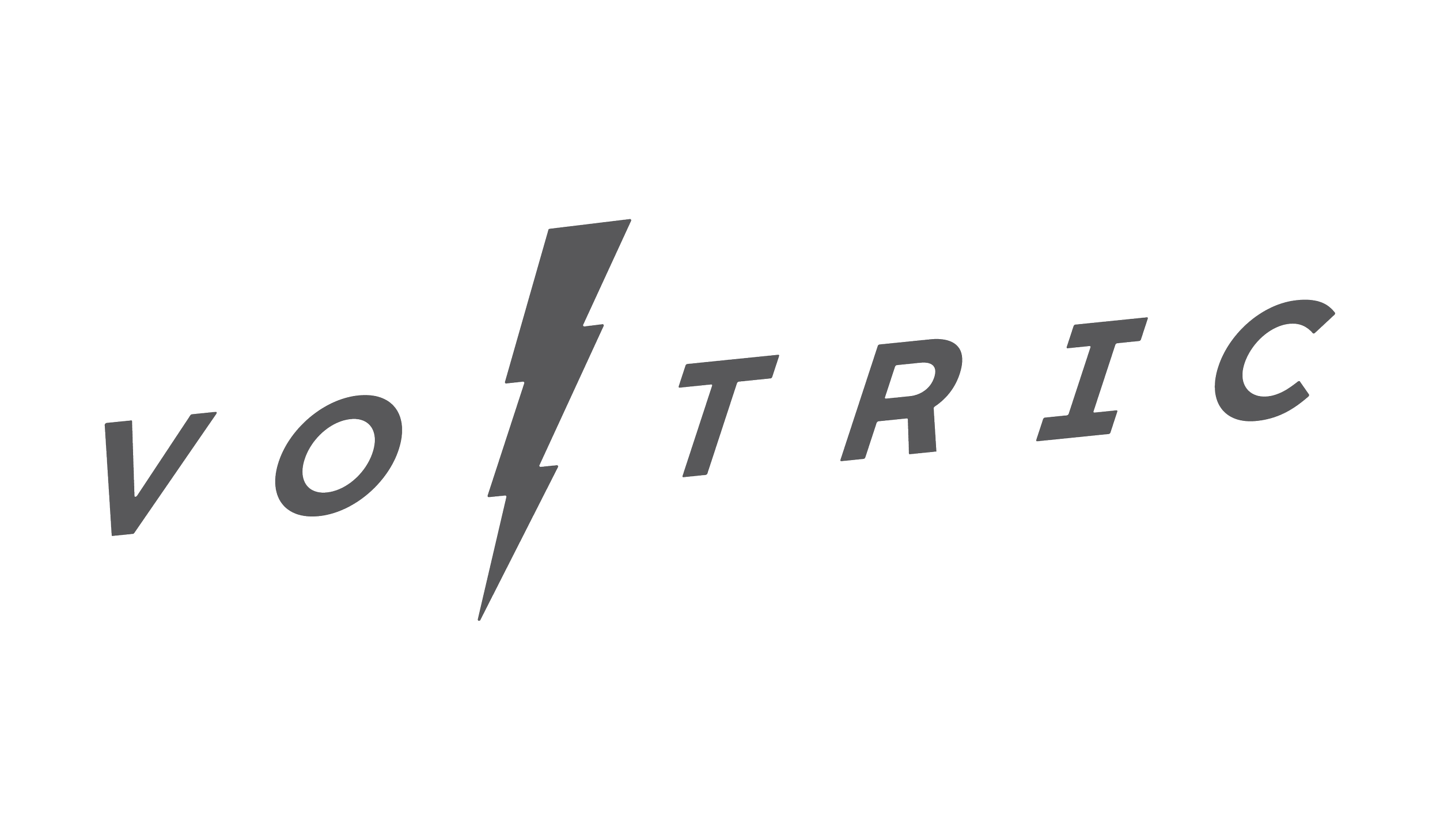


Vector Mark-ups
Taking those loose sketches and refining them in Illustrator helps clarify what the end result could be. By eliminating the options that didn’t align to the what the client’s story was, I presentated the client divergent directions we could go down. Either a wordmark, symbol, or emblem created a discussion to gauge what the client wanted to proceed with. After presenting these directions to the client, we started to move away from the “electric” imagery and focus on a mark that focused more on power and strength.


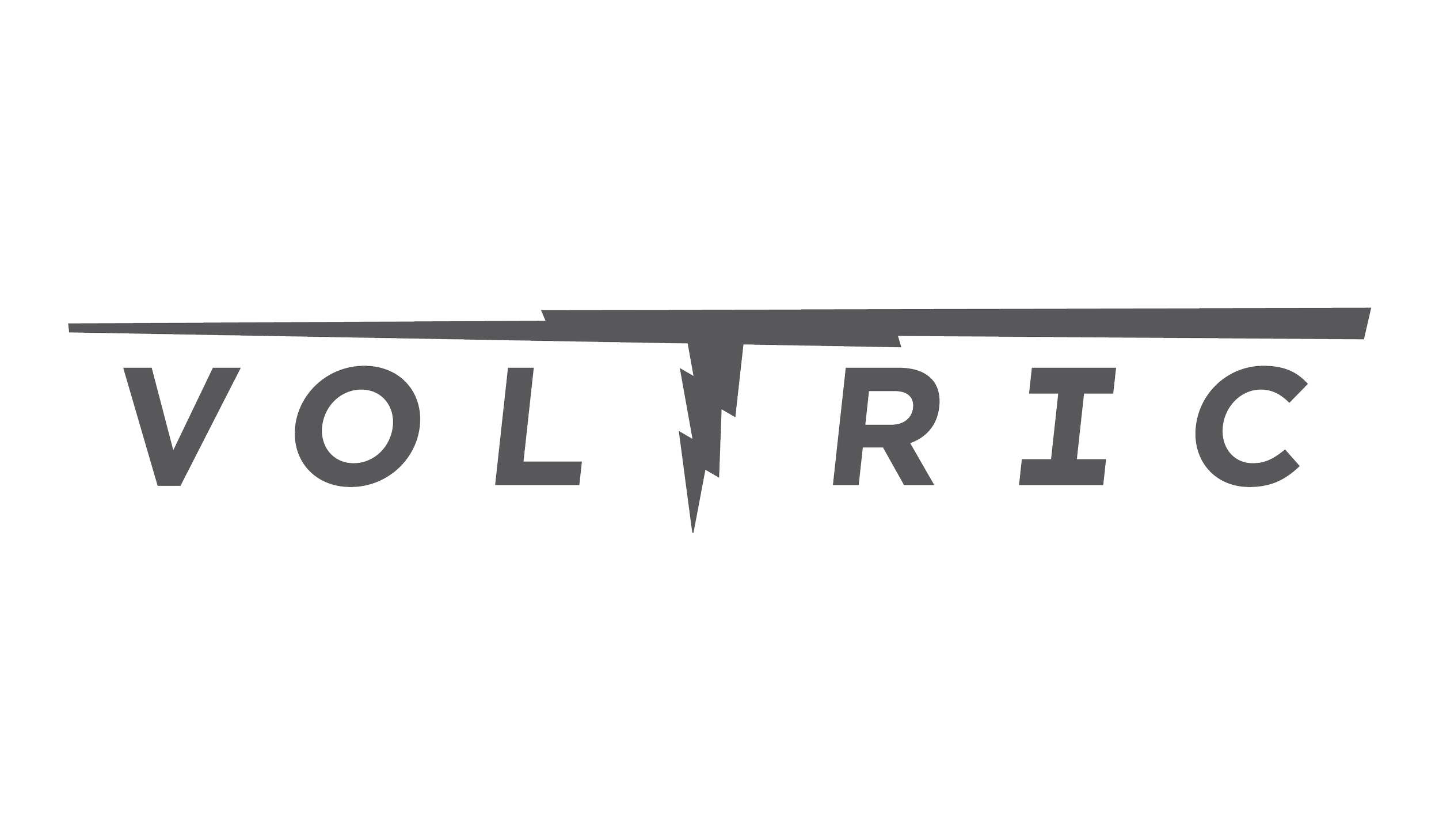
Option 1 — Dimensional

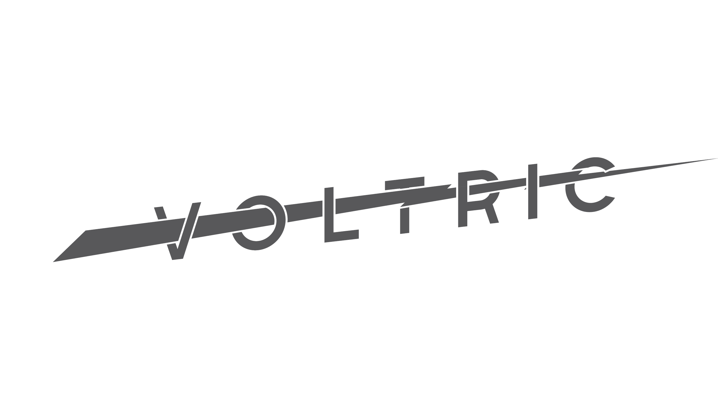
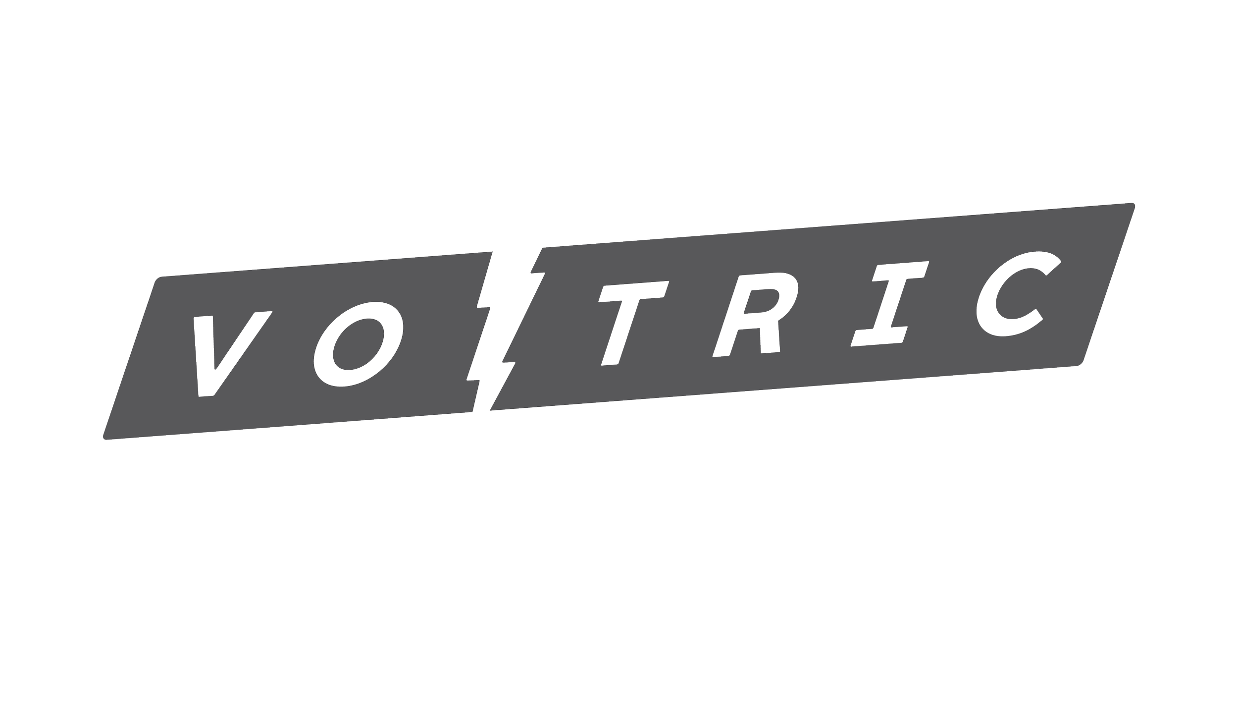
Option 2 — Oscilloscope
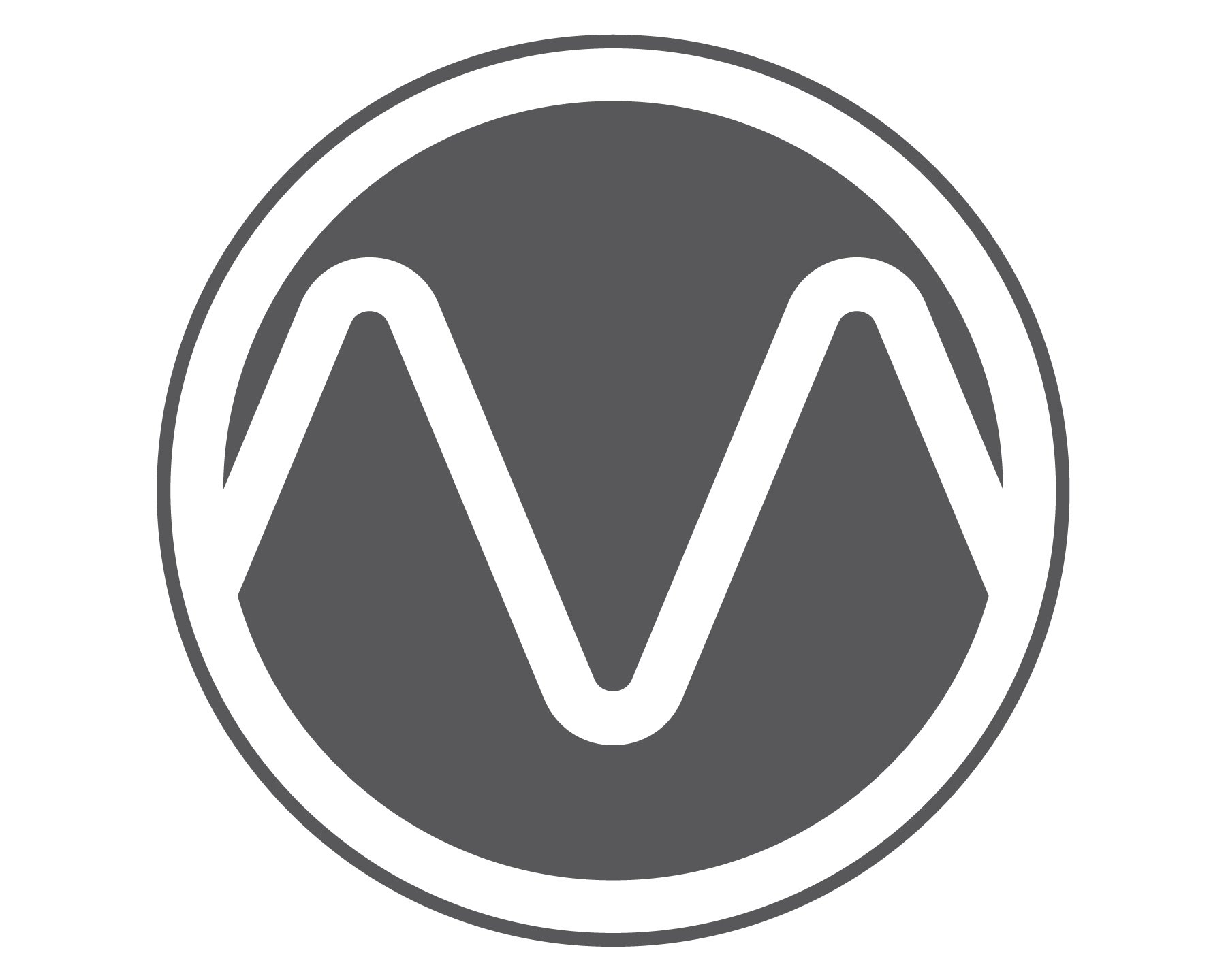
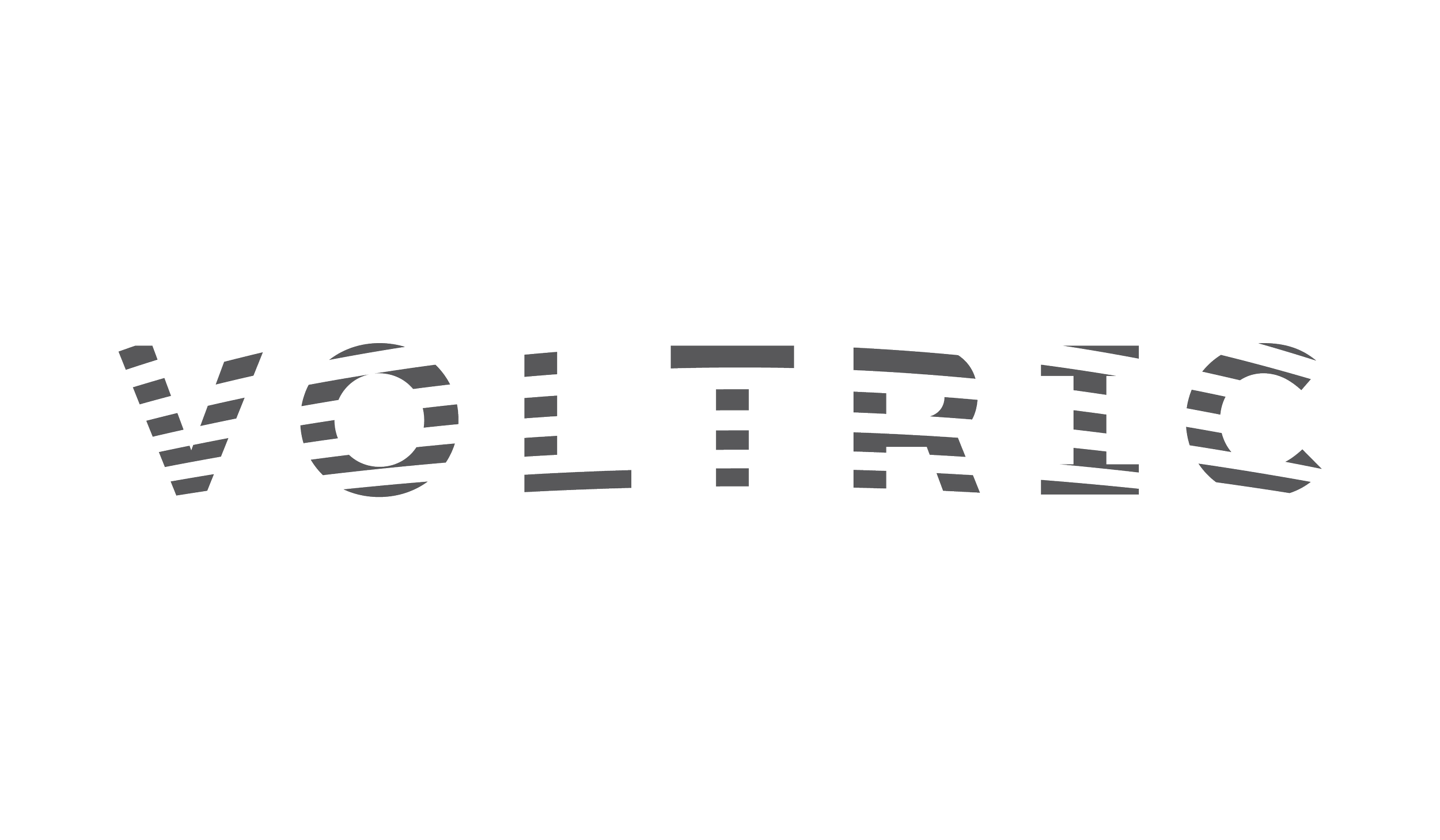
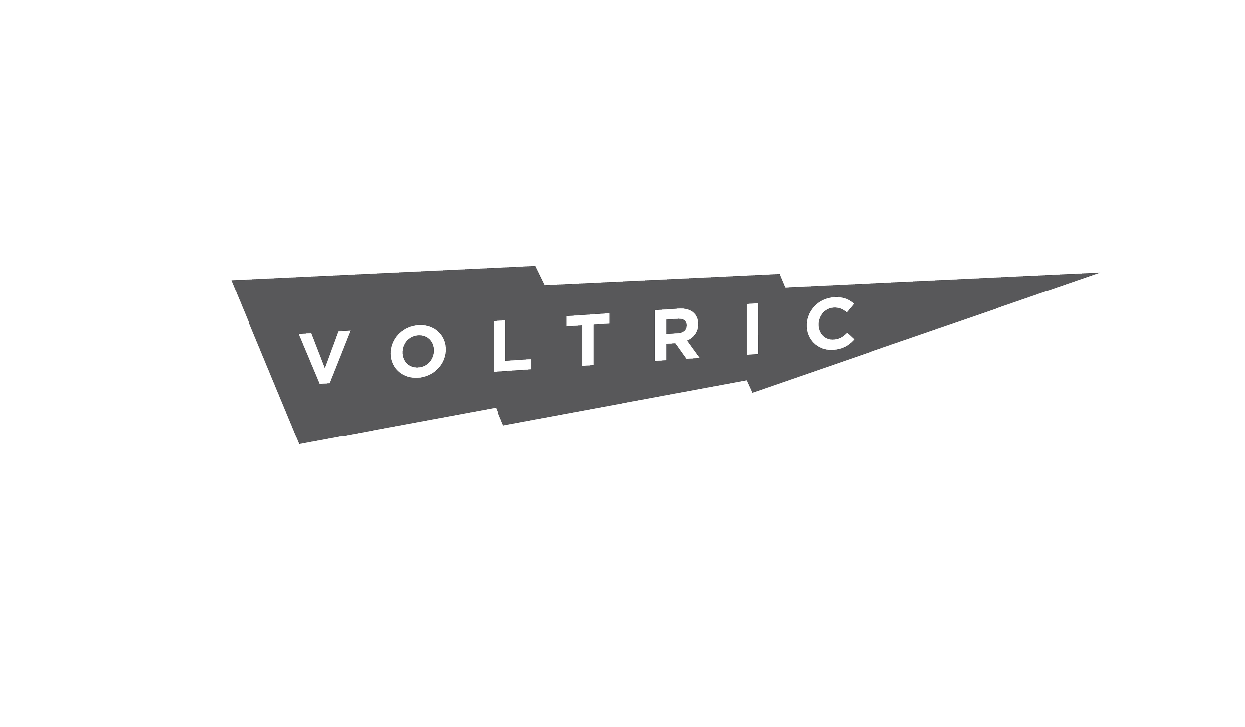
Option 3 — Architectual Movement

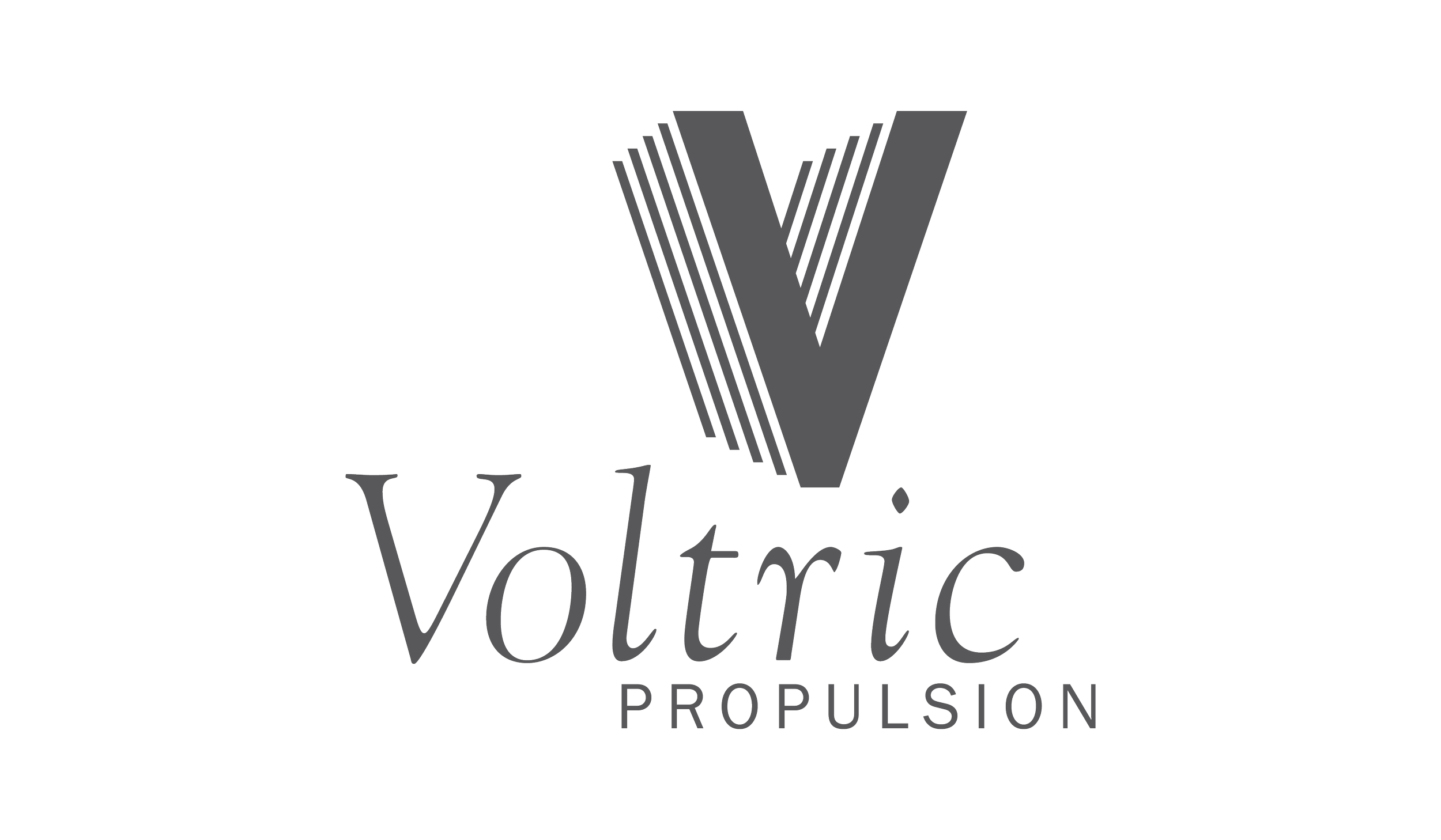
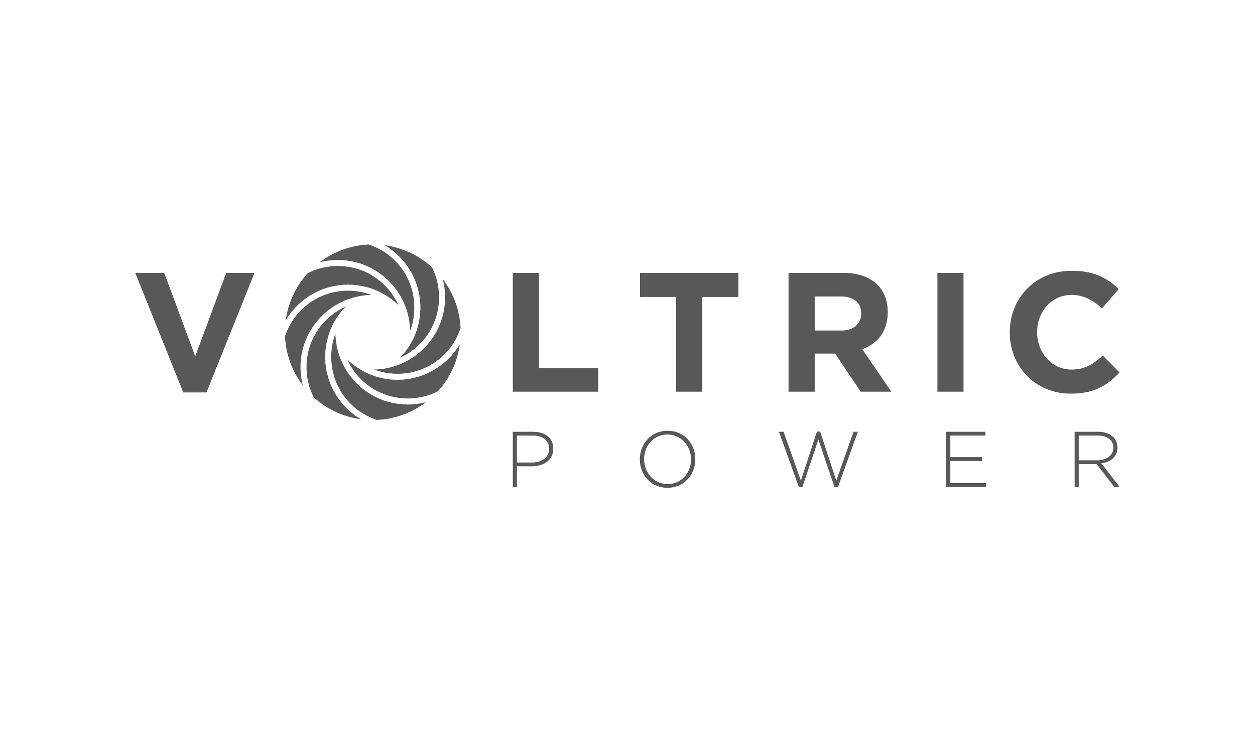
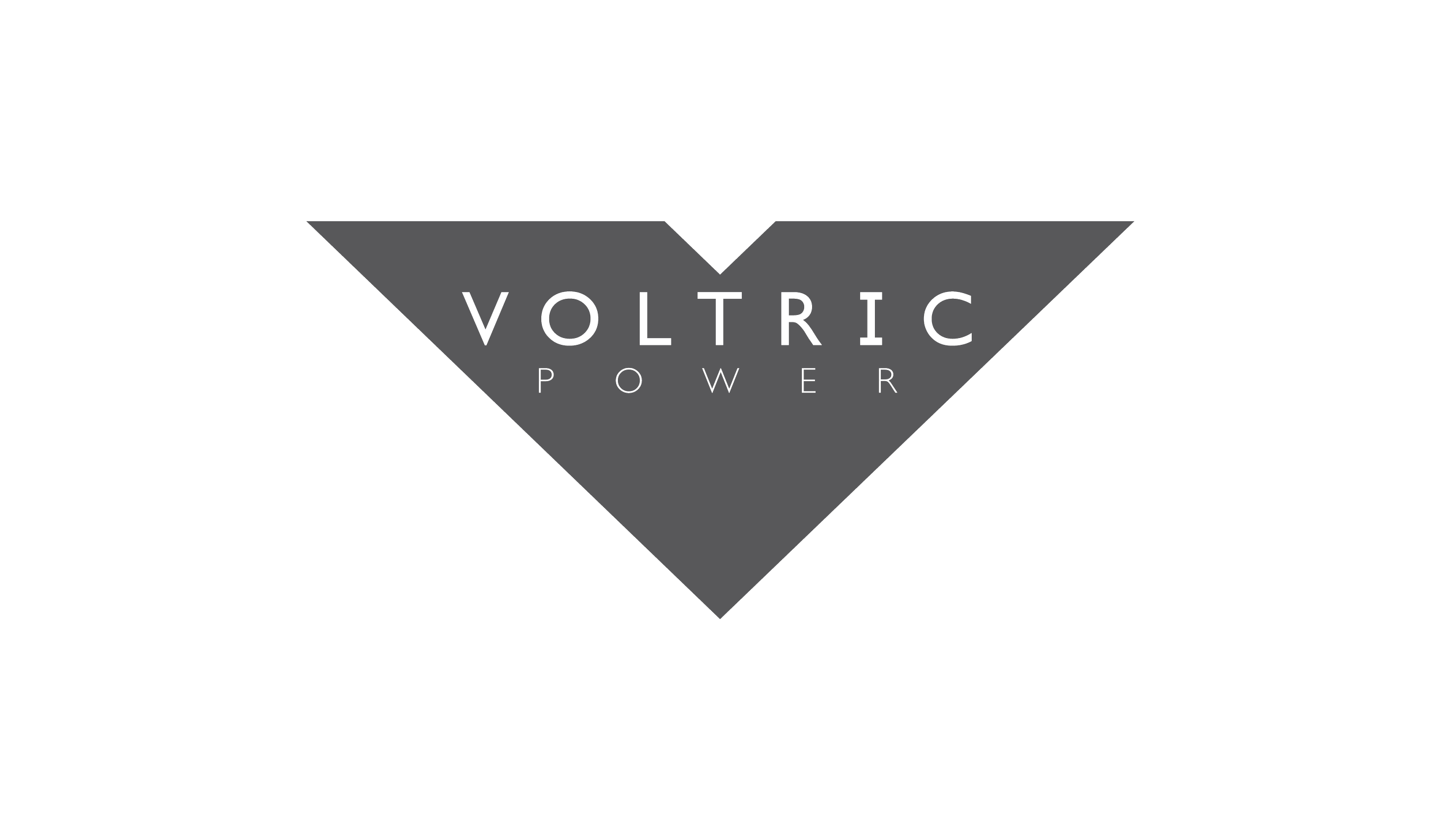
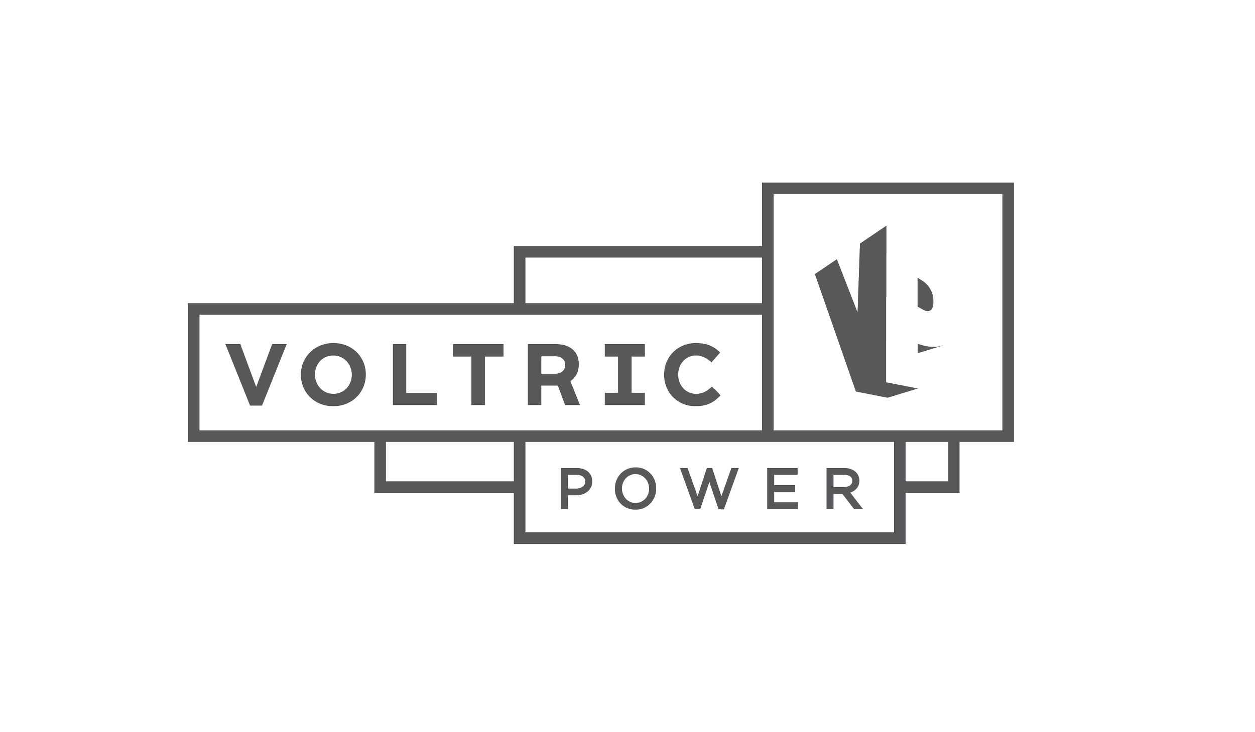
Exploration of Client Selects
The Client wanted to explore 3 of the graphic symbols we presented. I tried to exhaust as many possibilities while exploring each icon, and then presenting a suite of marks for each direction.
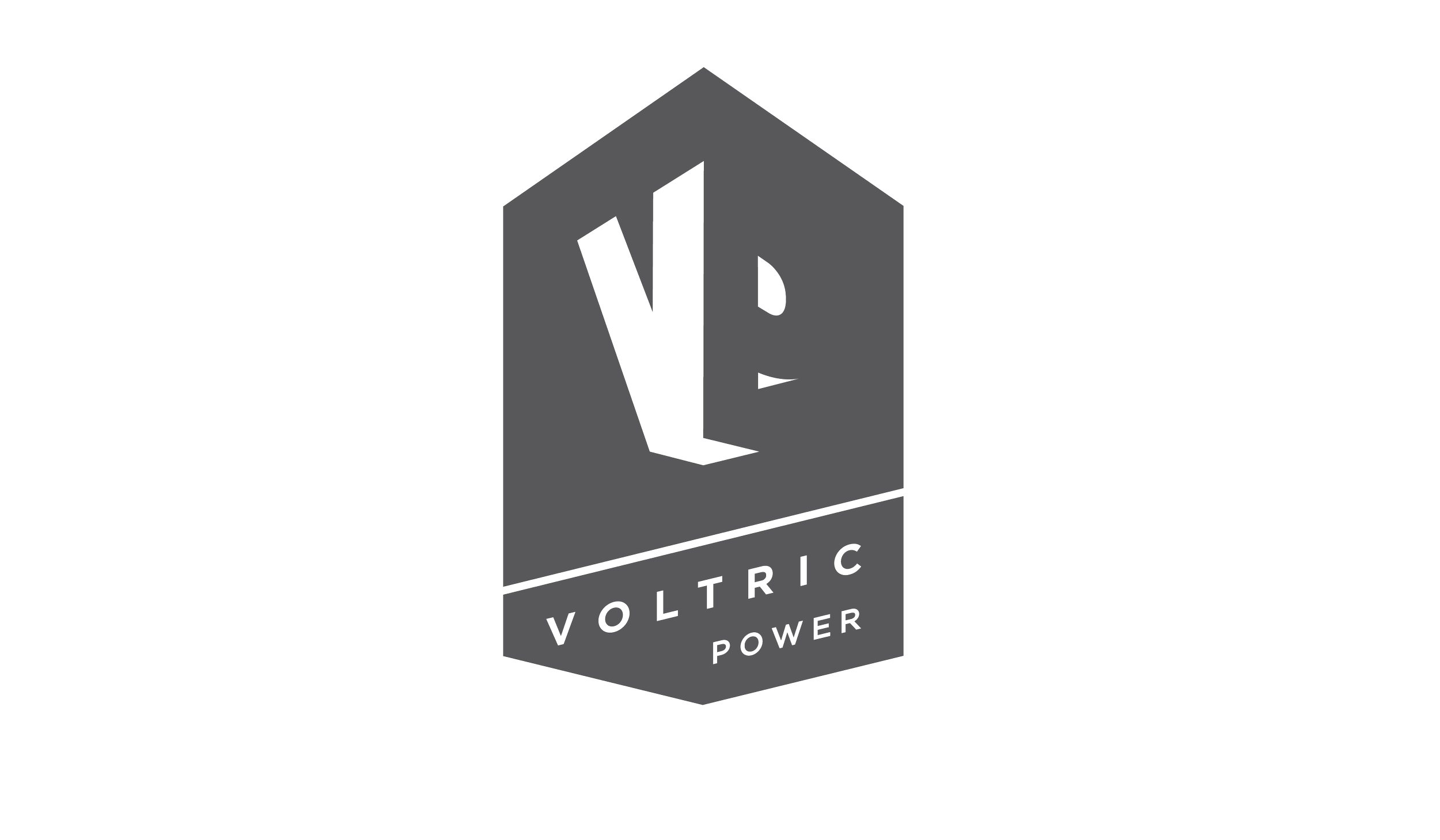
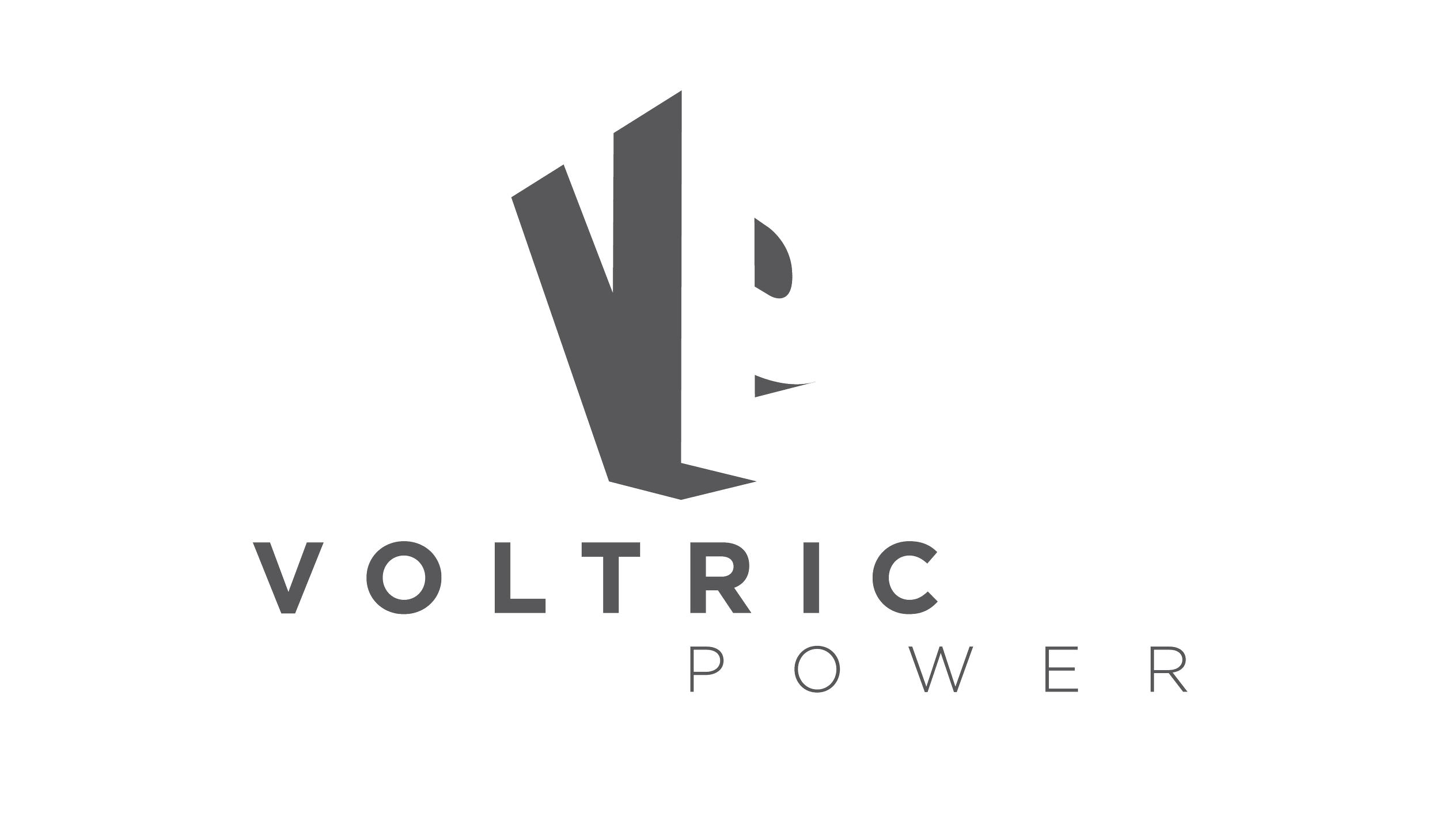
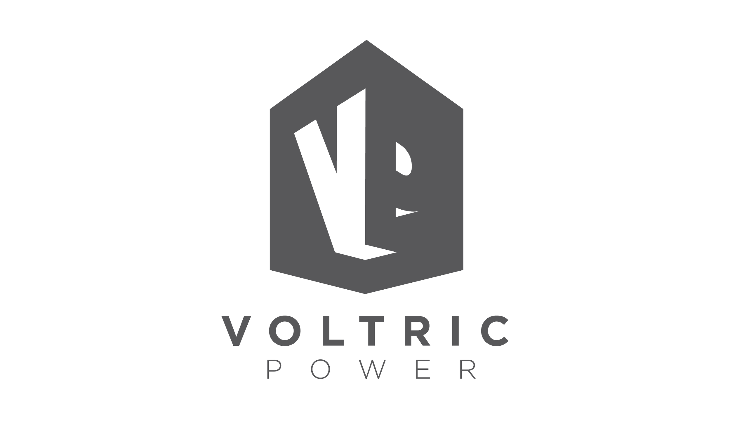
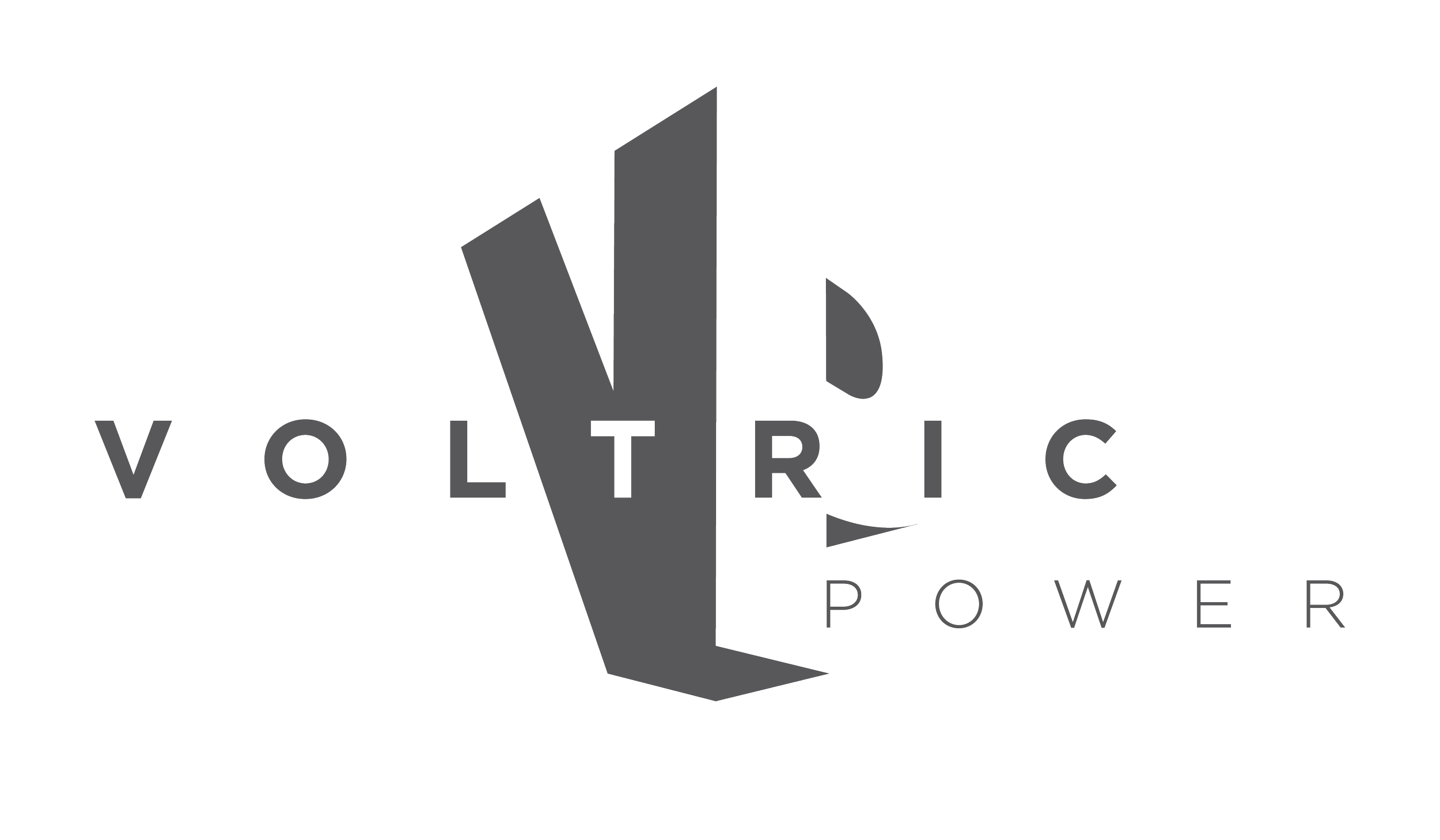
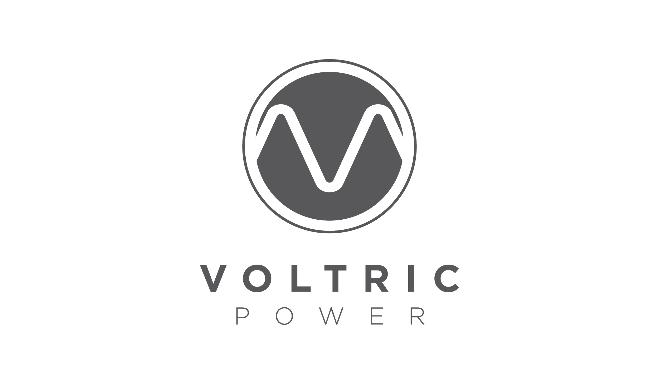
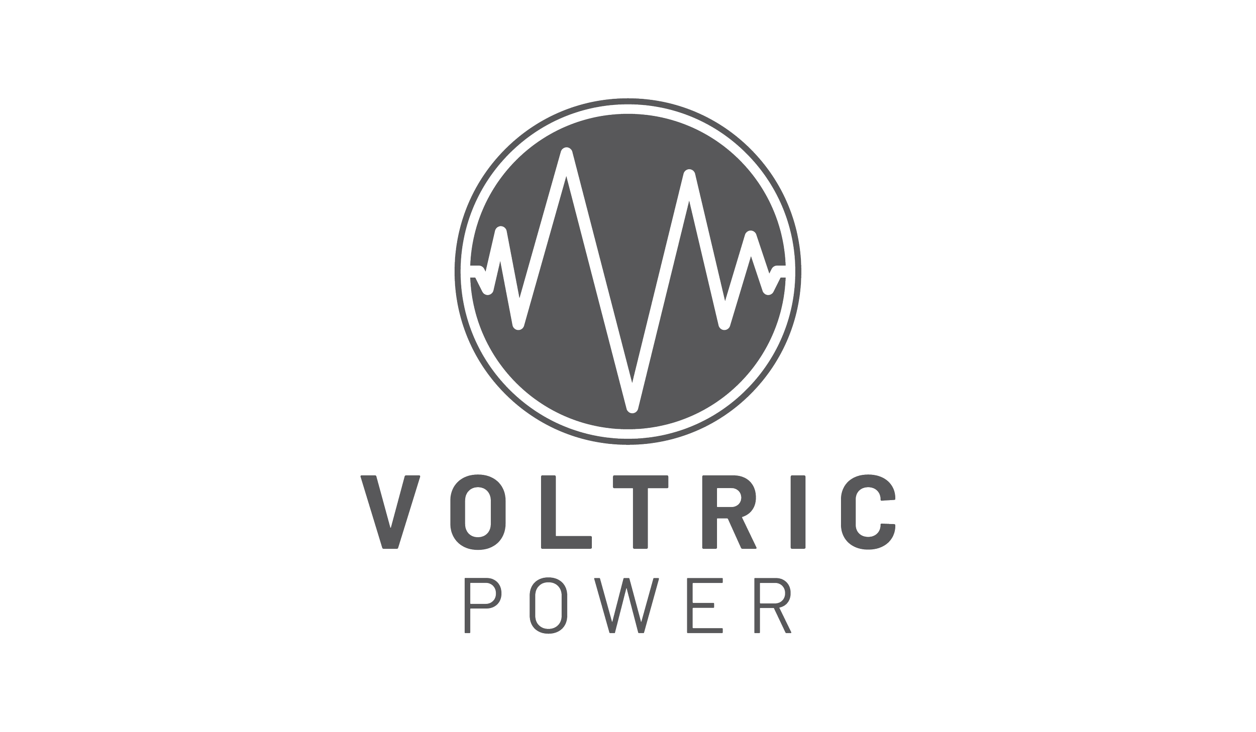
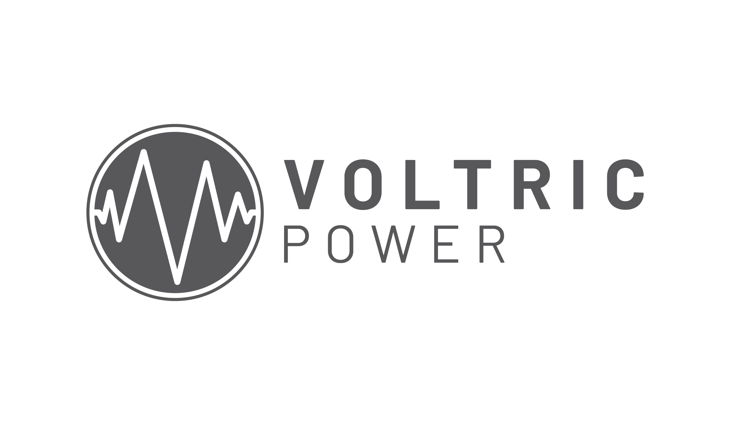
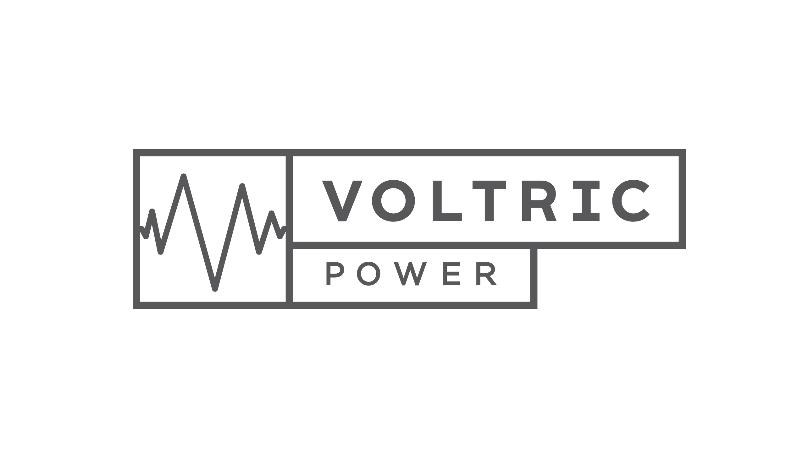
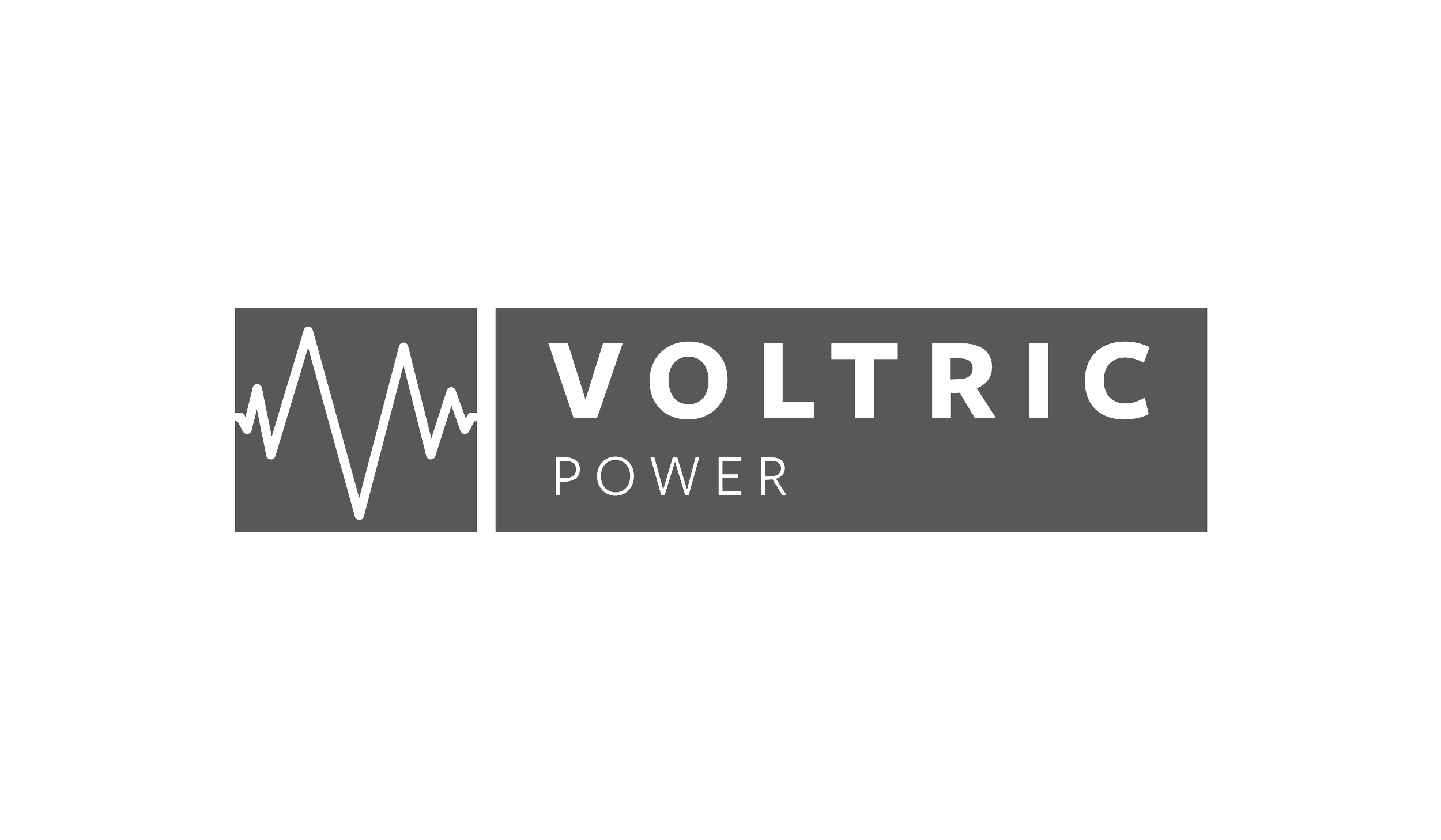
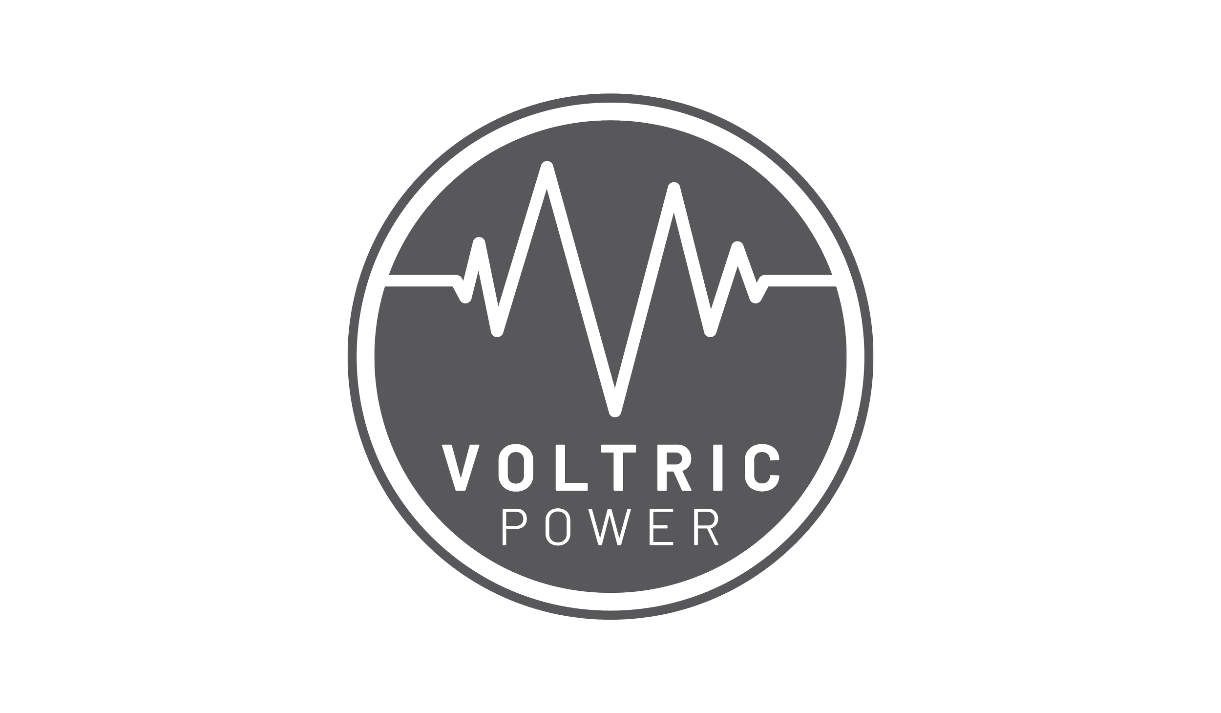
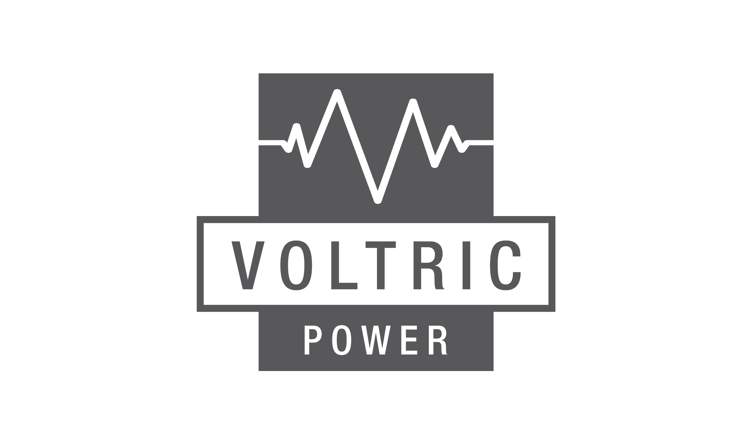
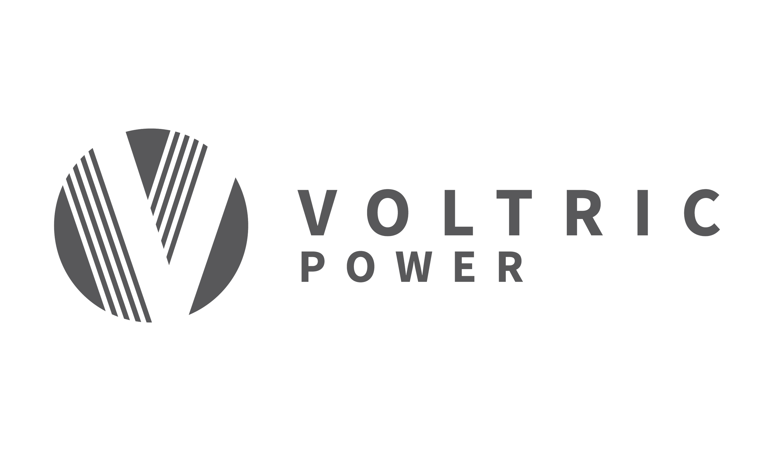
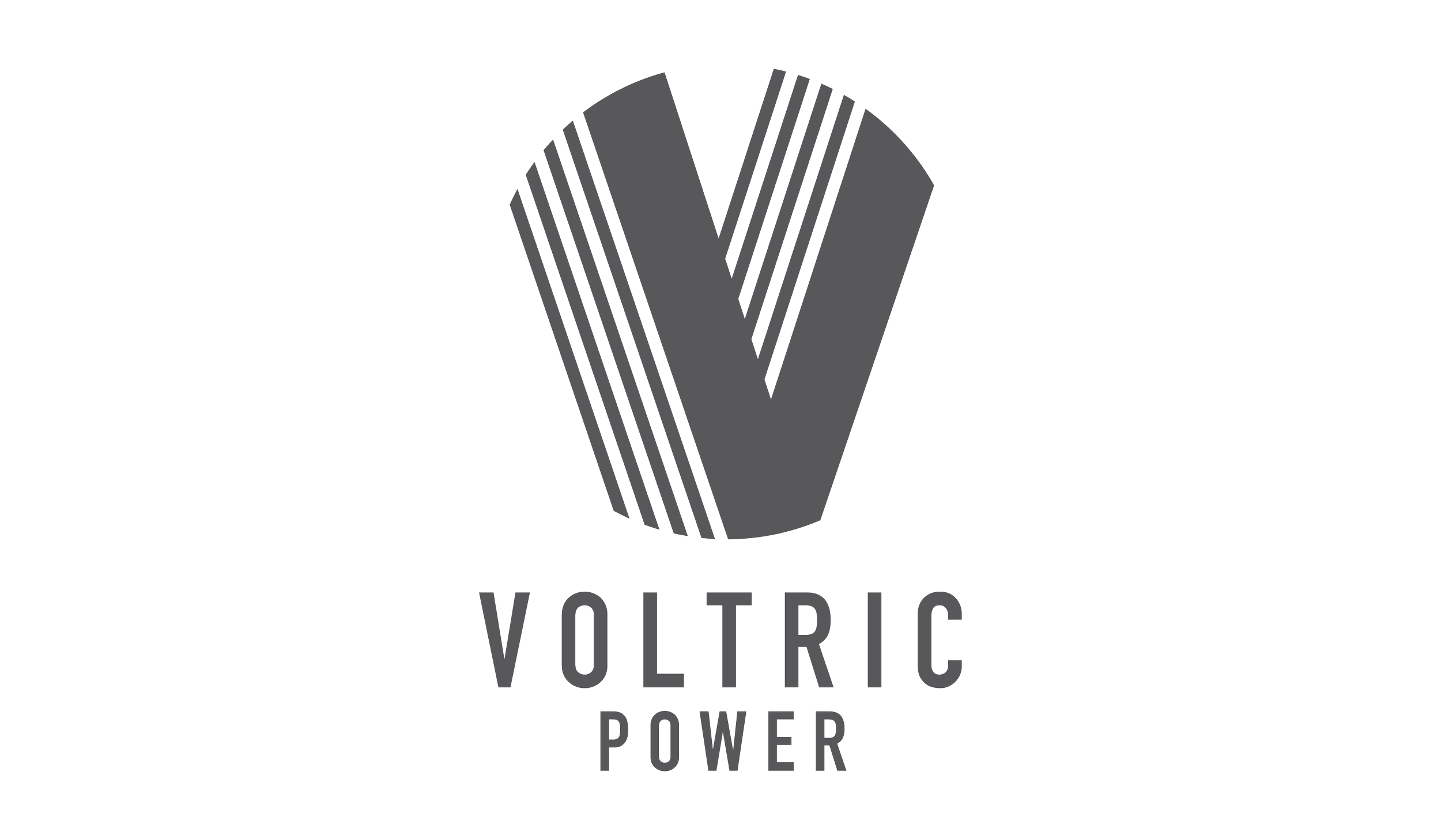
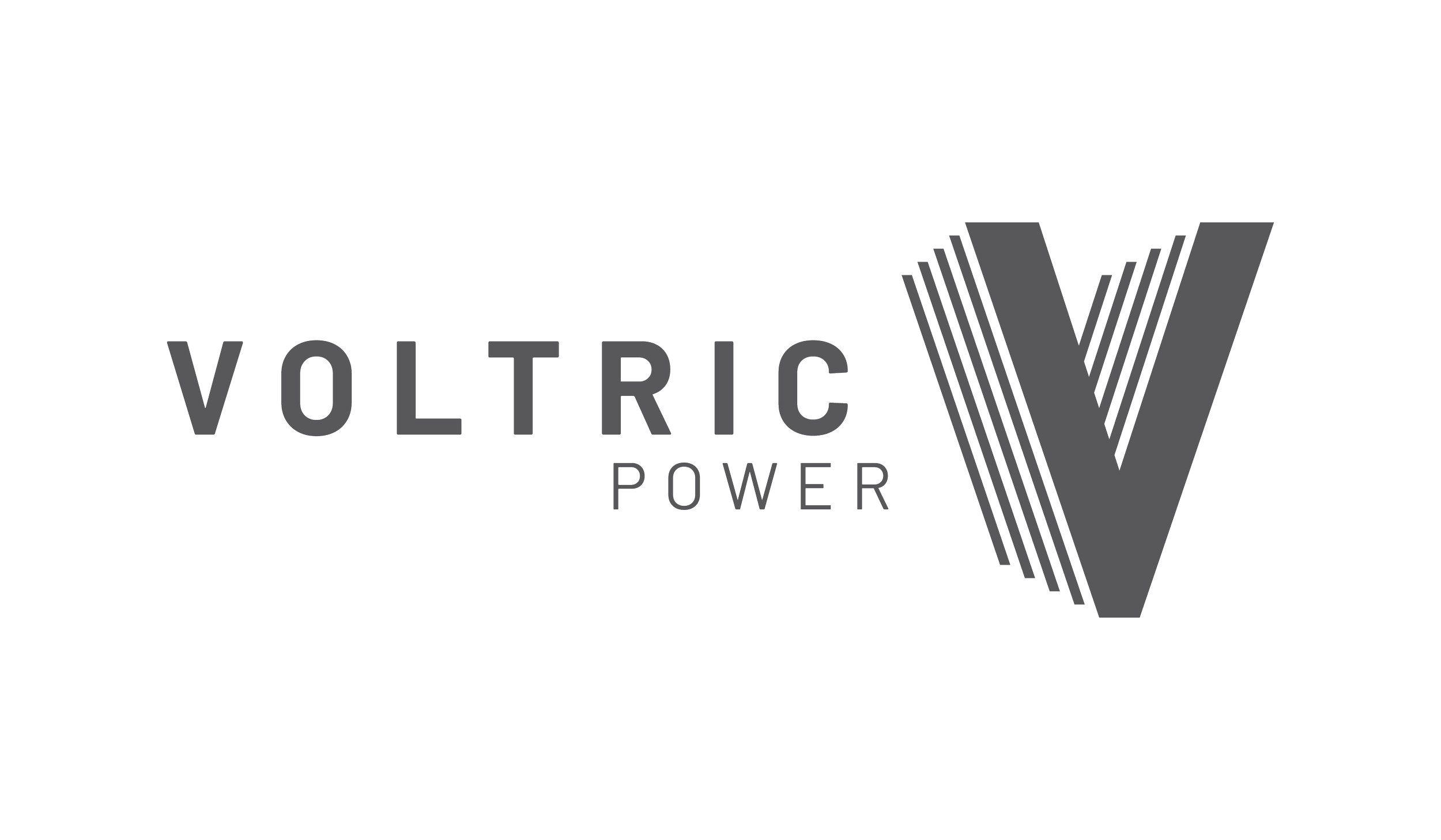
Suite of Delivered Marks
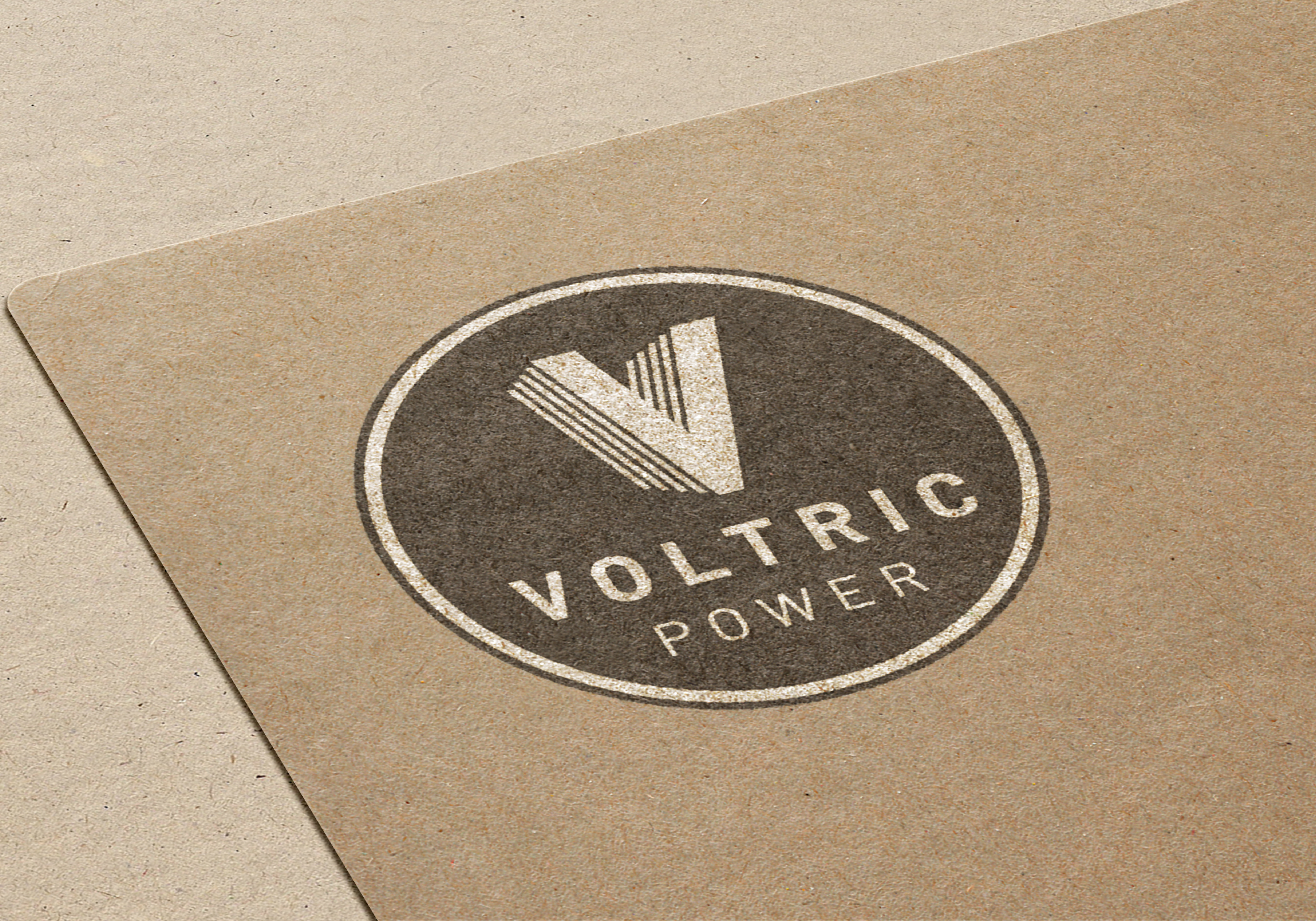
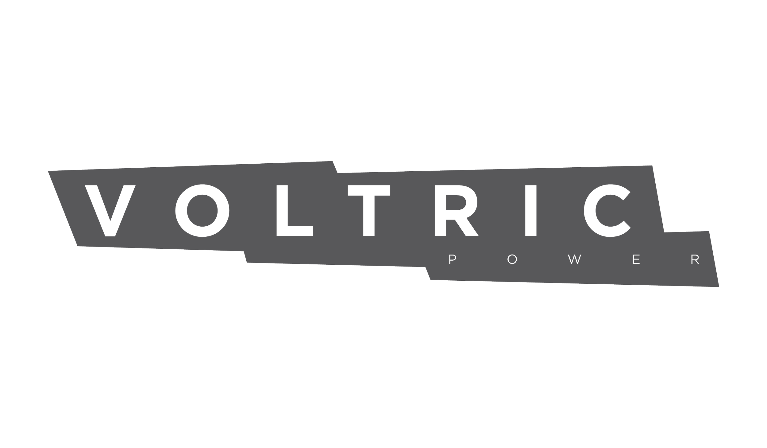
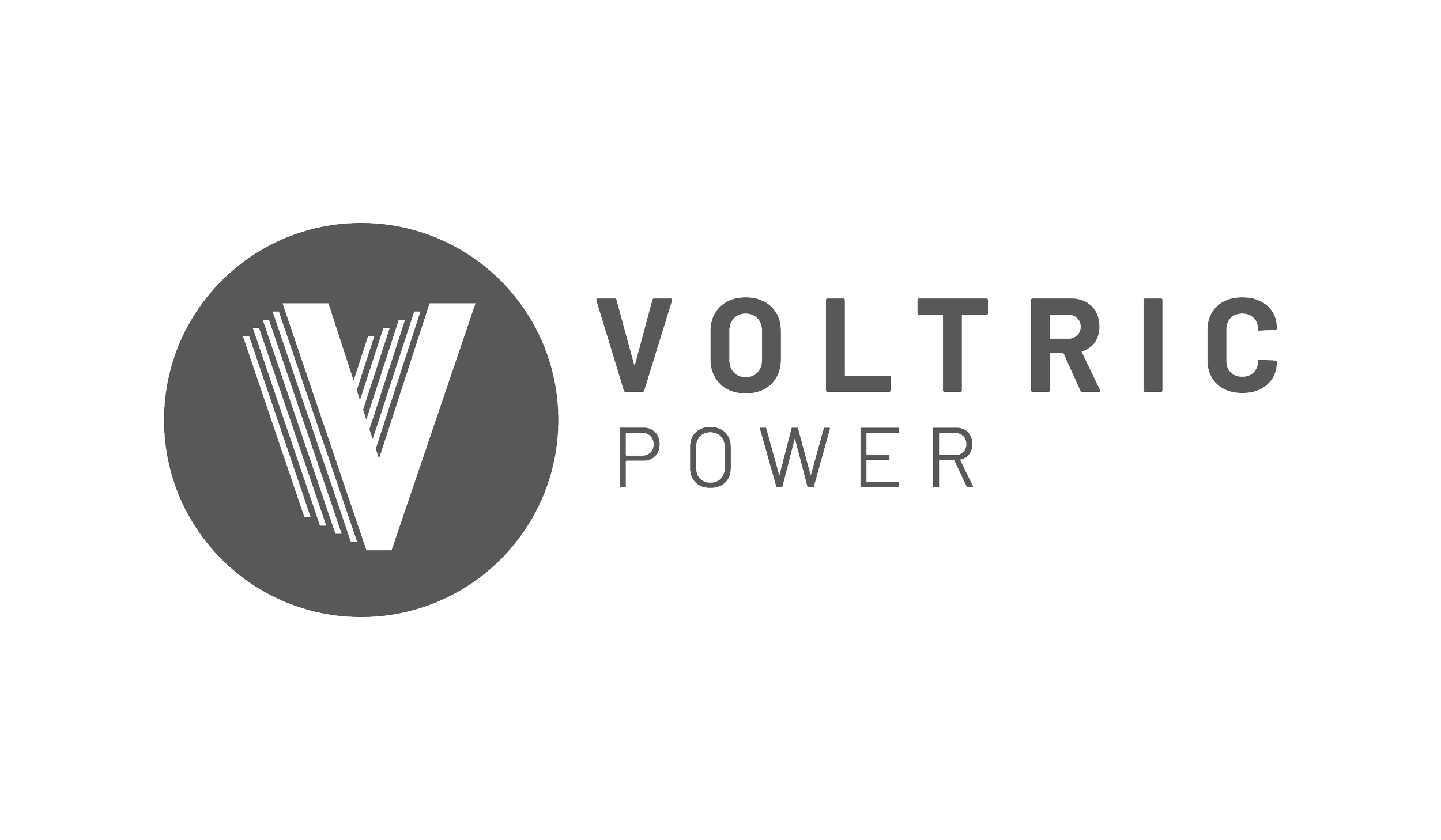
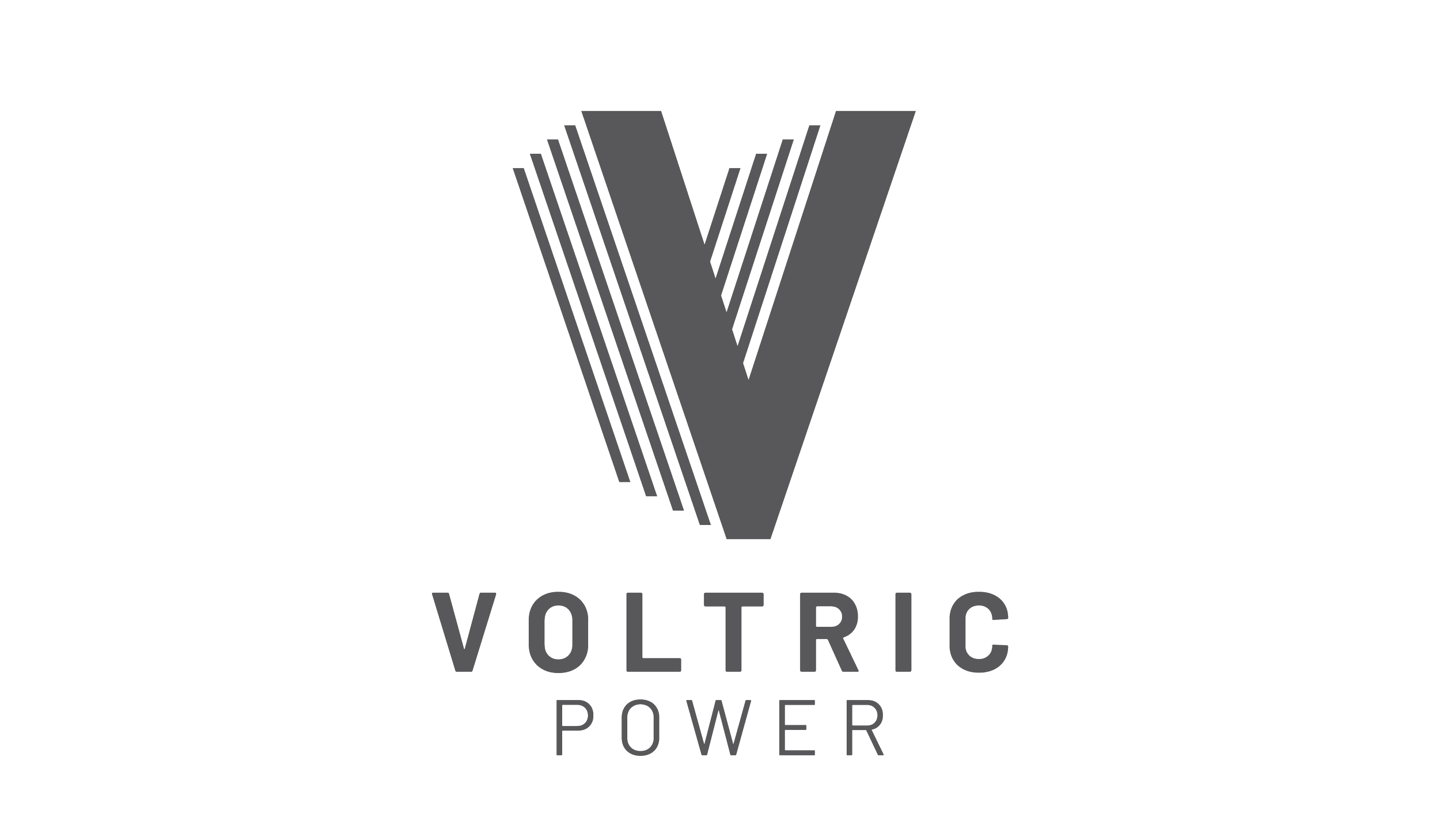
The client chose the Architectural Movement option but they really liked the dimensional version as well. I was able incorporate a little more dimension to the final mark. By adding that slight dimensional shift created more movement and helps the graphic feel like its being propelled forward. The final suite of marks included a horizontal lockup, vertical lockup, badge, and a solo graphic.
