Functionally Formed
A Close Inspection of Sean Raders' Mental State
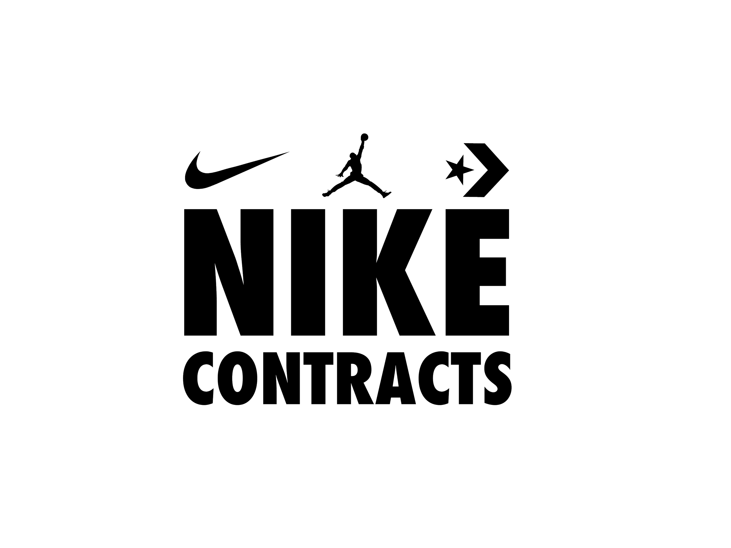
Concepts
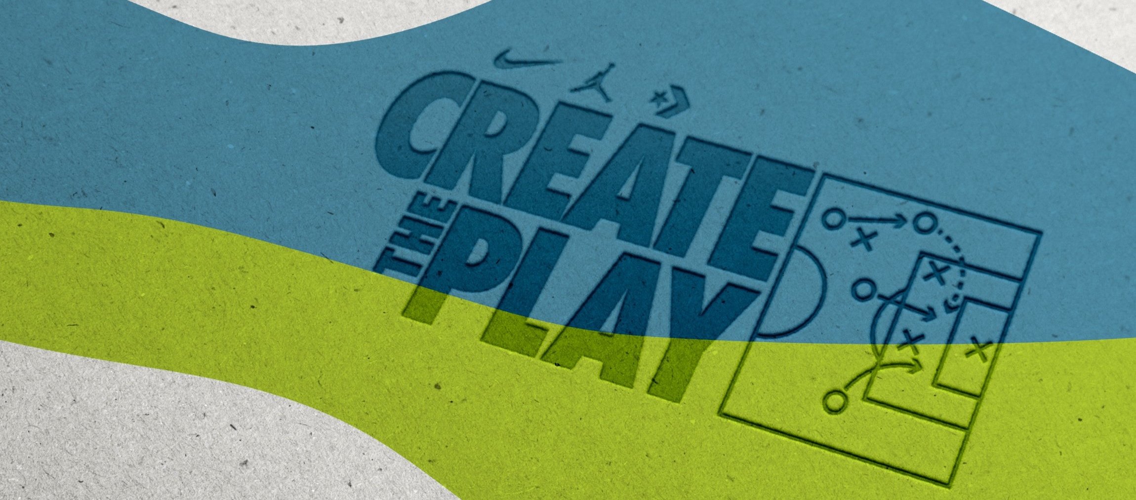
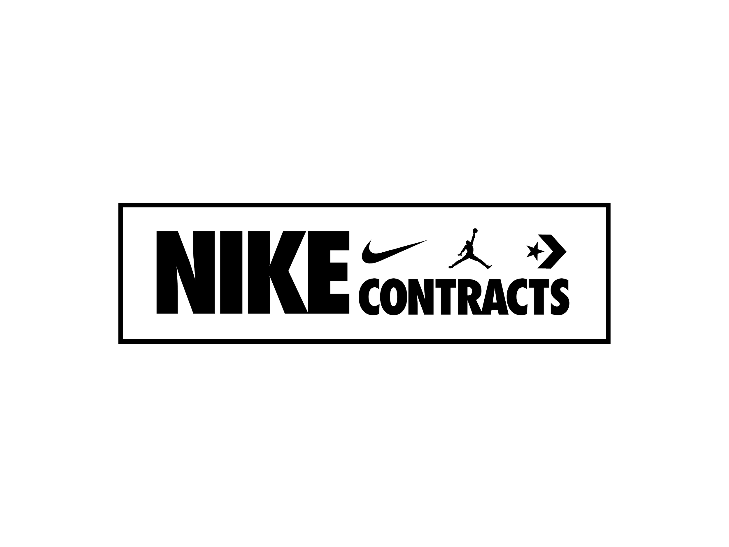
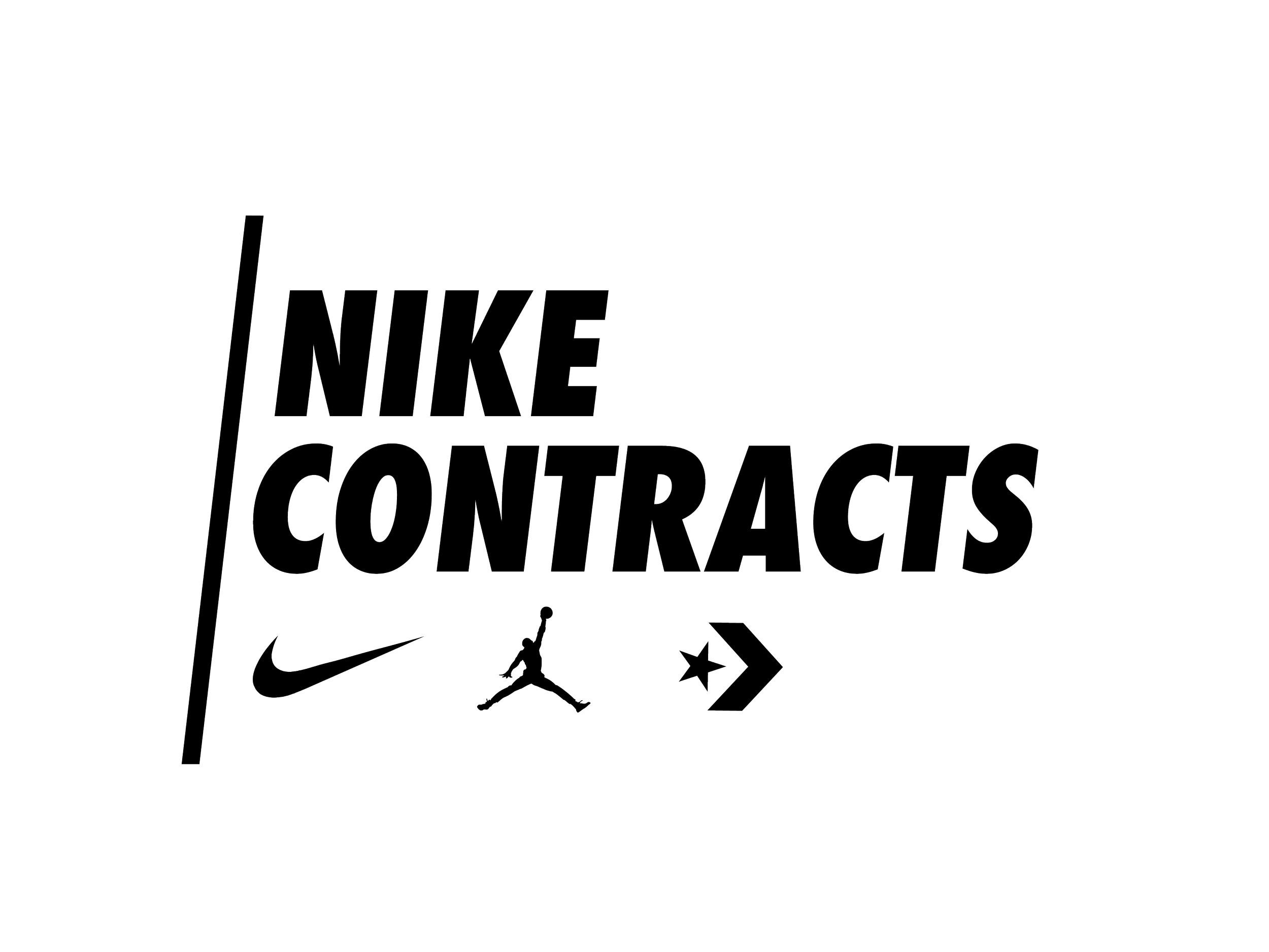
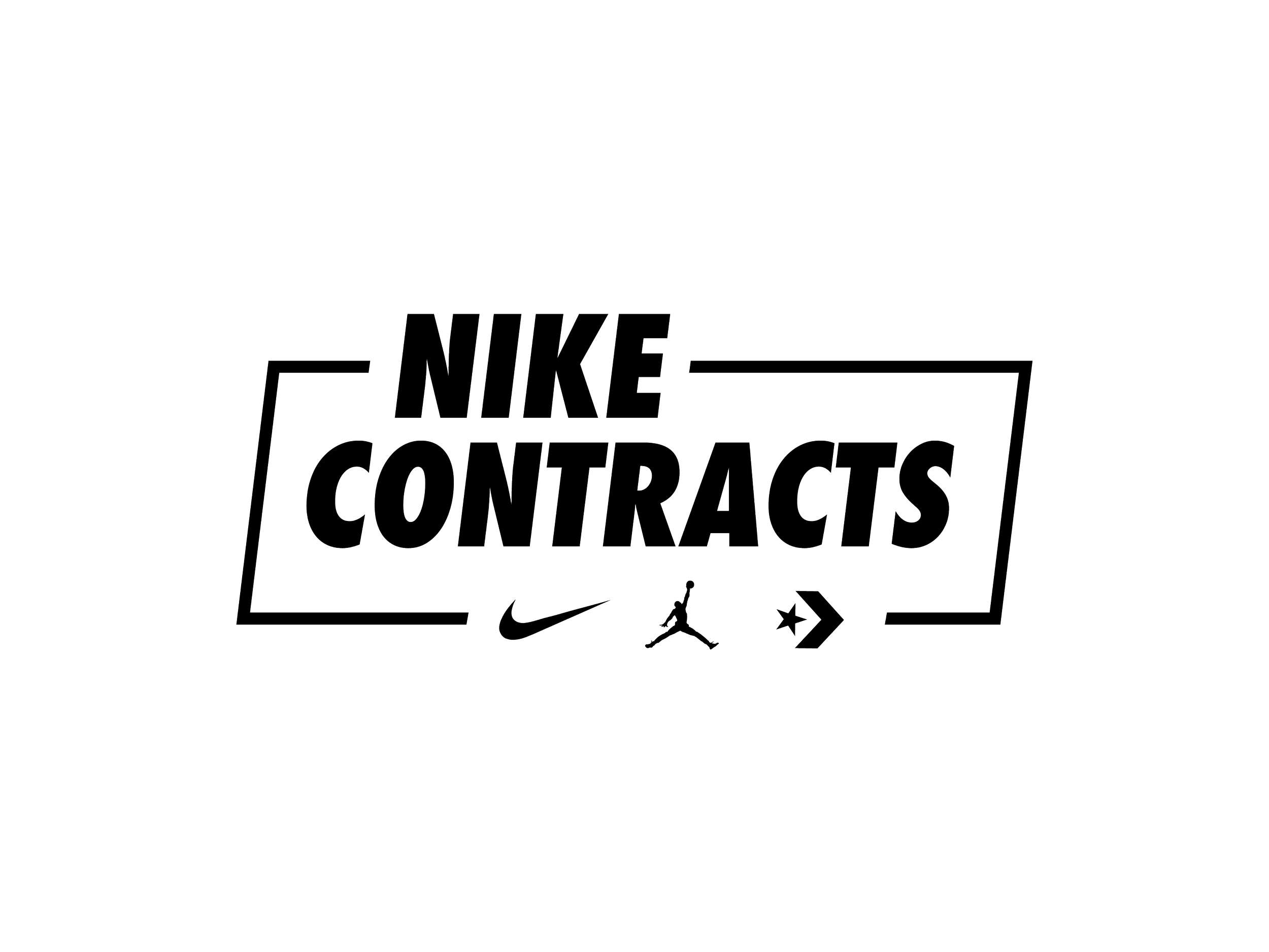
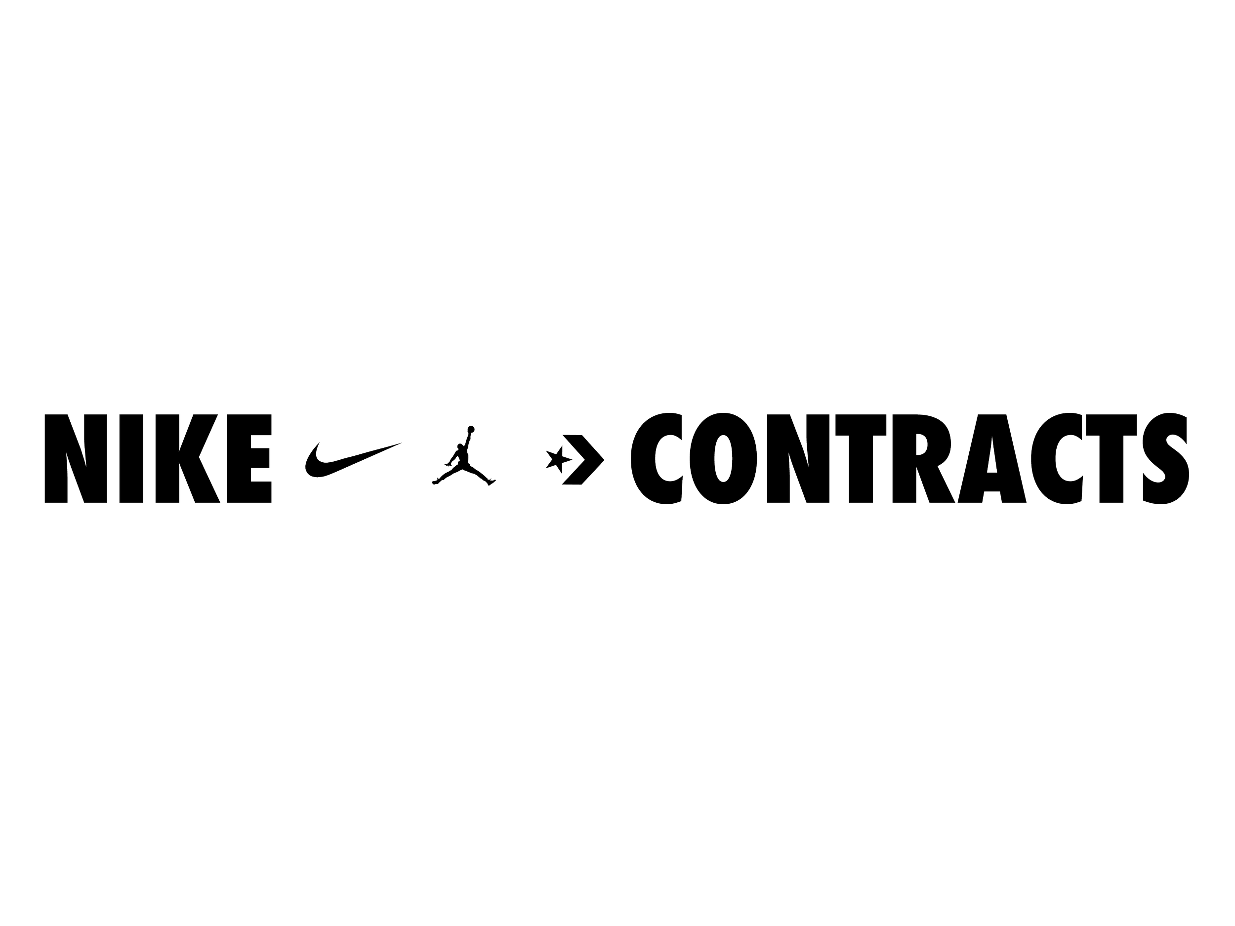
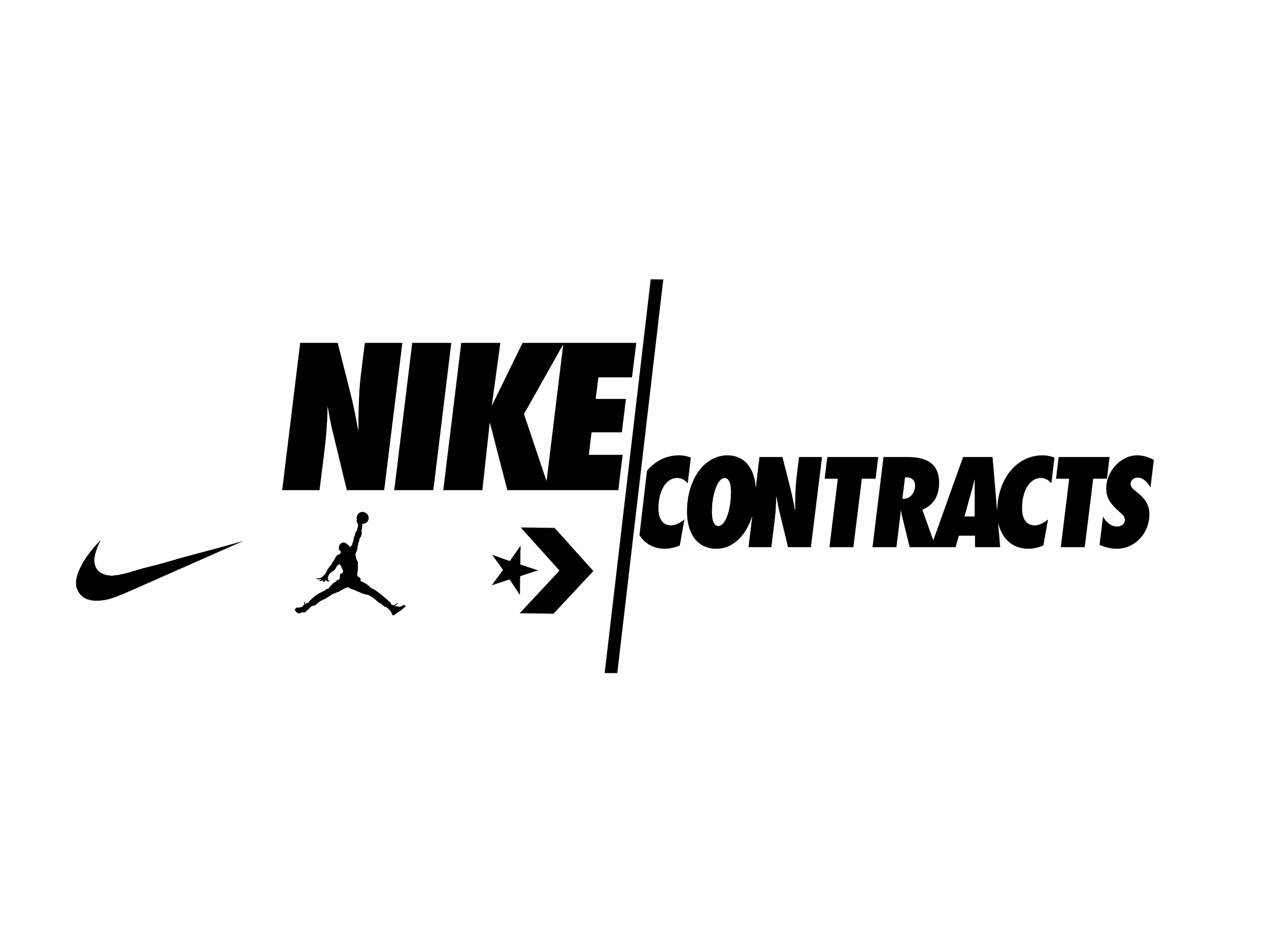
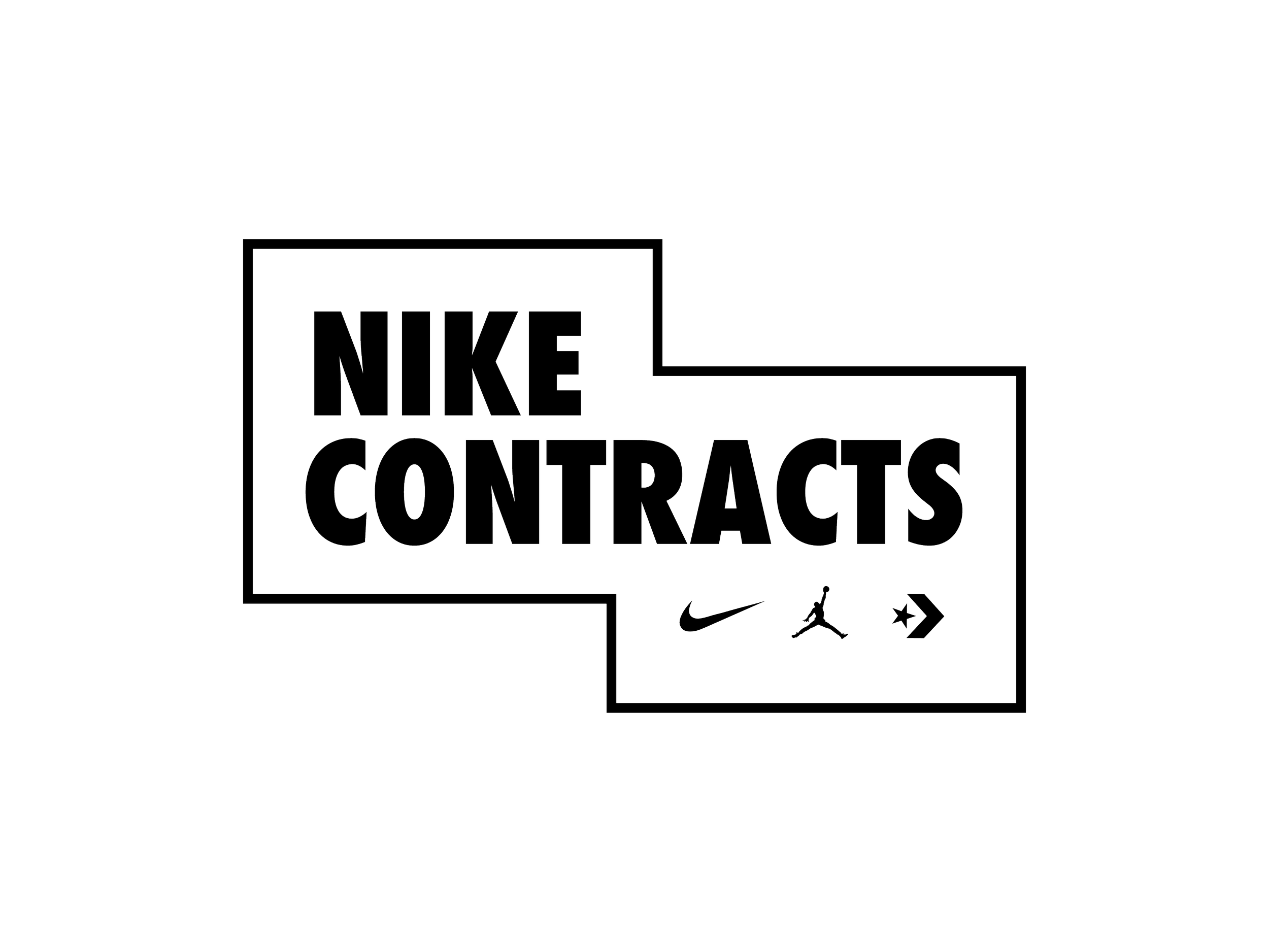
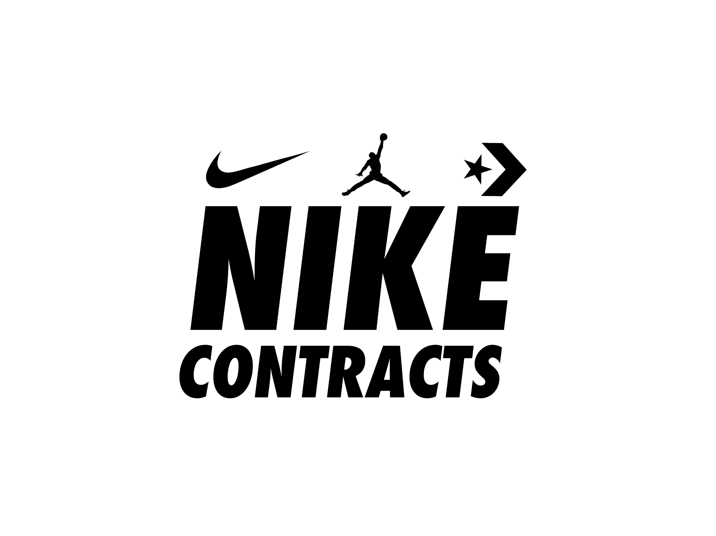
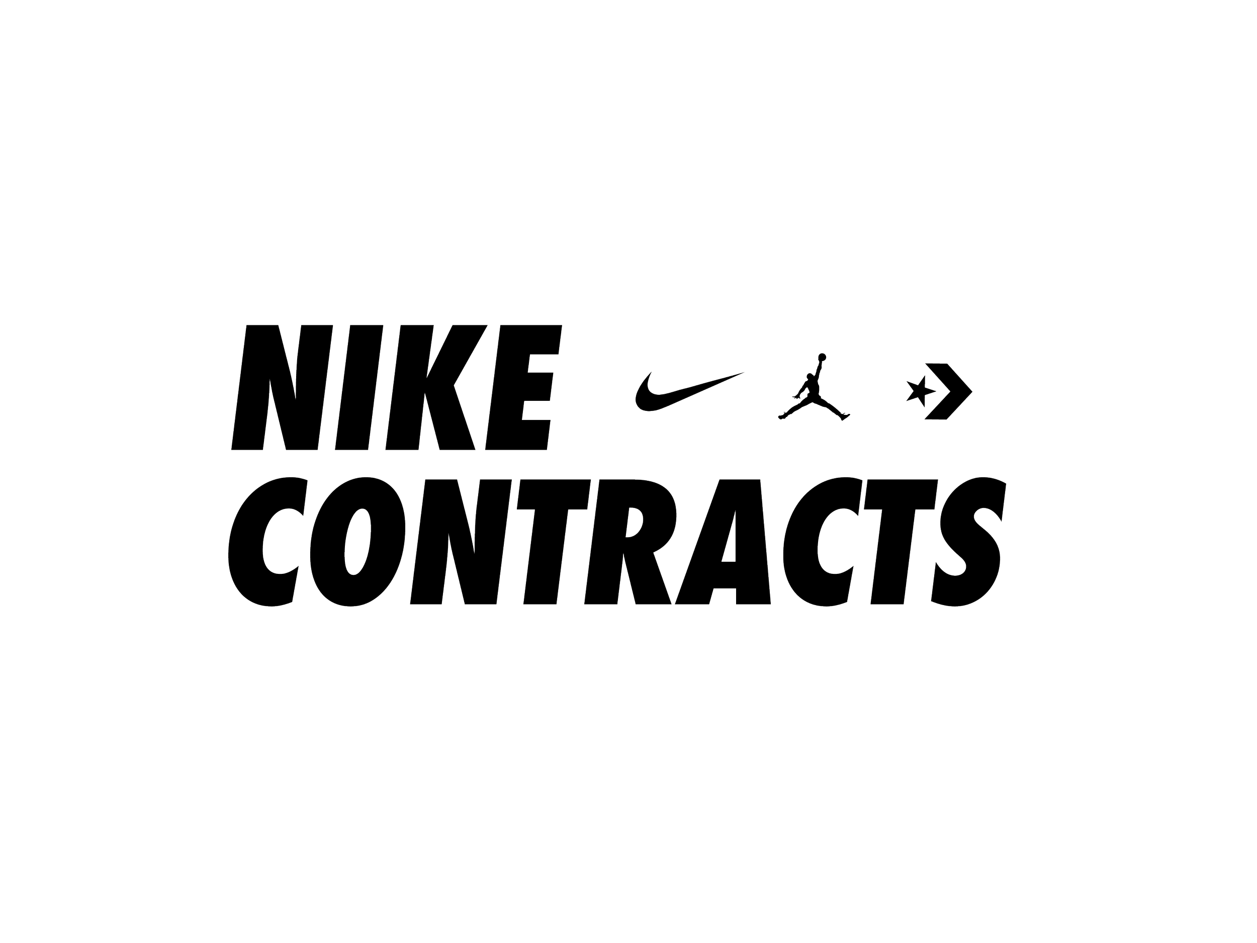
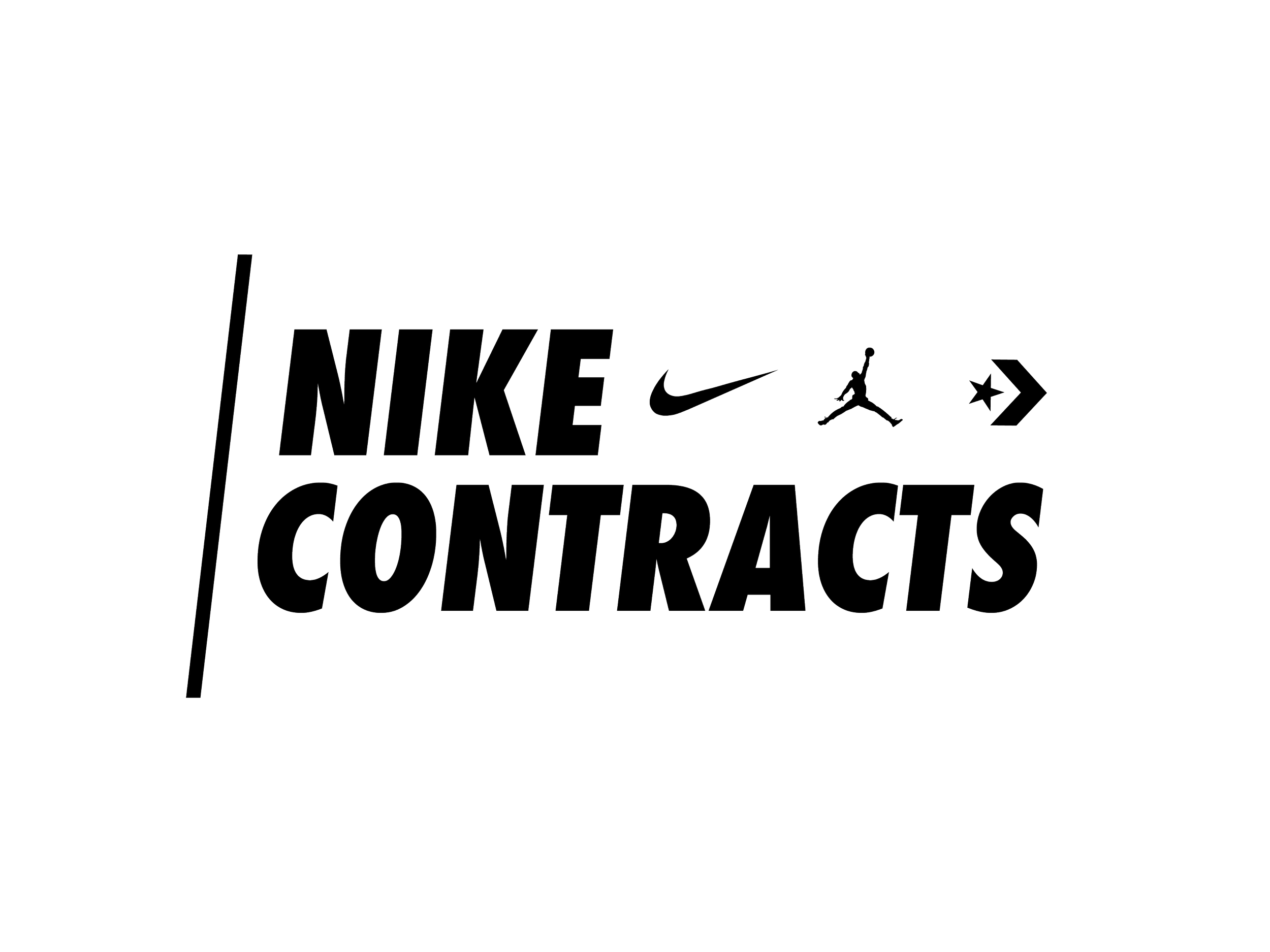
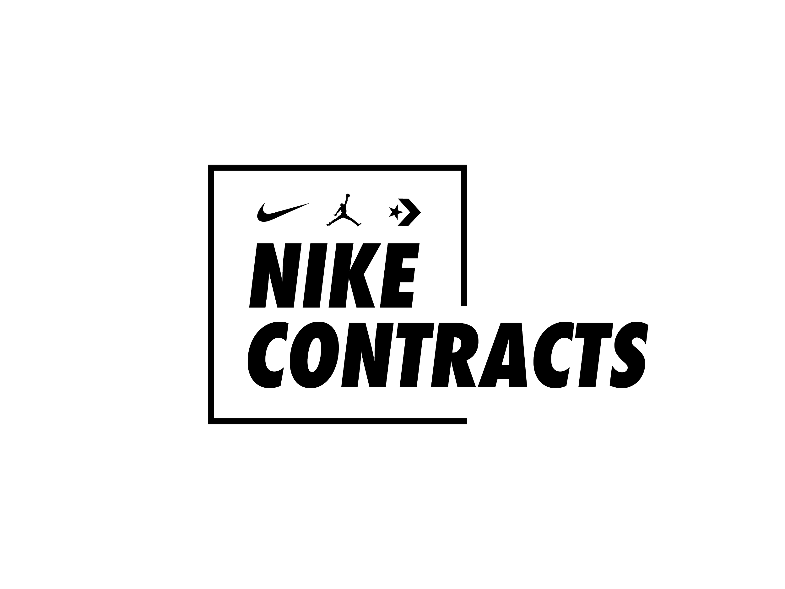
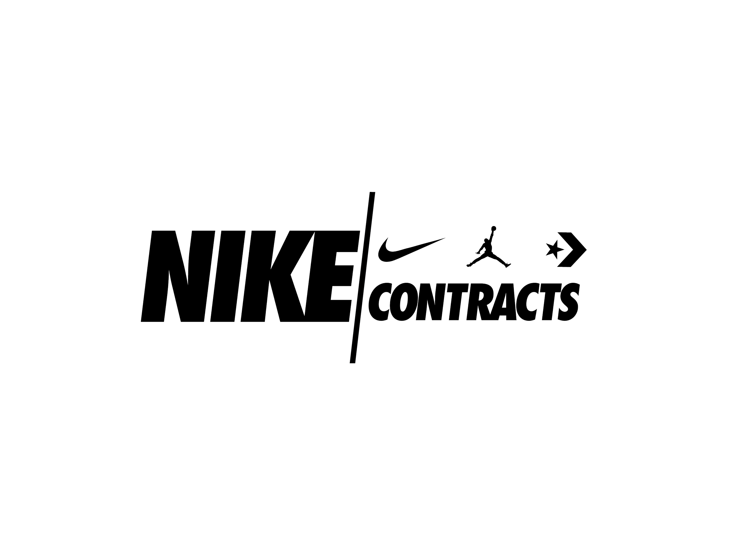
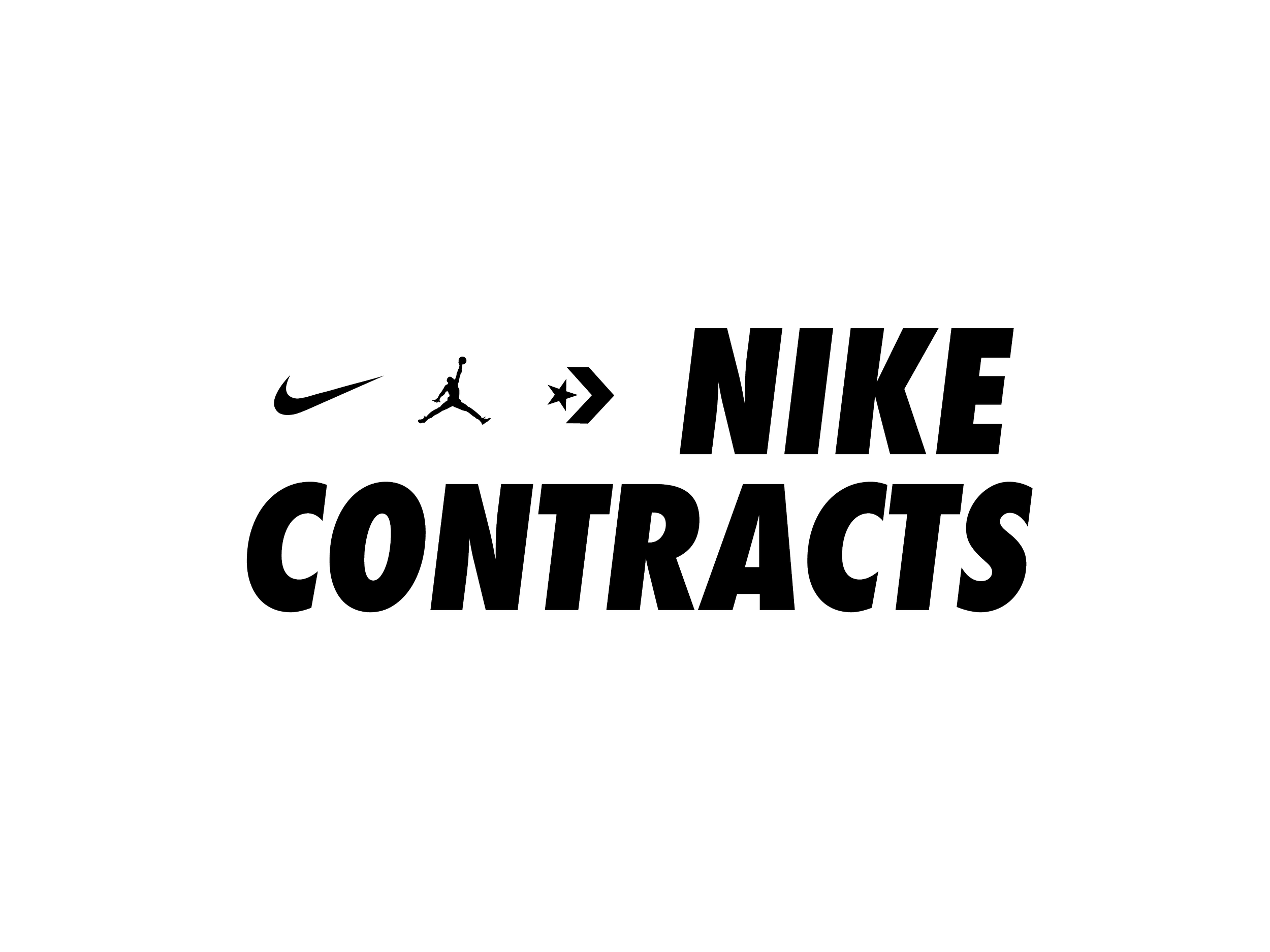
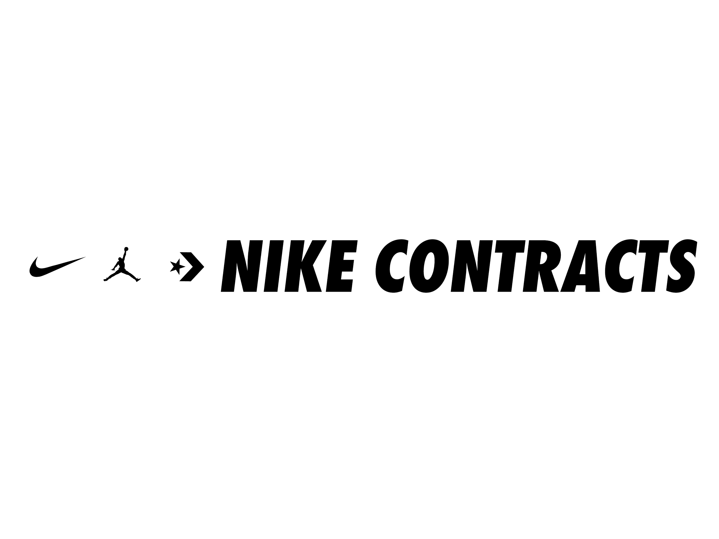
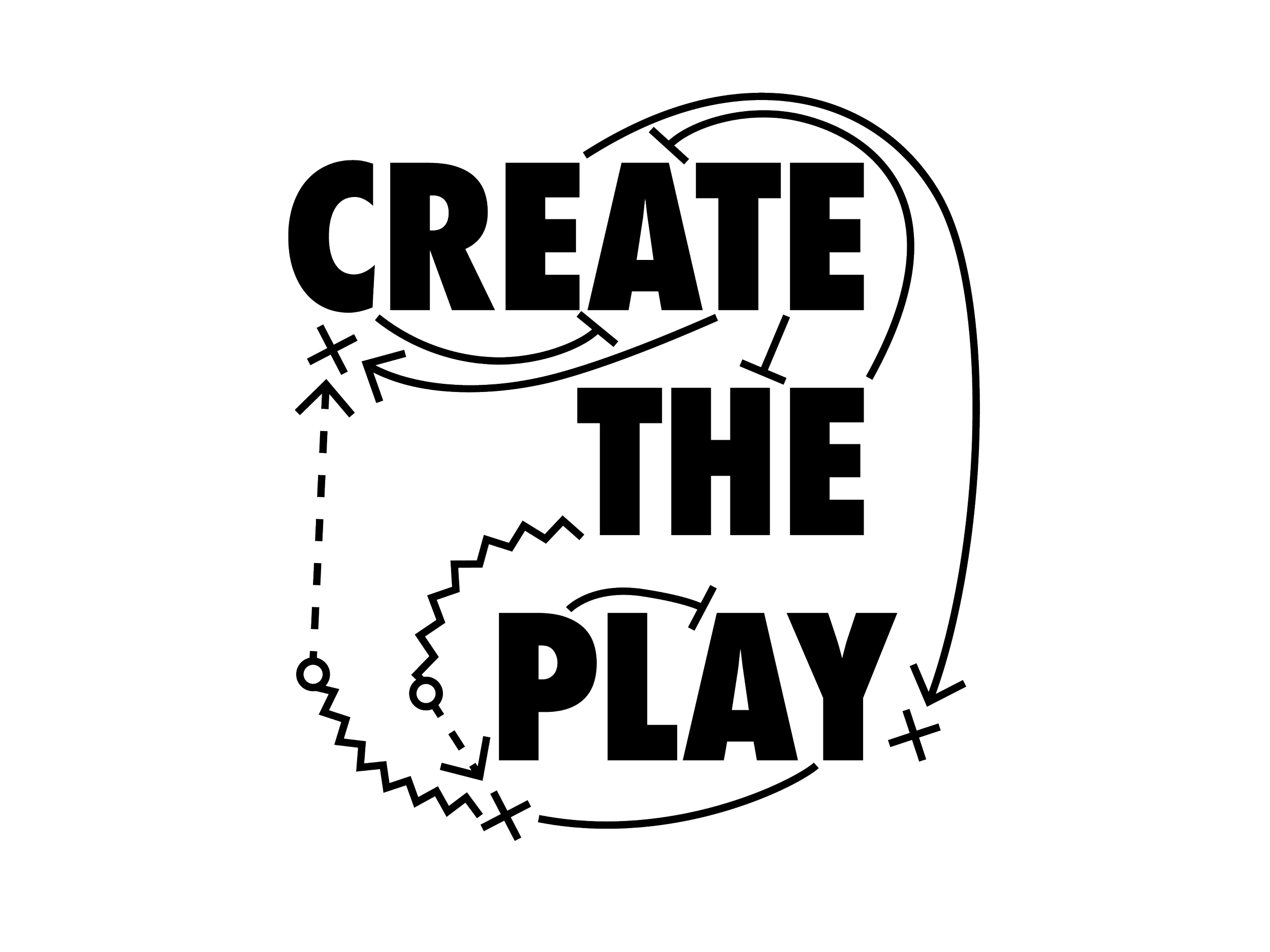
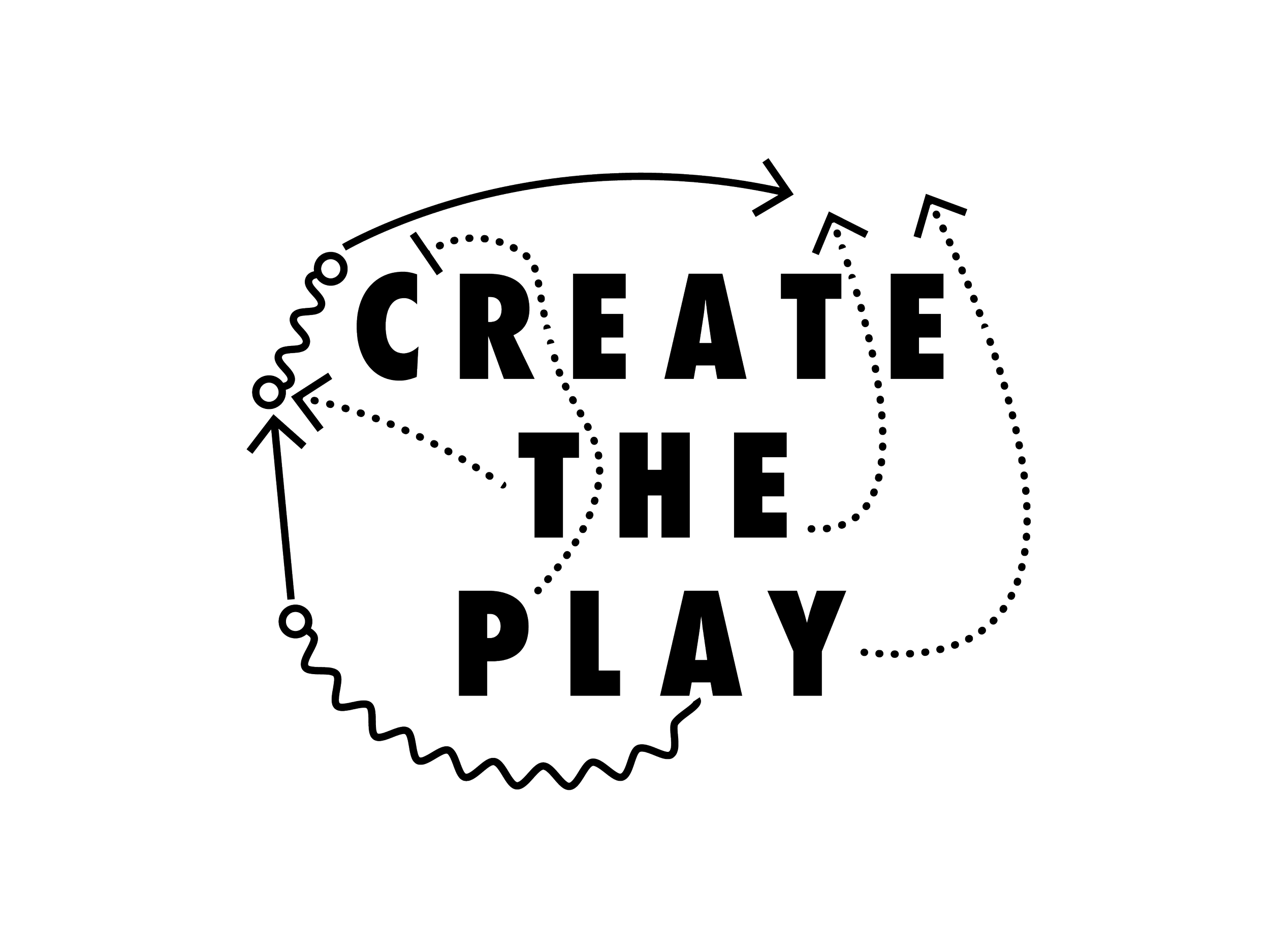
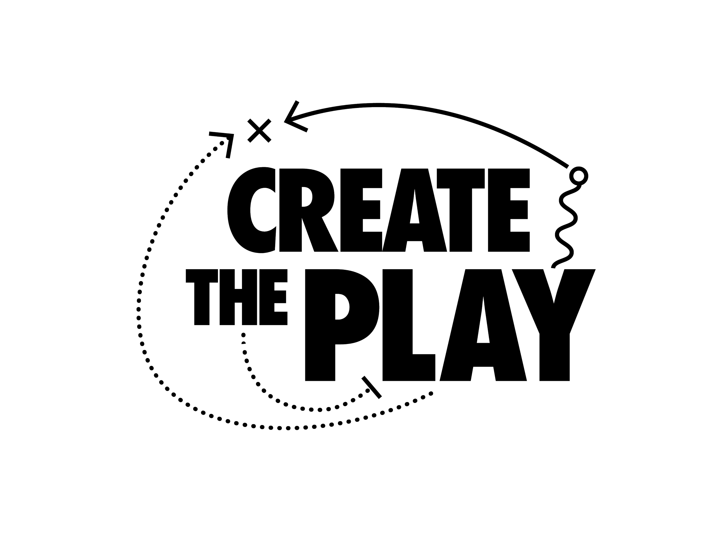
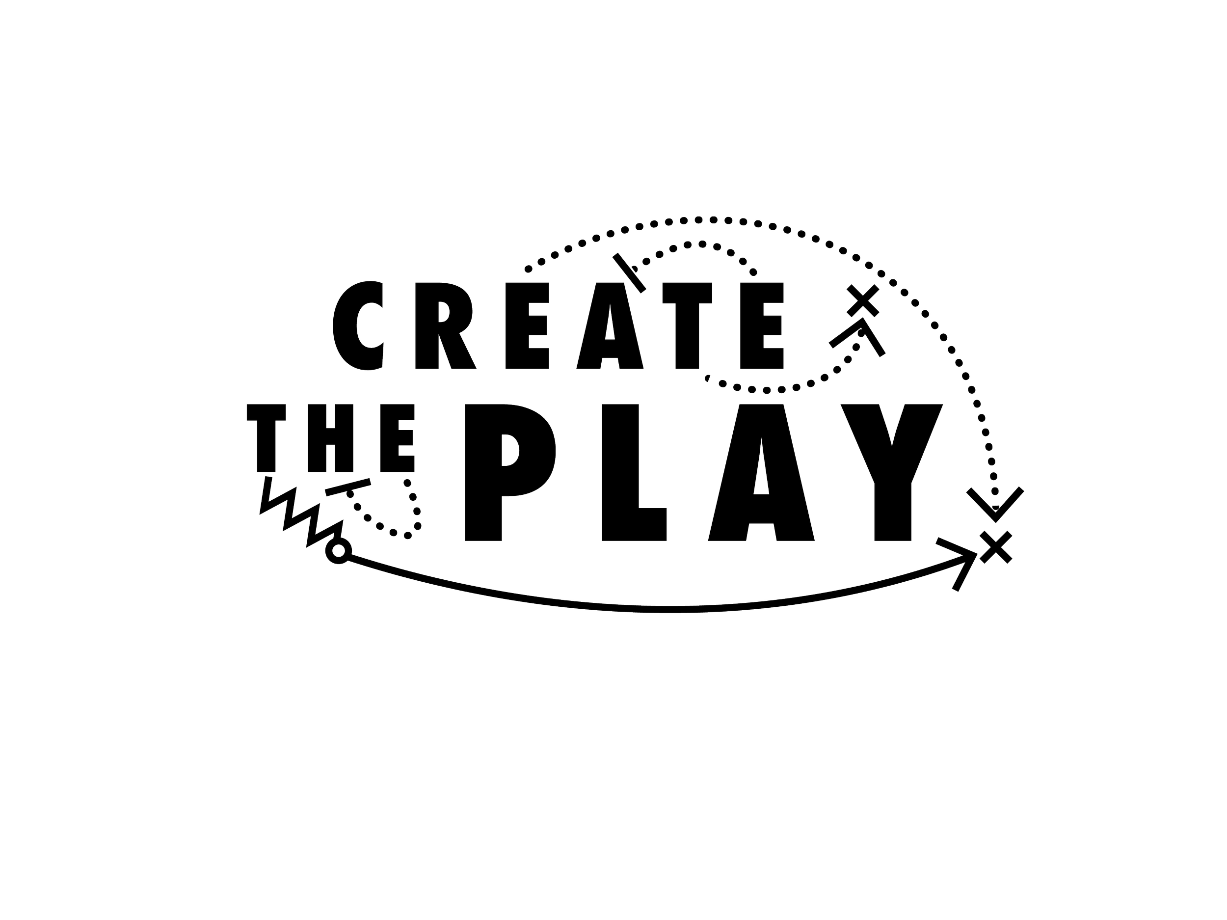
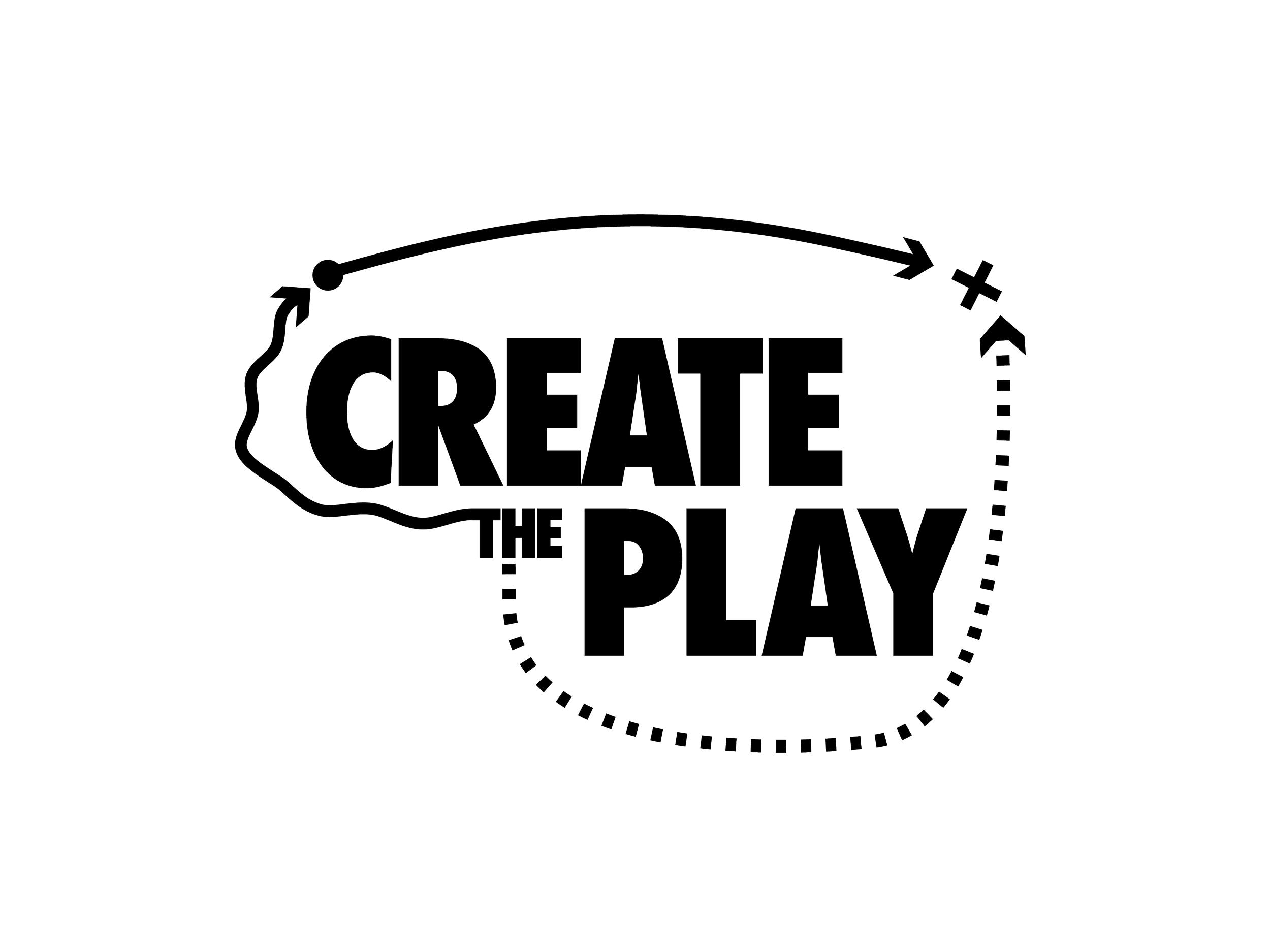
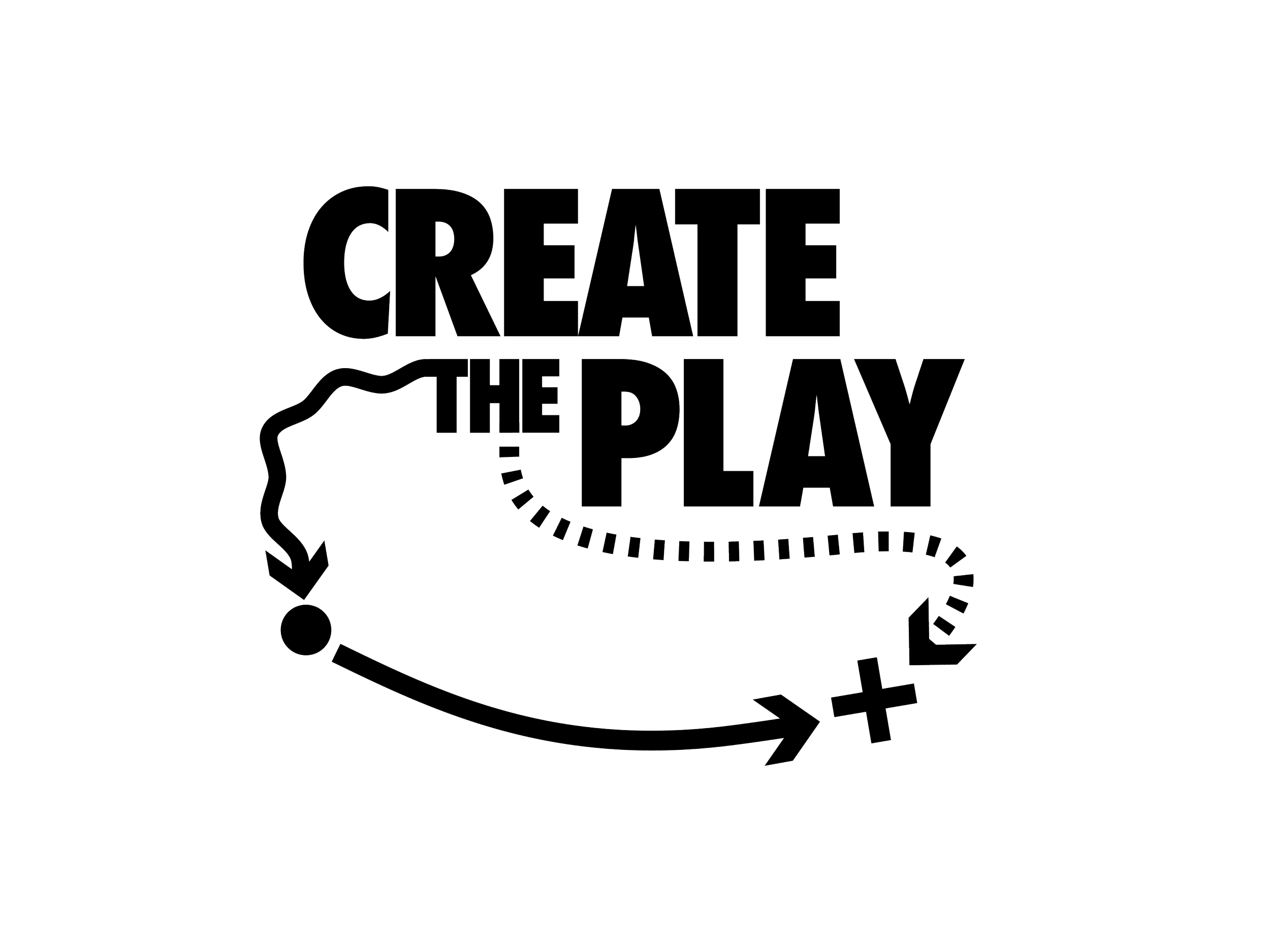
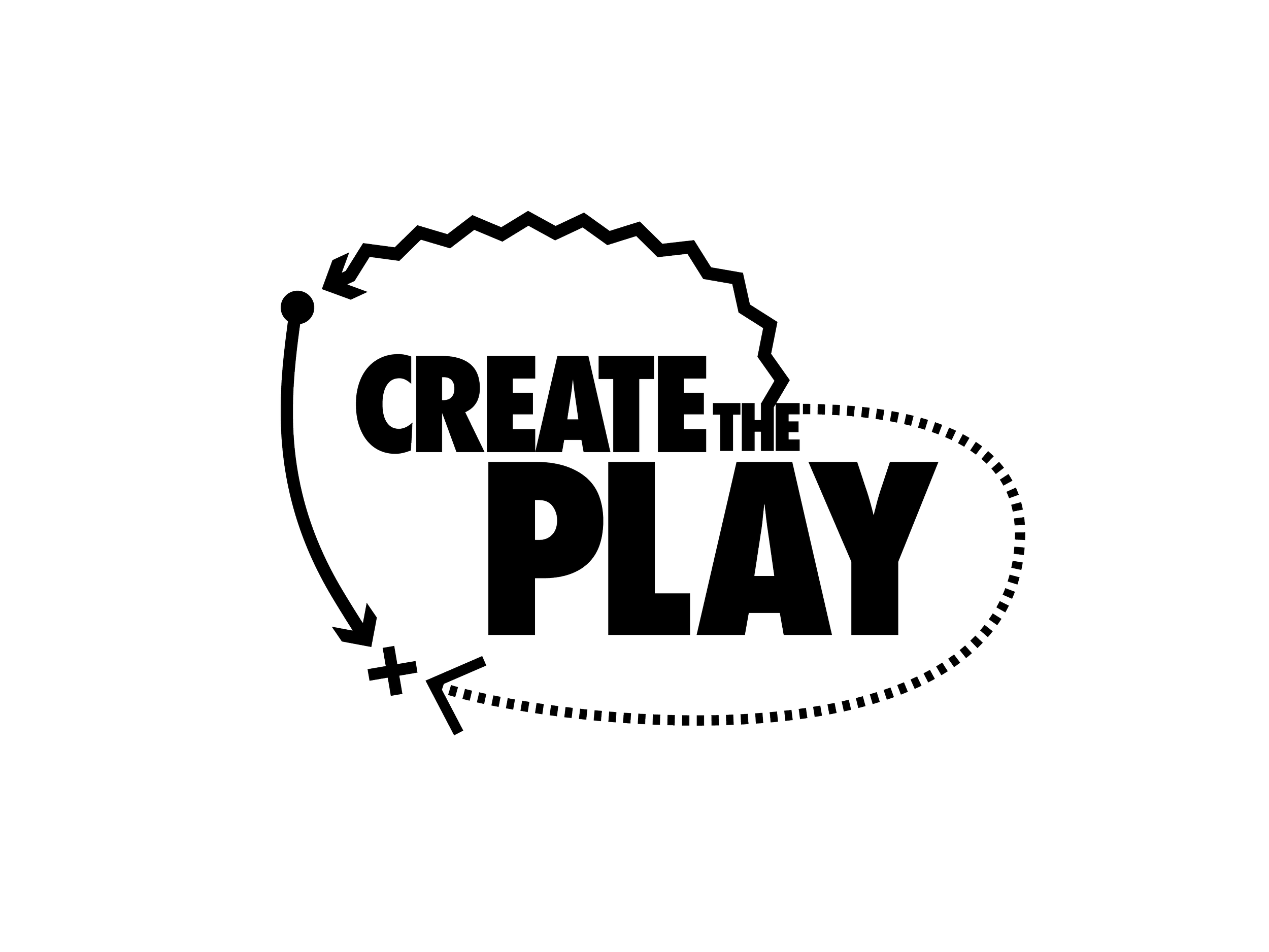
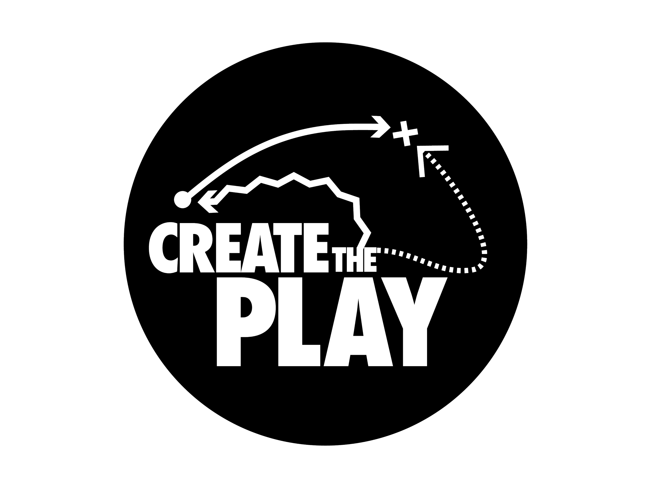
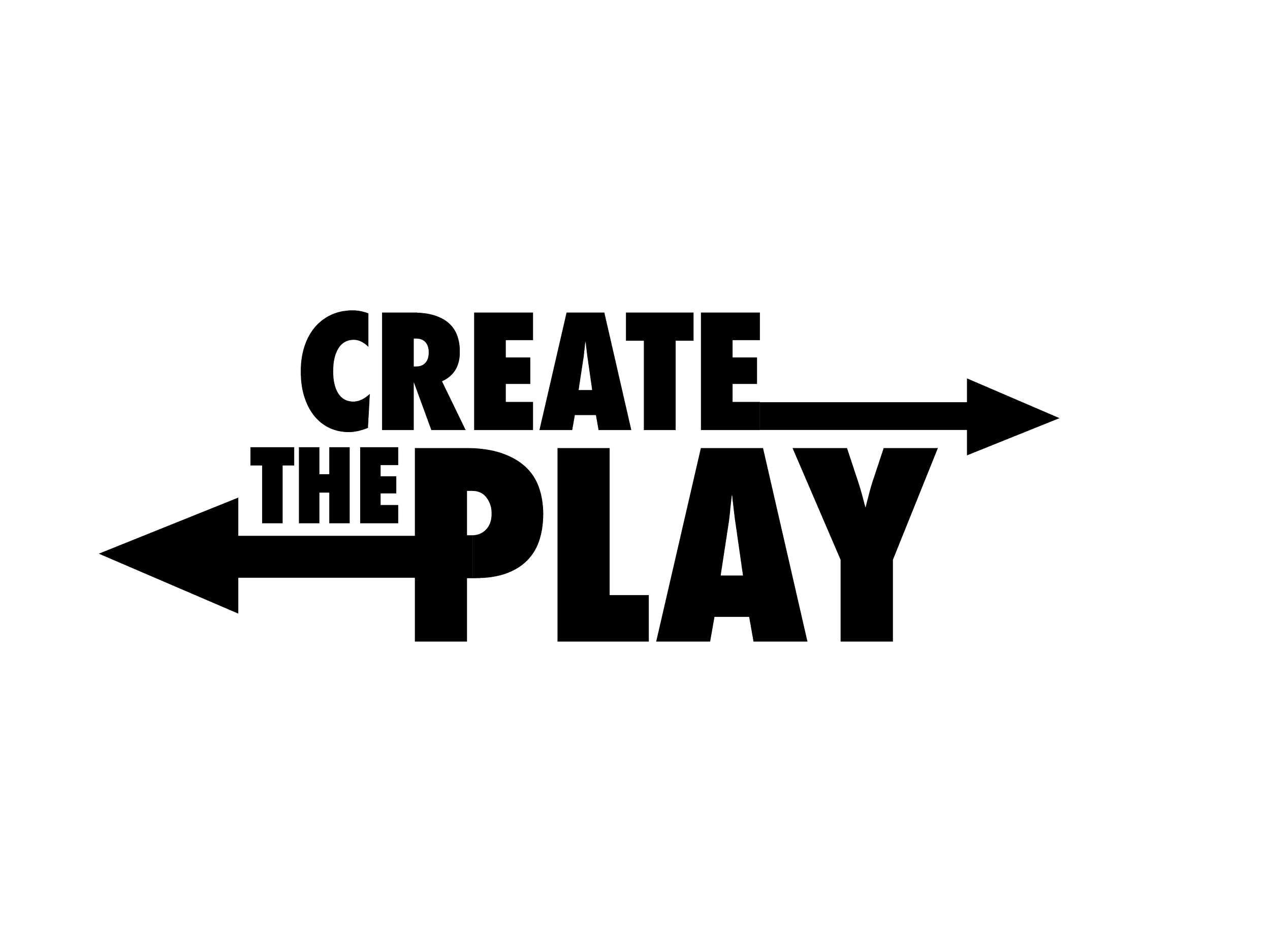
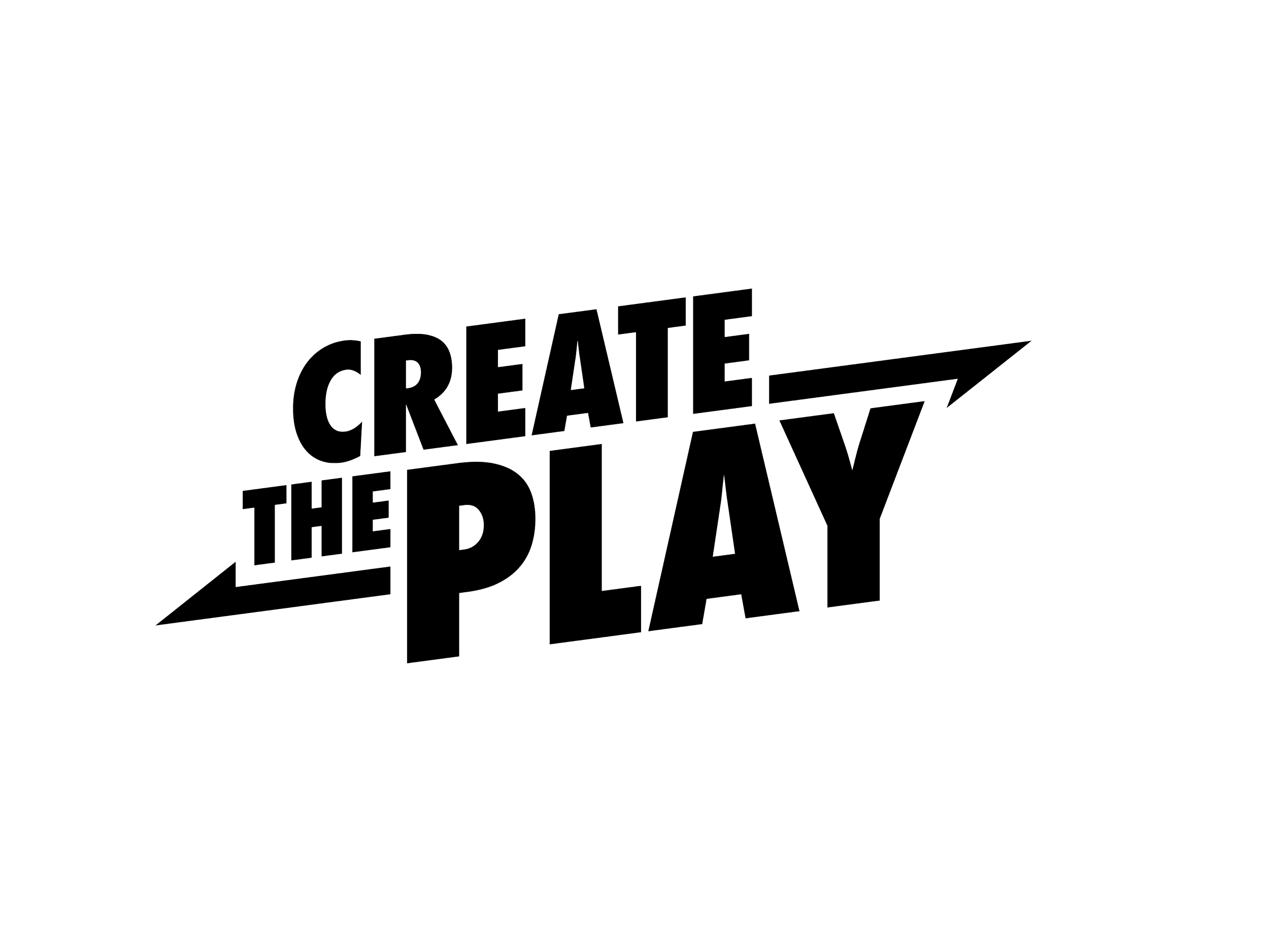
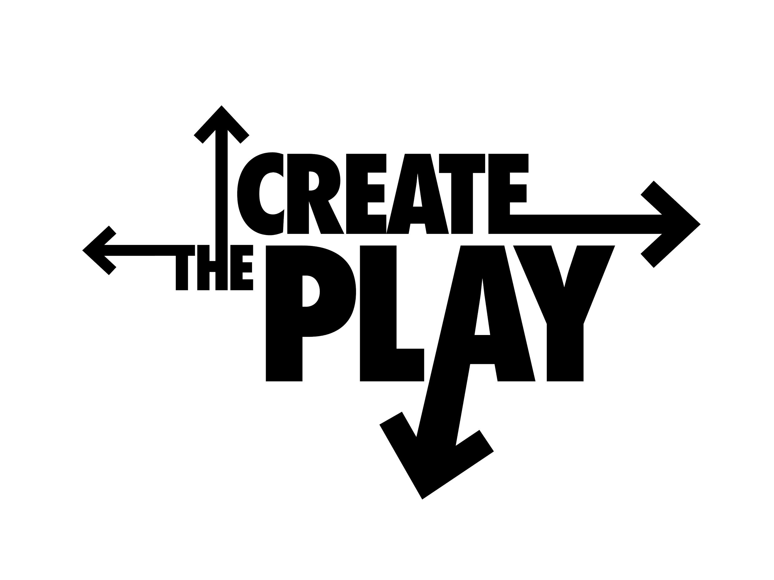
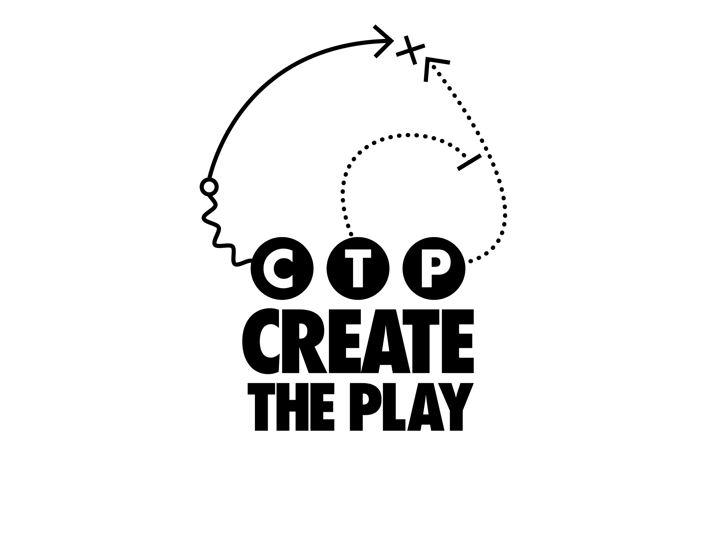
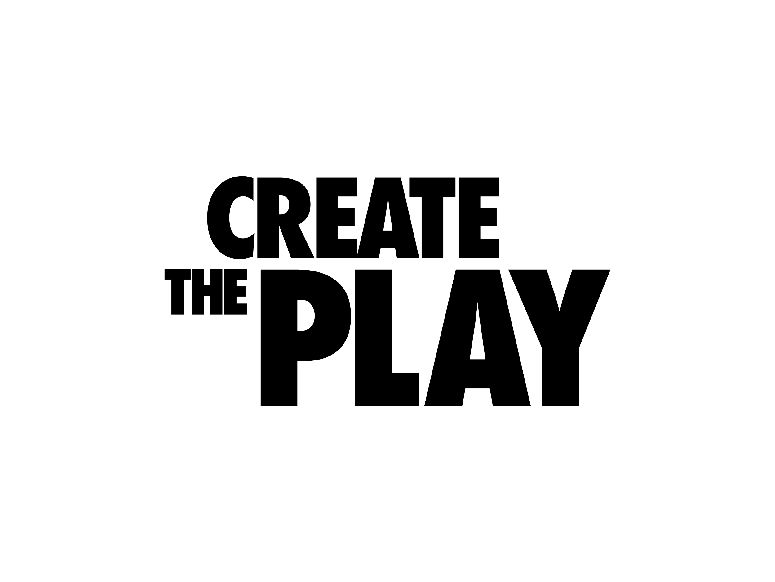
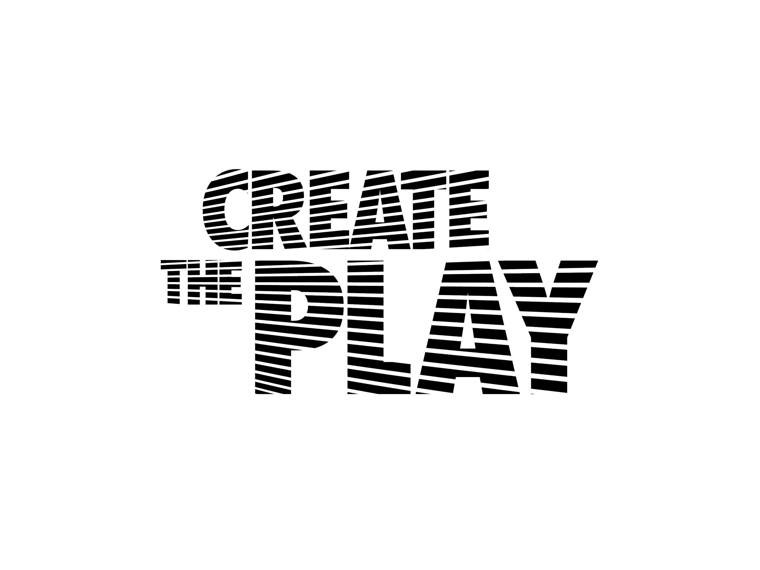
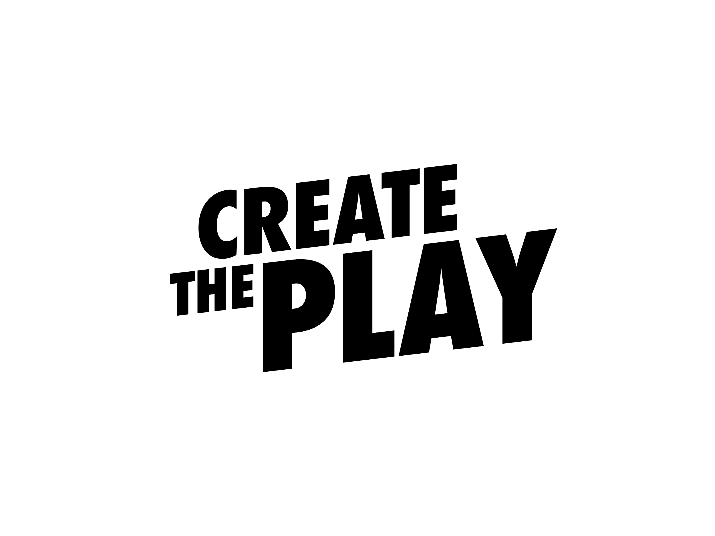
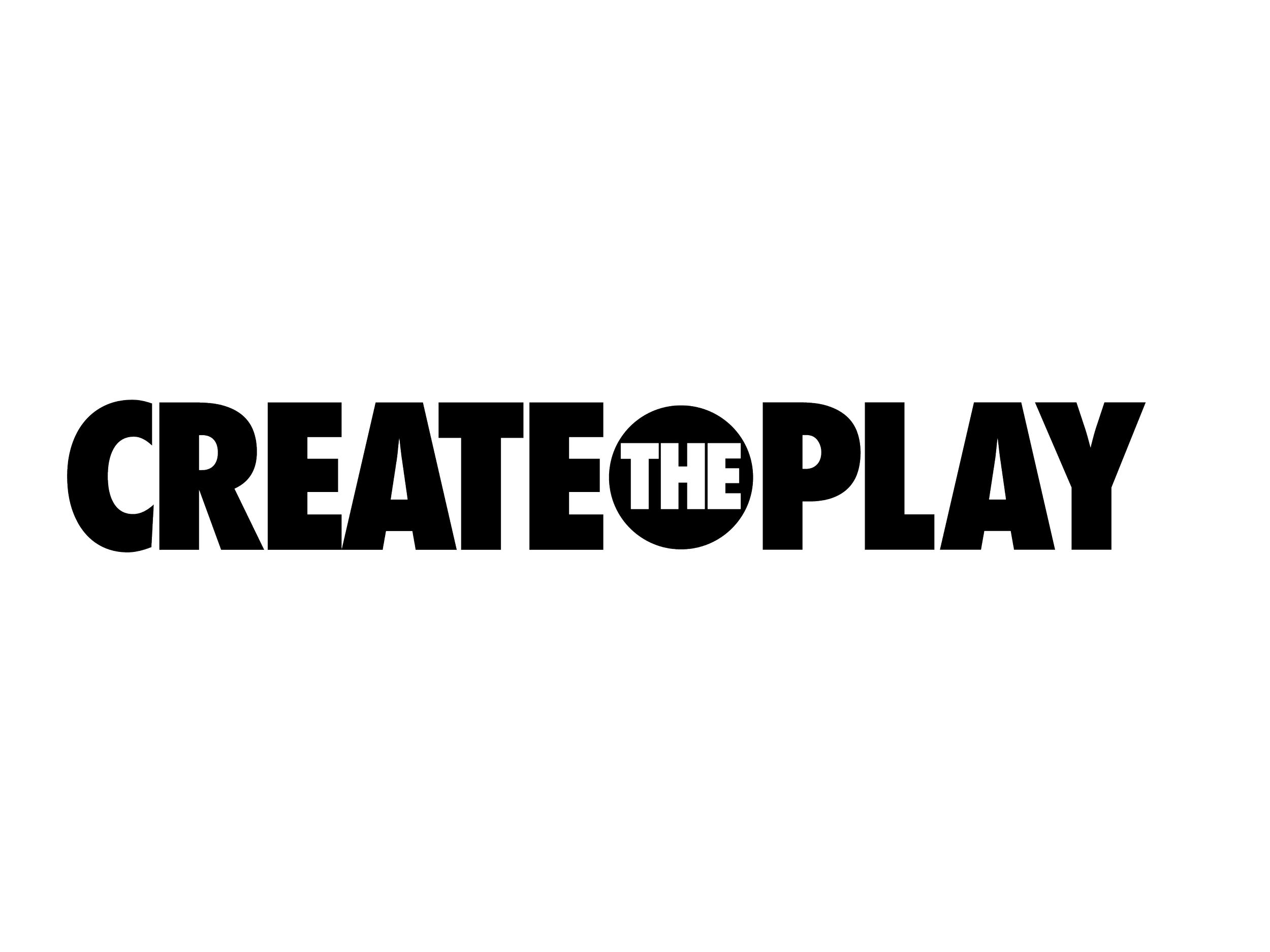
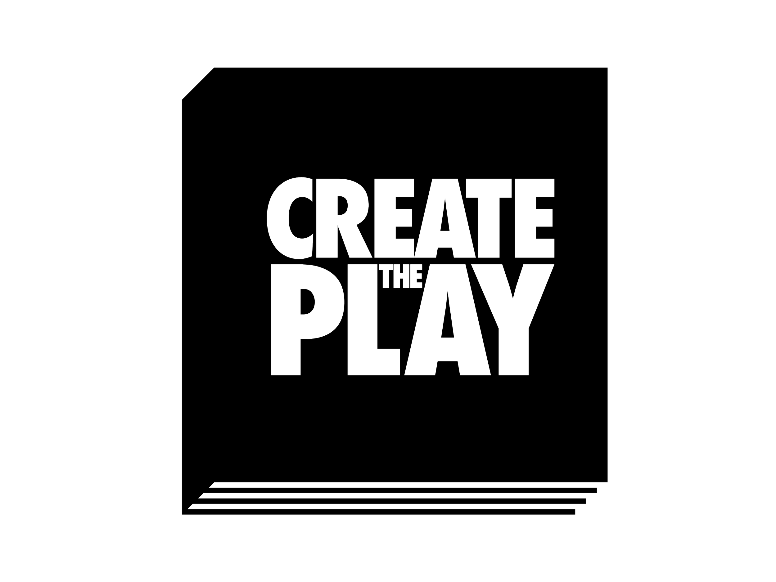
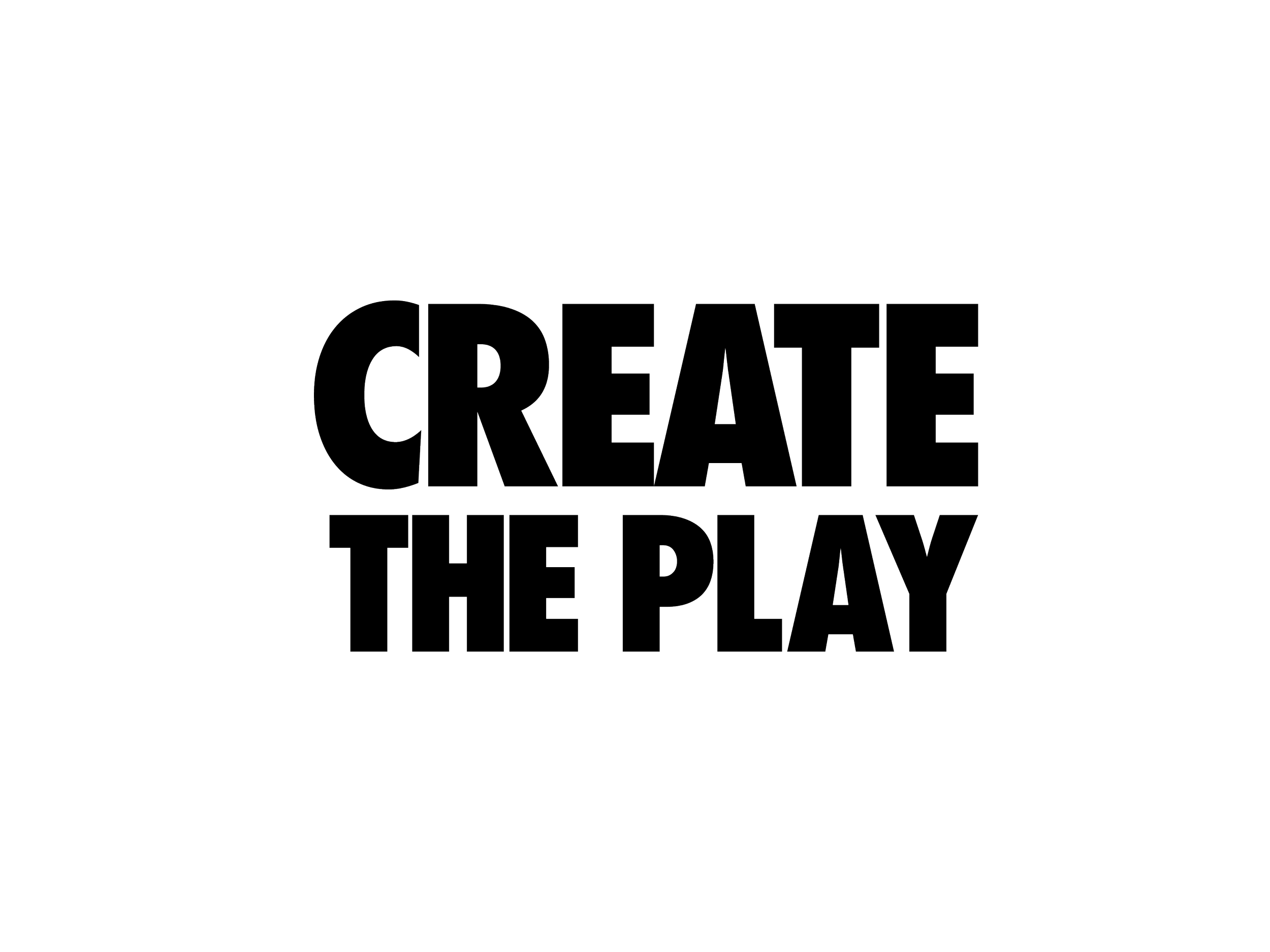
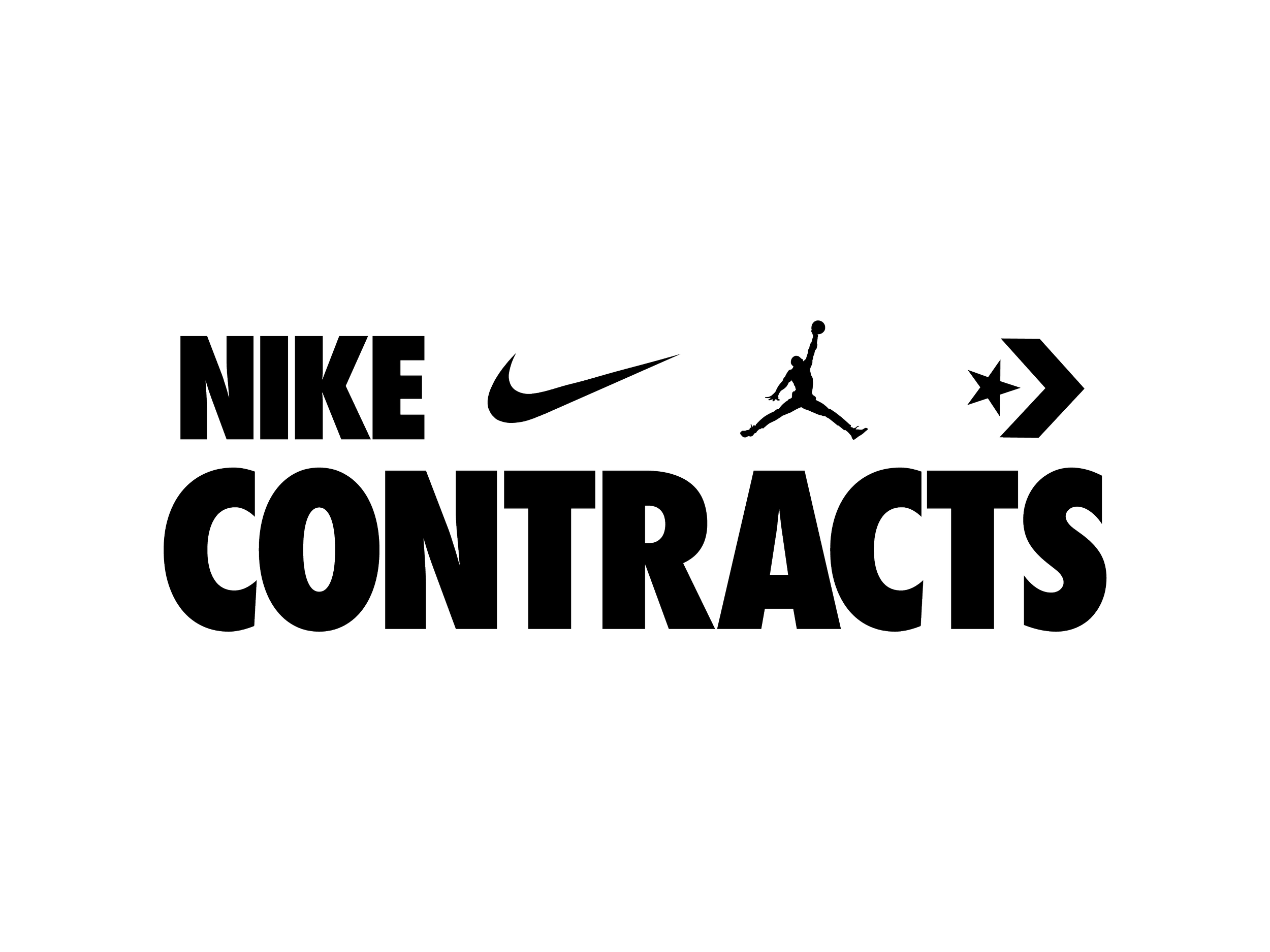
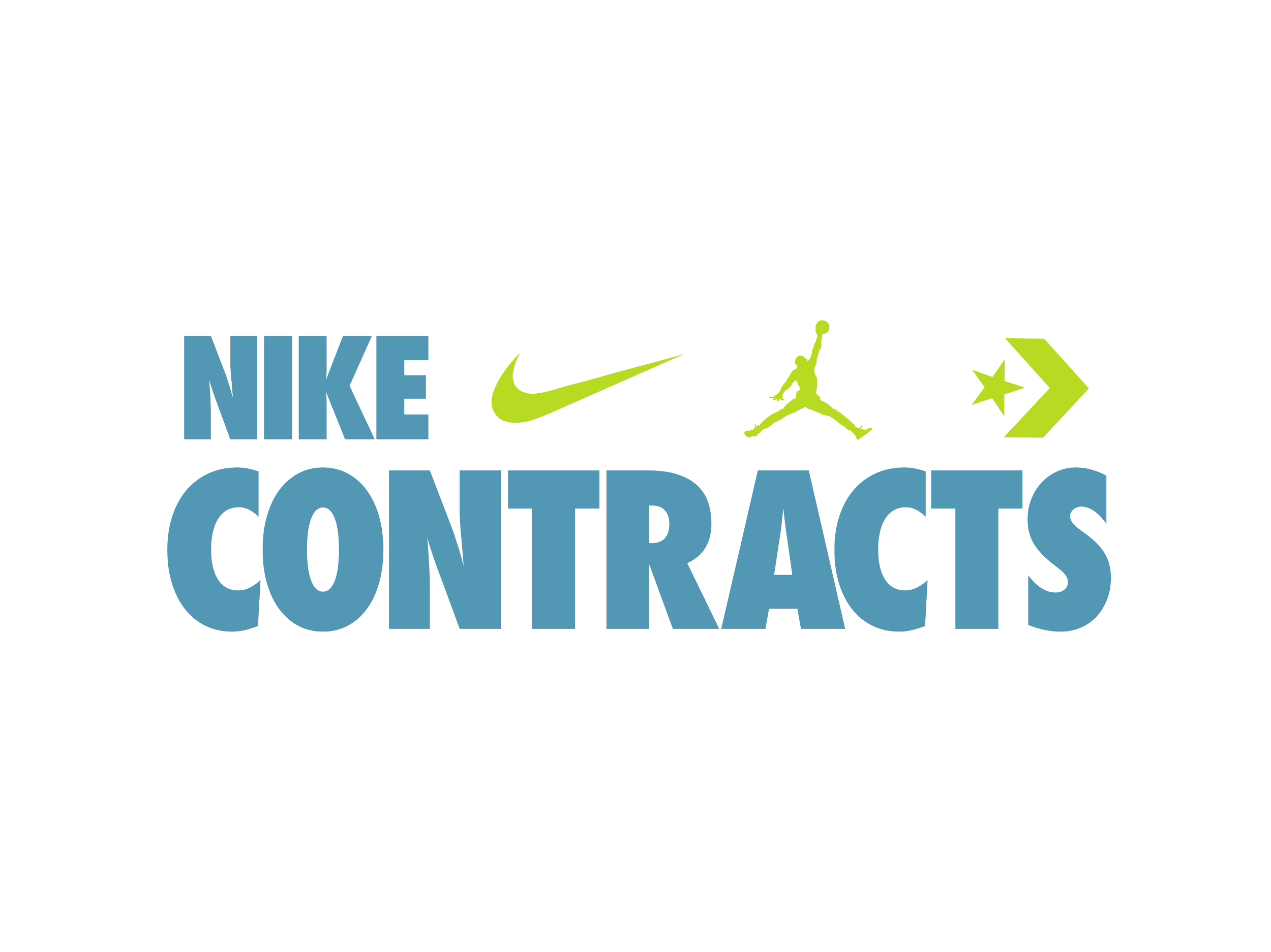
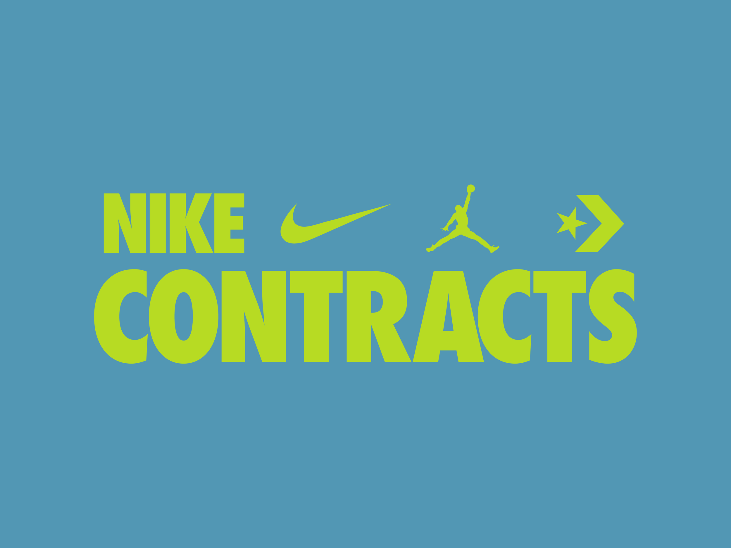
Opus was first tasked with creating a Nike Contracts logo that would fit within the Overall Nike naming conventions. It also needed to incorporate the Swoosh, Jordan, & Chevron marks as well. Simultaneously we needed to create a Logo lockup for the Create The Play campaign, which was part of an overall push for Nike Contracts when they introduced the new internal branding. The client wanted to implement a soccer theme to the Create The Play mark for more global appeal.
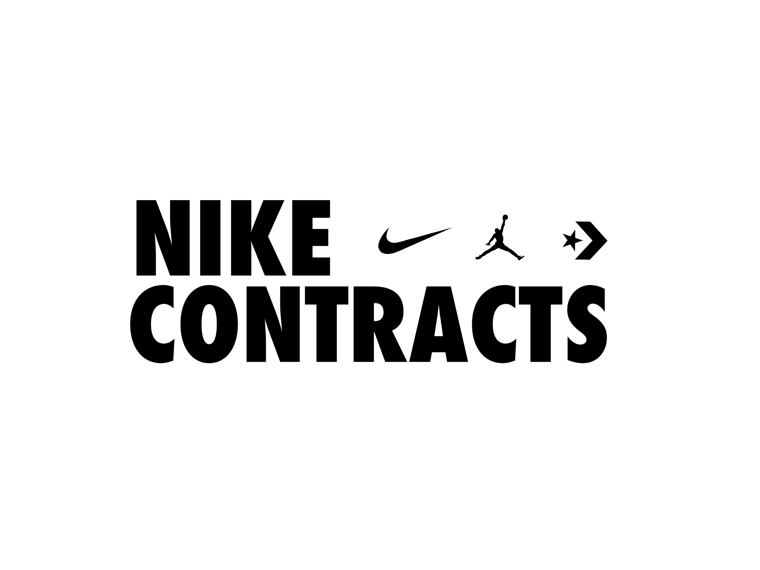
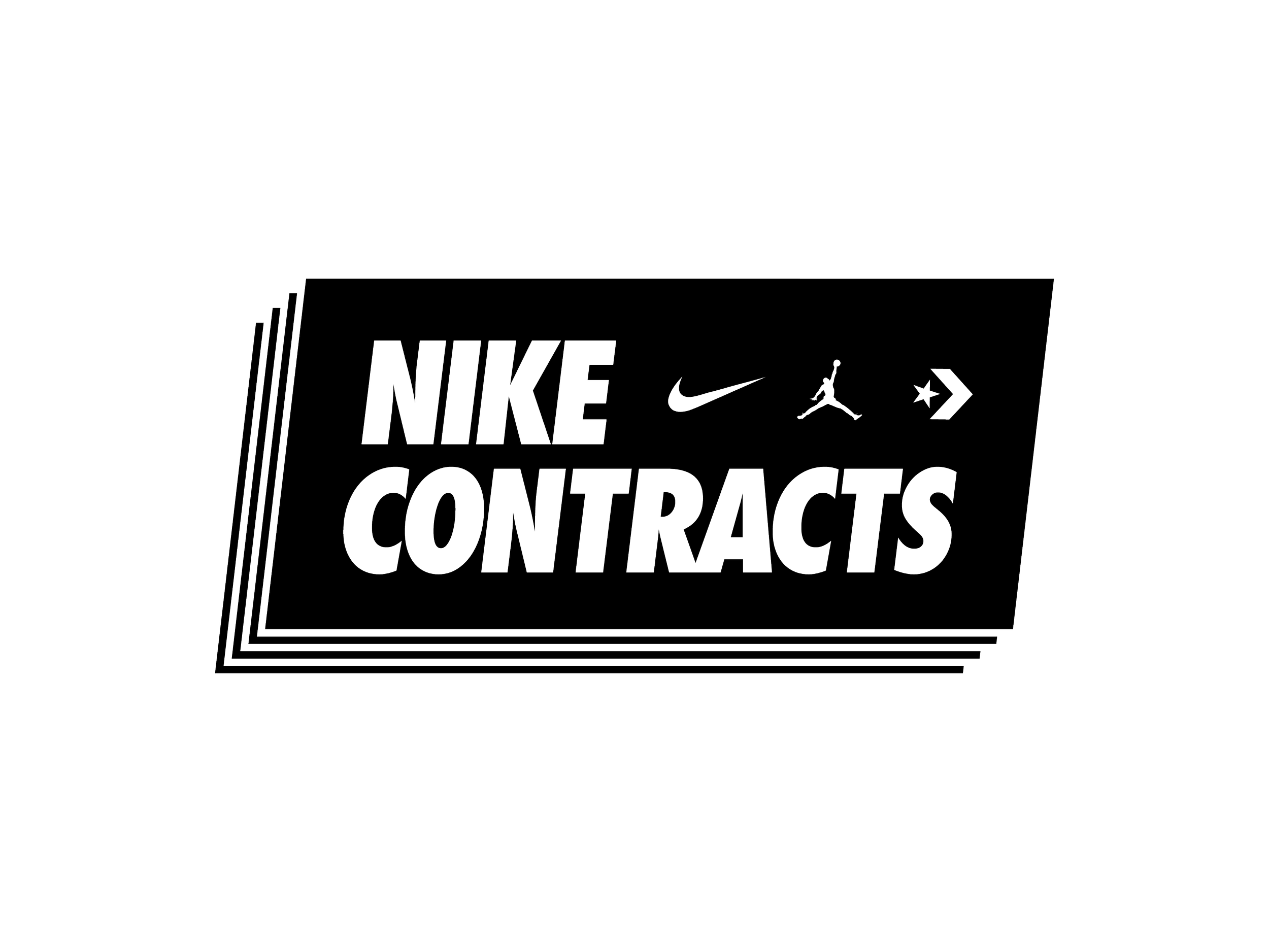
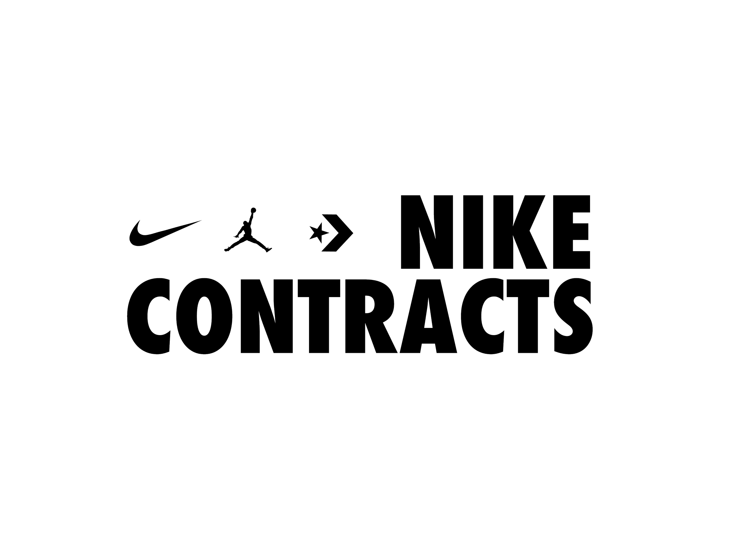
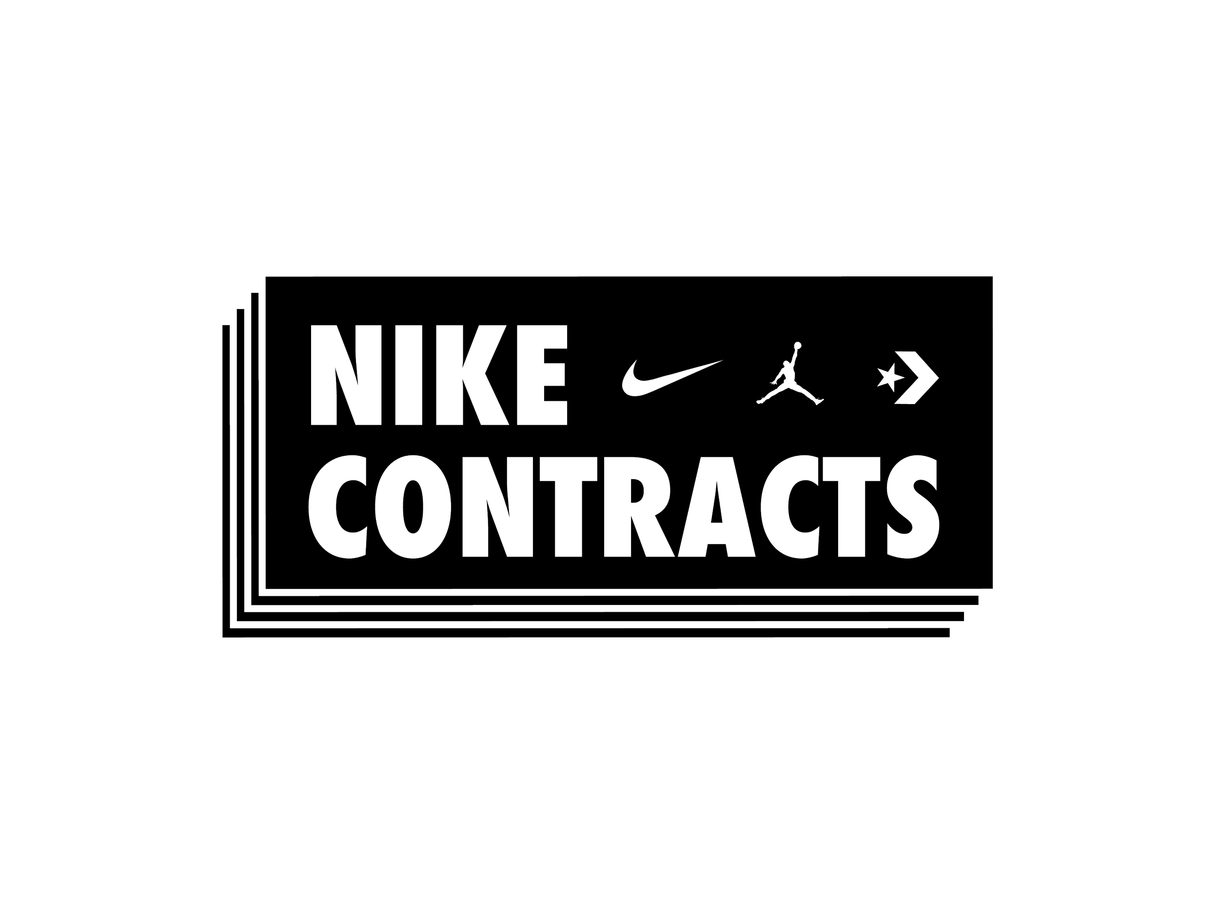
Logo Suite
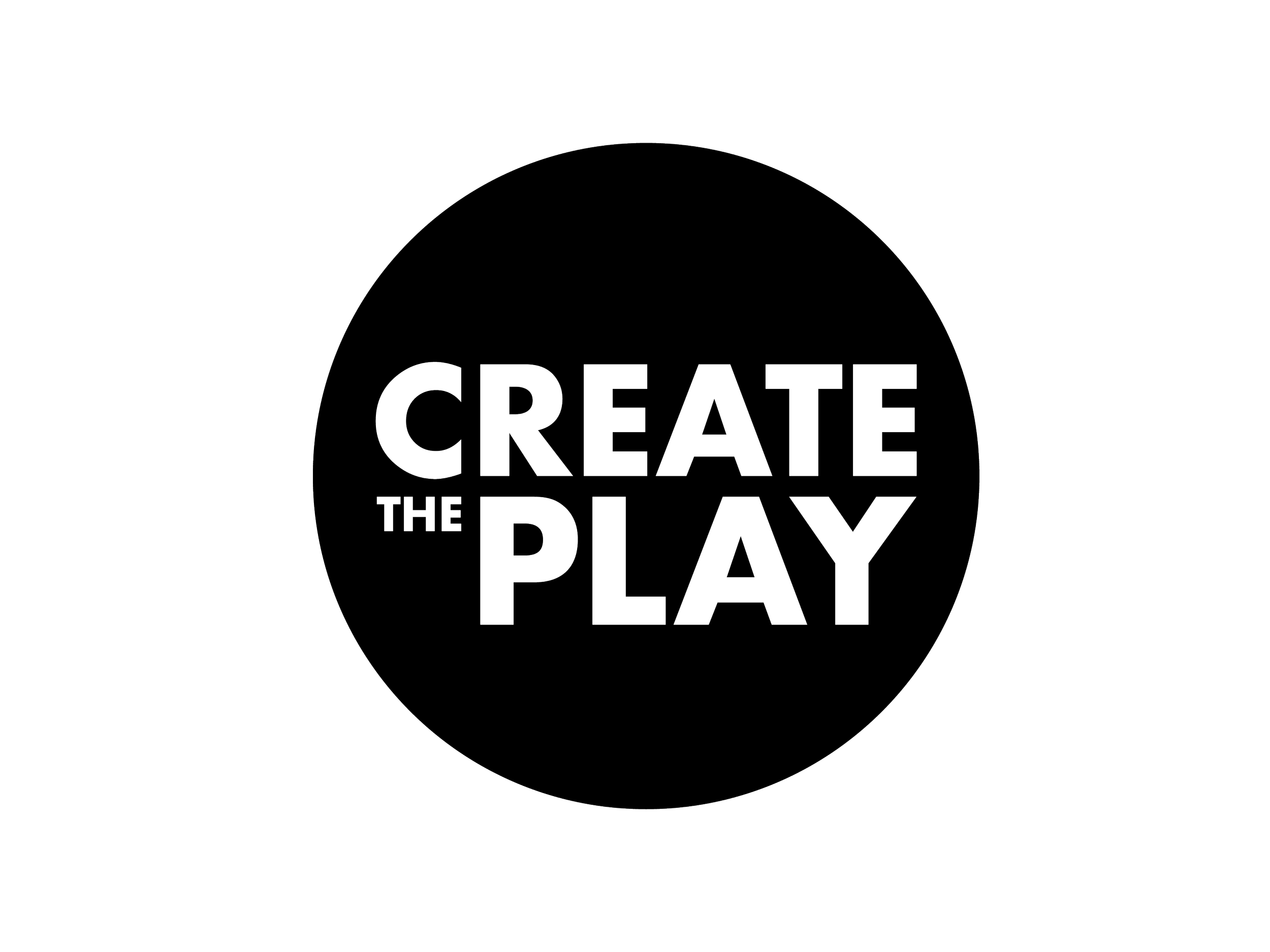
Technically this wasn’t the final suite of logos as the client asked for more variations. But this is the how the logos worked as separate marks and locked-up together.

Contract Green
R=183, G=219, B=35
HEX #b7db23

Contract Black
R=35, G=31, B=32
HEX #231f20

Contract Sky
R=82, G=151, B=180
HEX # 5297b4


Design Elements
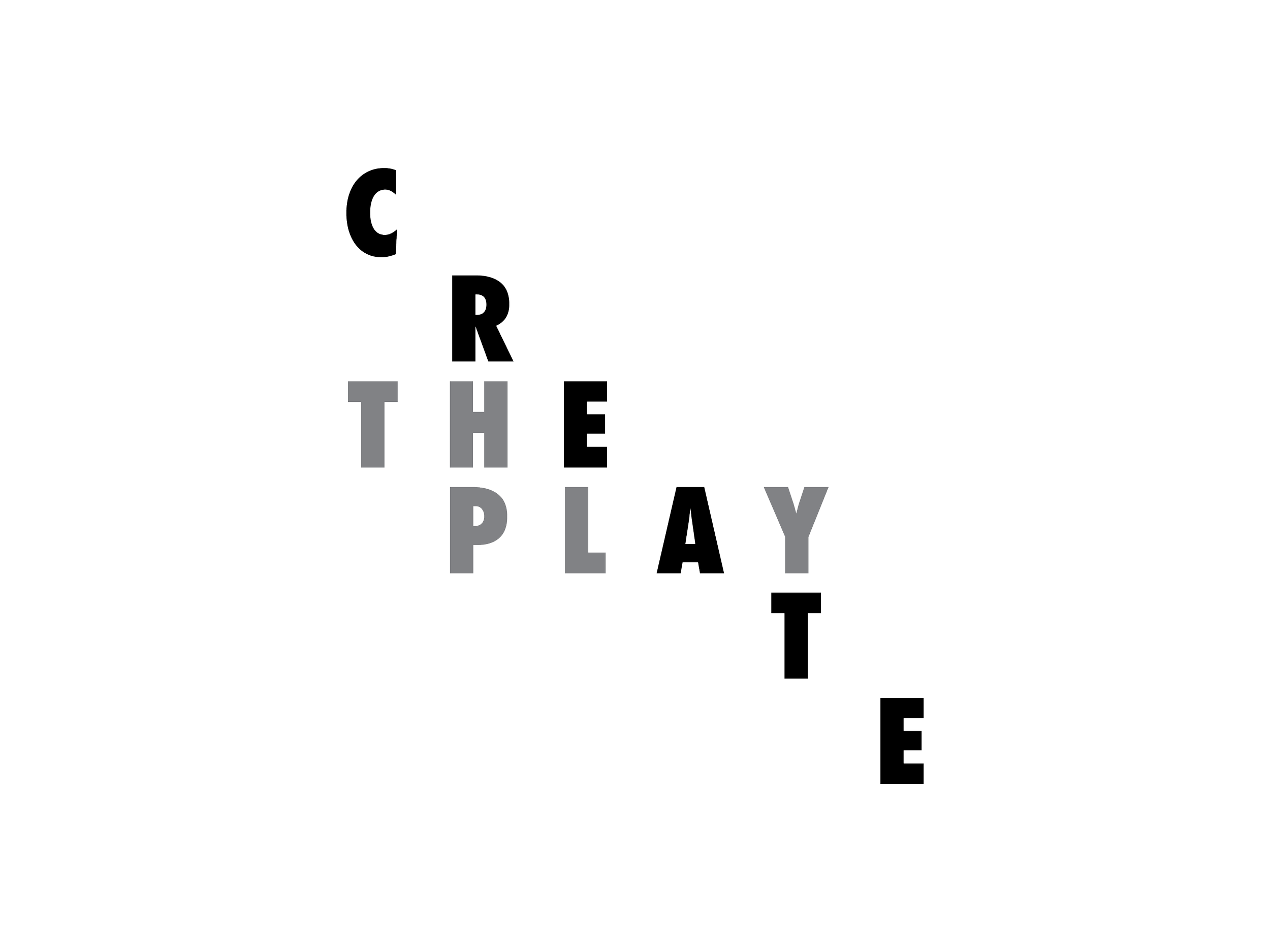
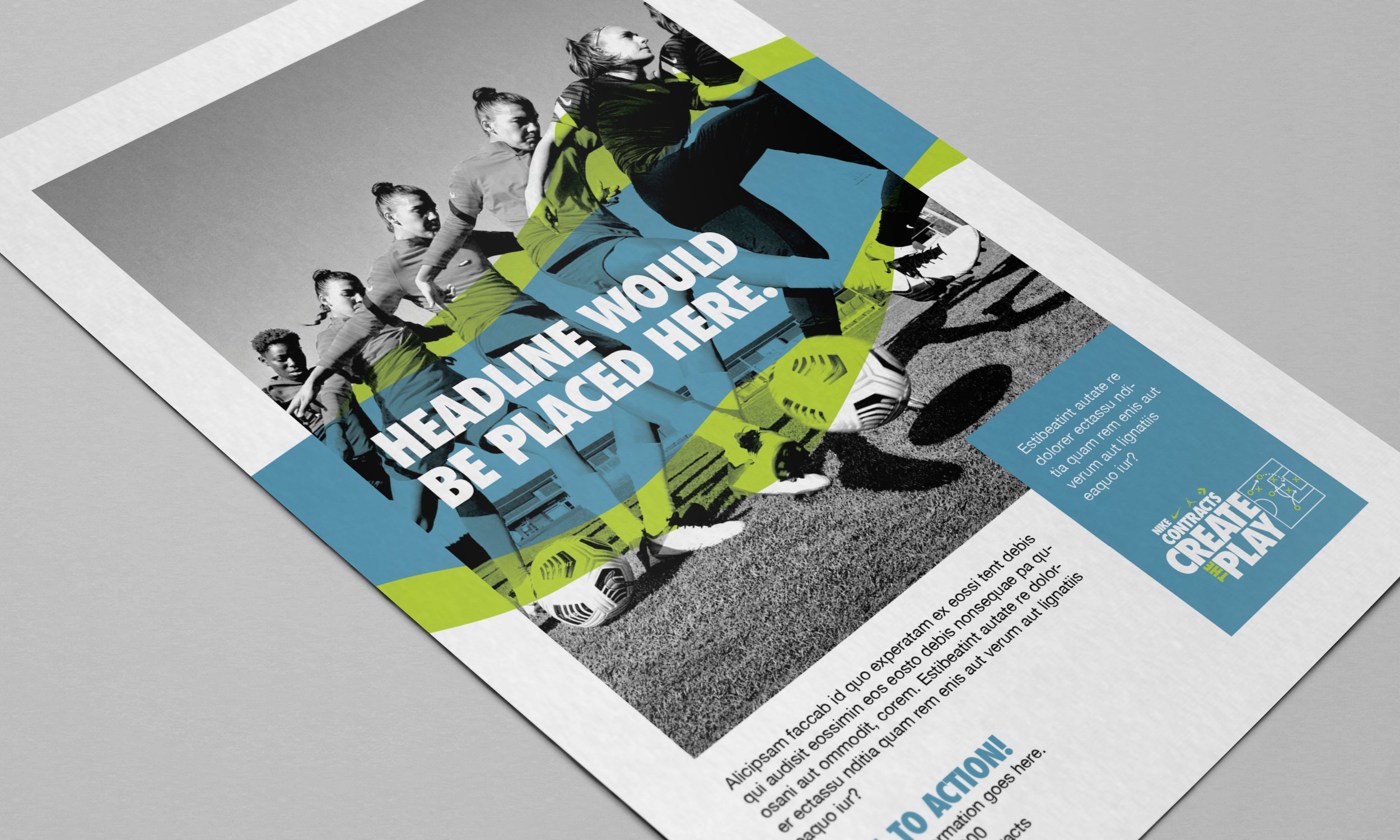
During our initial conversations the client stated that movement and flexibitly are key touchstones to what they wanted from the visual identity. After a few rounds we landed on these amorphous shapes, which can be manipulated and used as highlights with photography or in areas that need to call out text.


Photography
Nike Contracts wanted to communicated teamwork within the visual identity. Nike gave Opus access to their online database of assets and I found these team images. The movement of the team working on their skills aligned with the overall aesthetic we wanted. I converted the color photographs to high-contrast black and white images, which gives the Nike Contracts Division an ownable, stylized, and cohesive identity.

Examples
When updating a visual identity, no matter how small, there needs to be examples of what normal operating files could look like. Showing the client how the pieces fit within the puzzle. Since this is an internal Nike client, we weren’t spec'd to create brand guidelines but I did want to give them examples of how to implement the design elements. I also created some email templates, presentation templates, and common Microsoft documents for immediate use.