Functionally Formed
A Close Inspection of Sean Raders' Mental State
Graphic Collage & Tag design
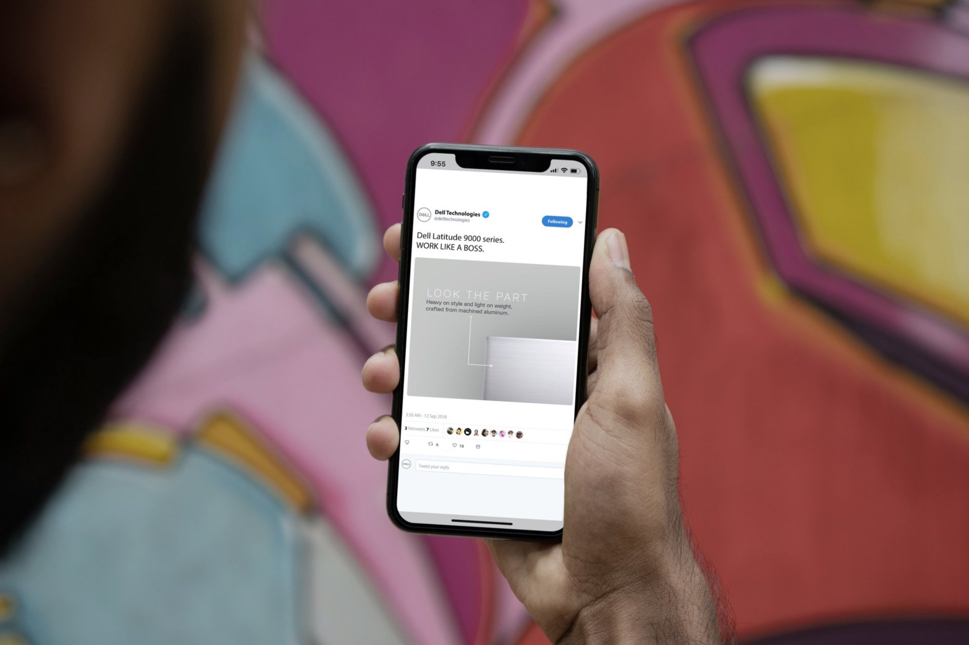
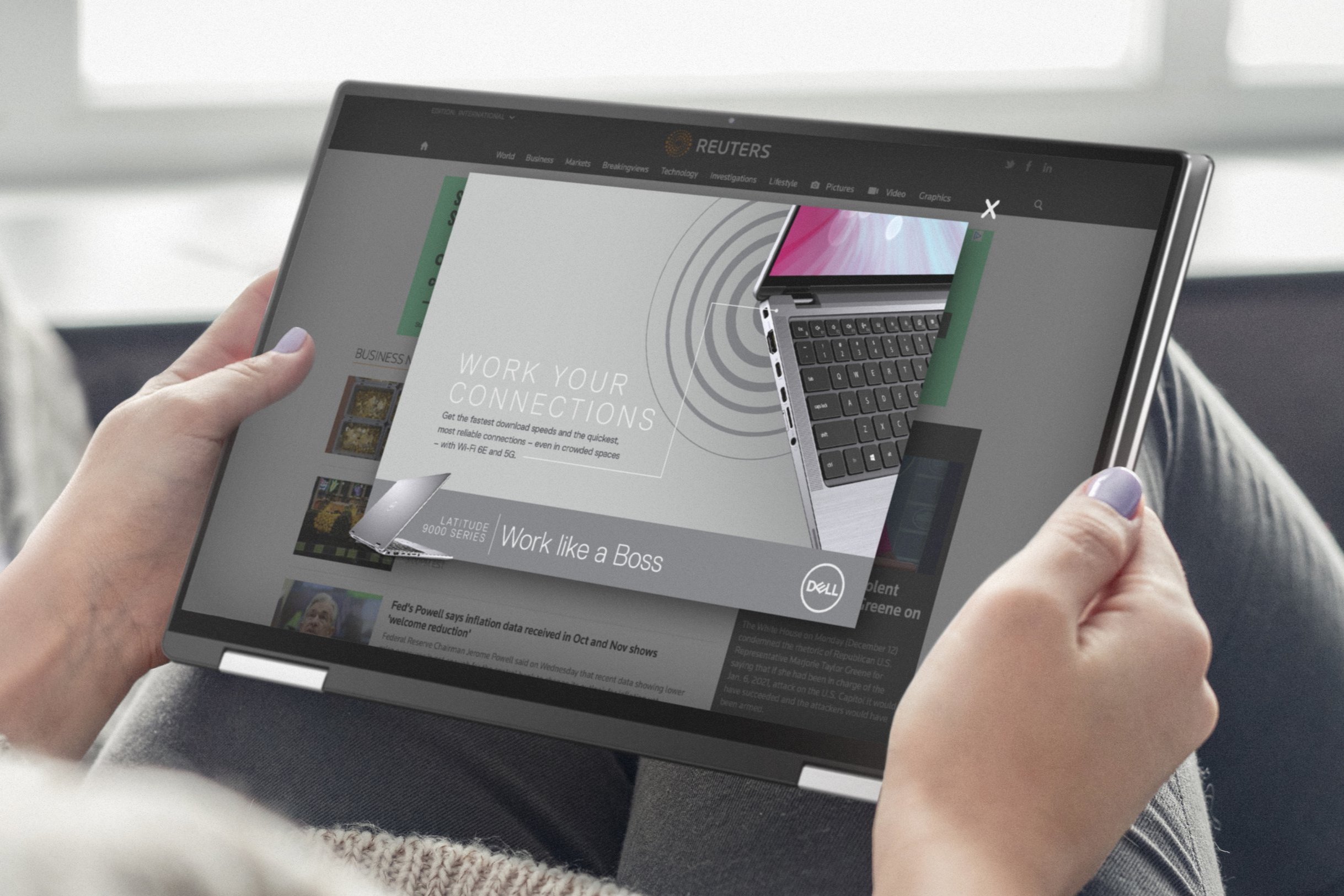
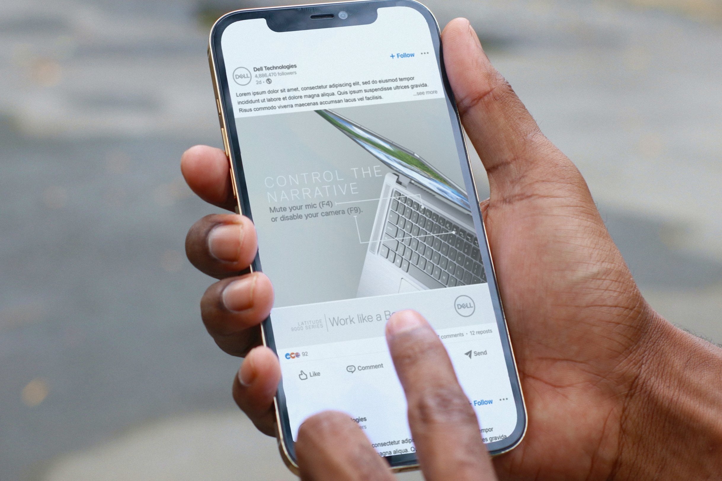
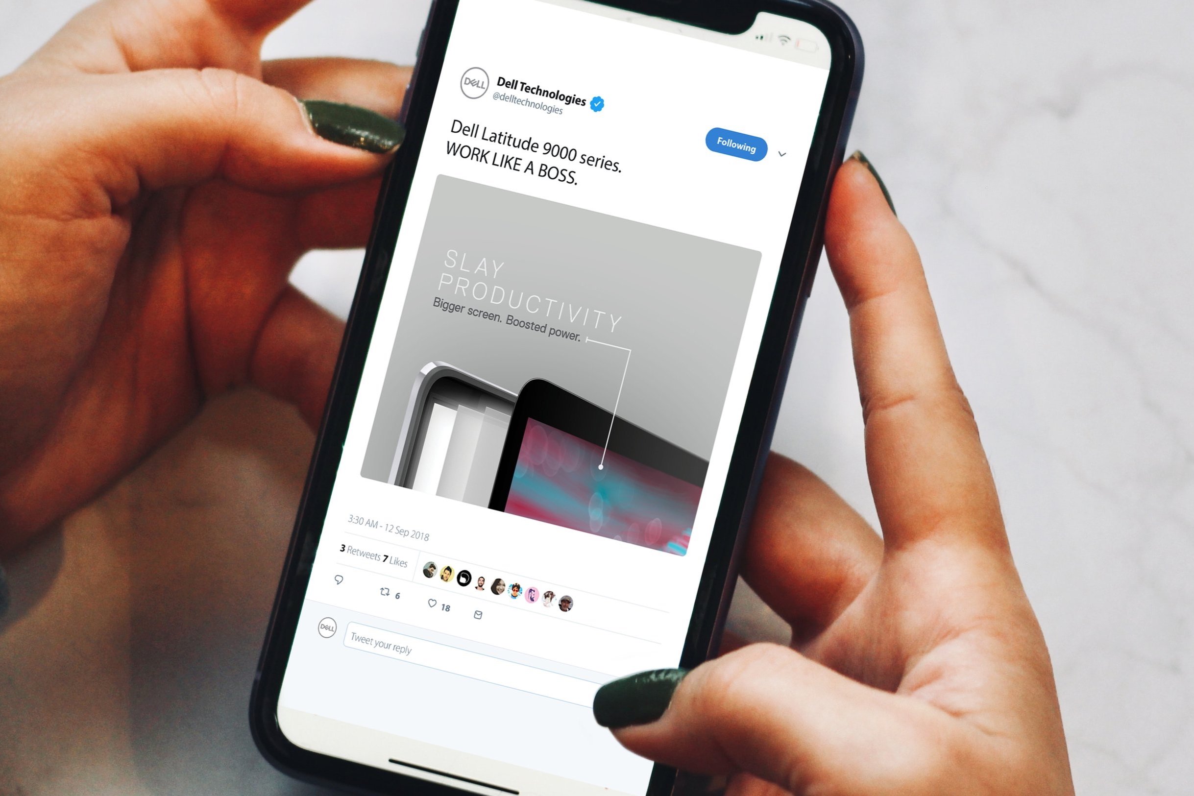
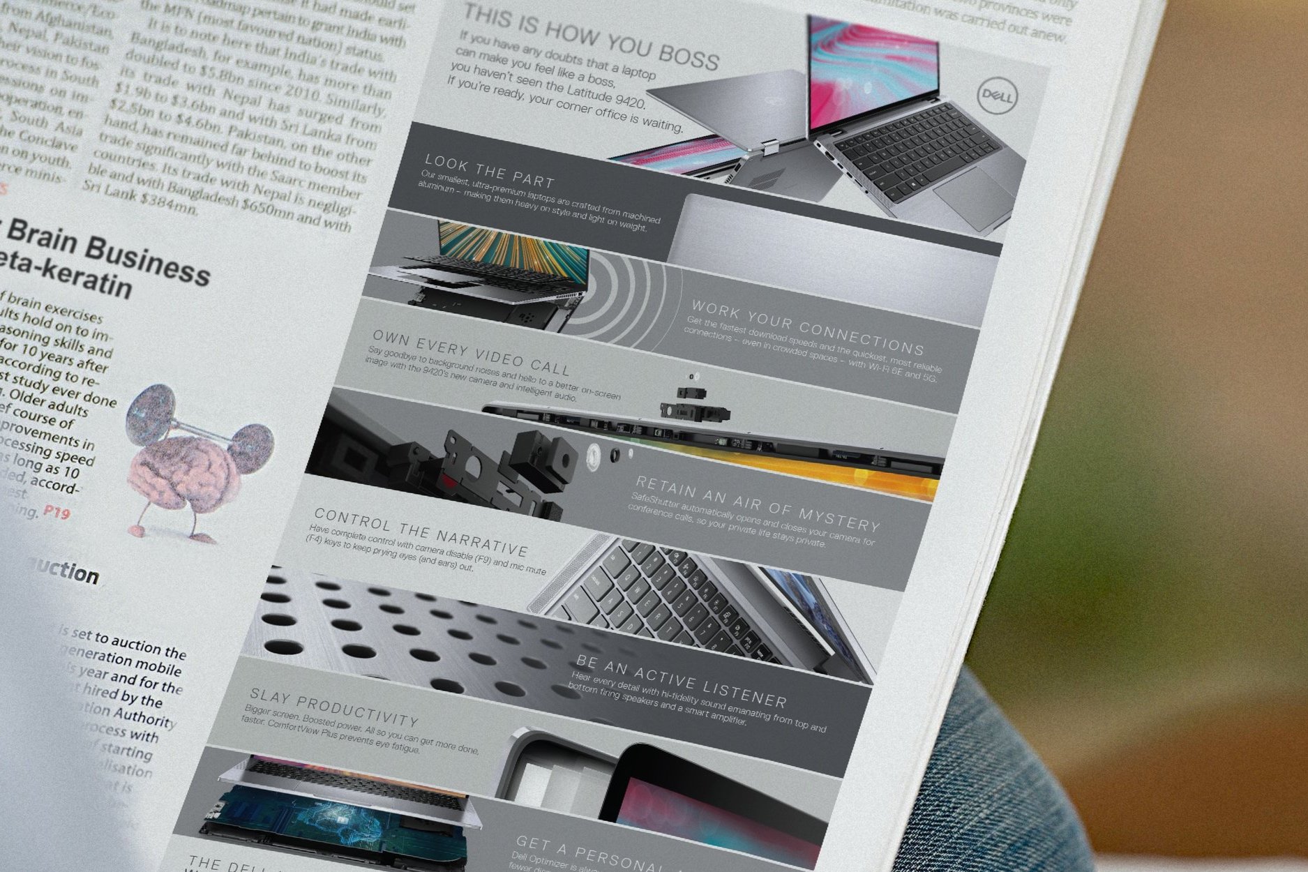
Concepted with my creative partner – Lindy Gross – around imagery that could be used to describe all the factors that make the Latitude 9000 series high-end. A sum of all its parts pulled together in a concise manner. After presenting concepts to the Dell team we landed on what I call the “Boss Collage” and tag line lockup. The collage works as a, “what is that?” head turner to pull the viewer in closer to the full message.
By eliminating the typical Dell Blue colors for the campaign and using lighter gray tones helped lift the devices to another level.
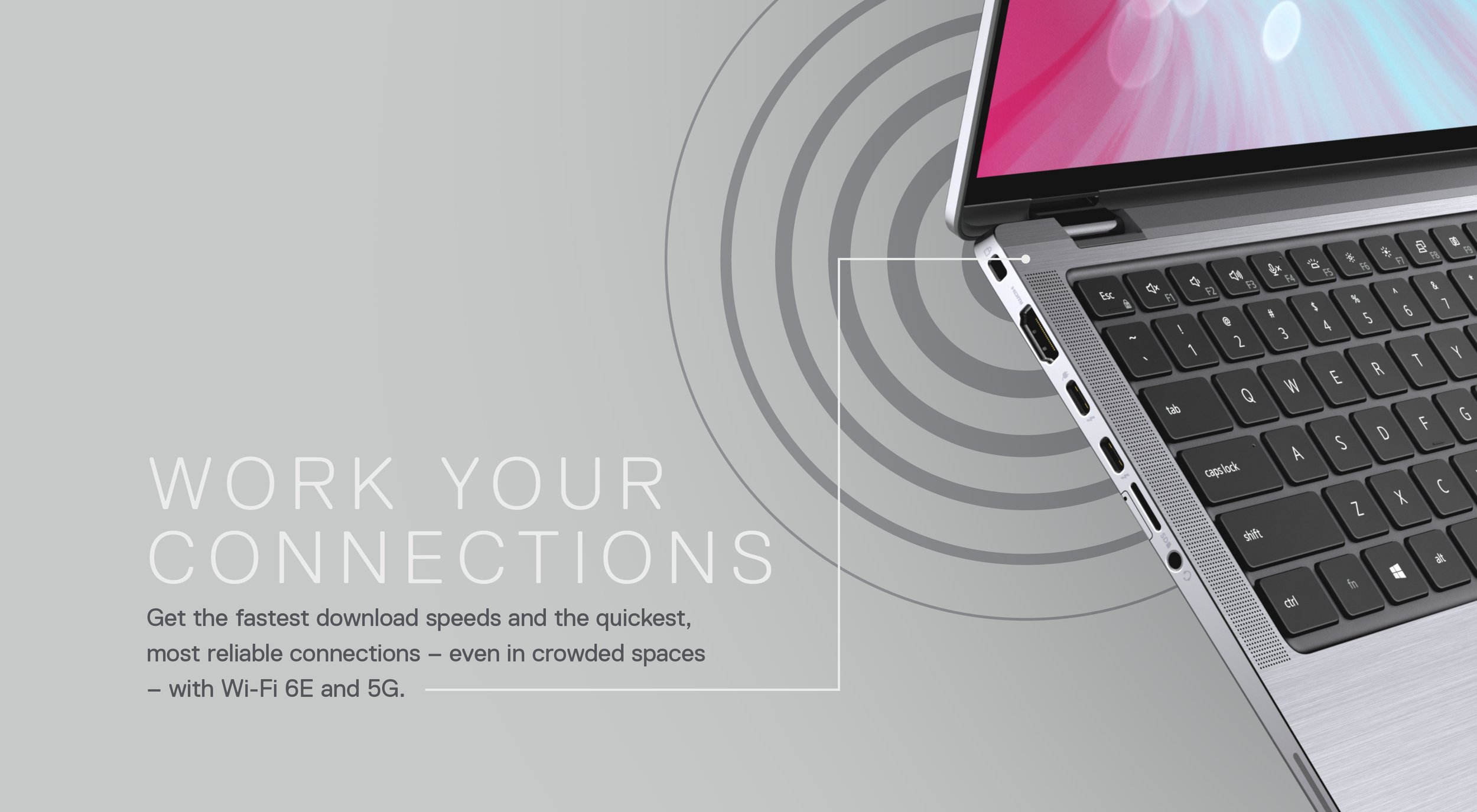
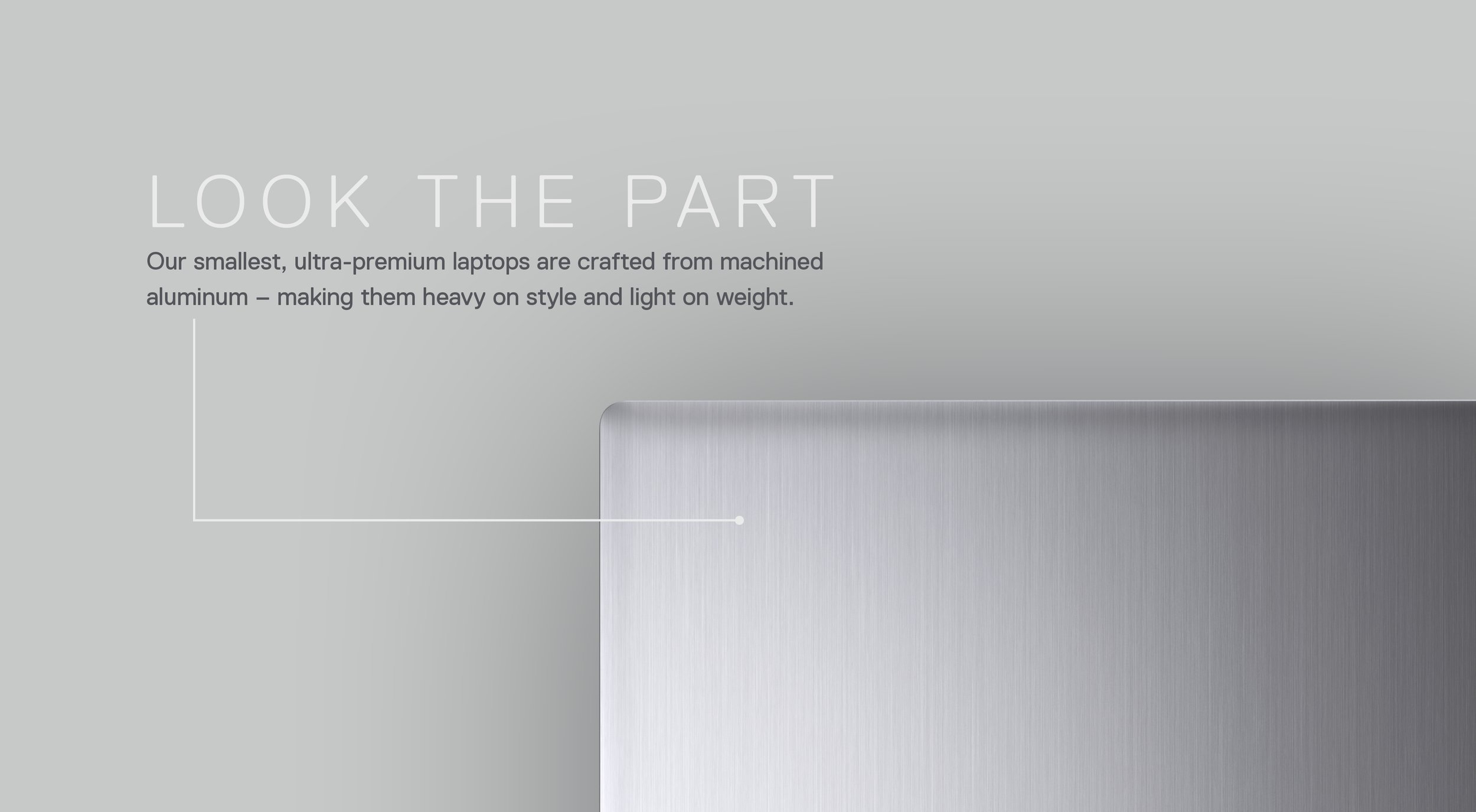
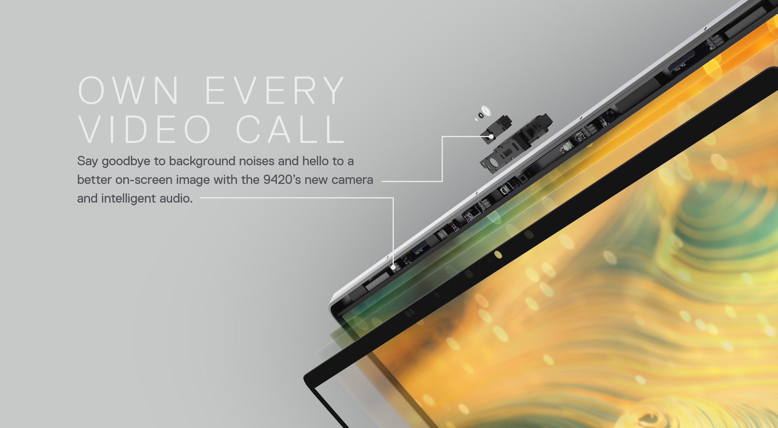
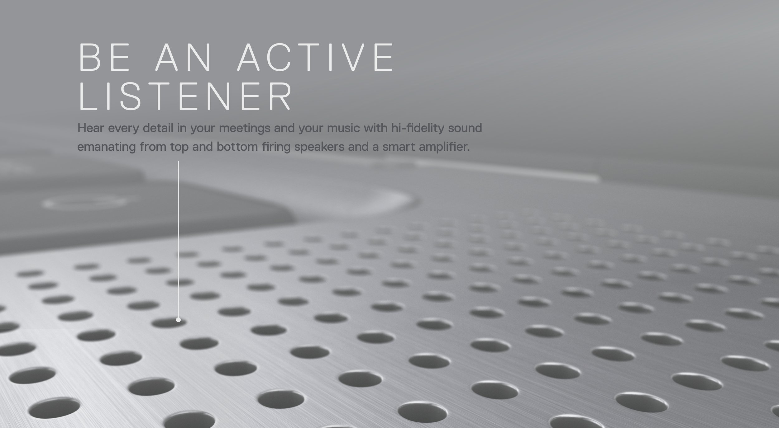
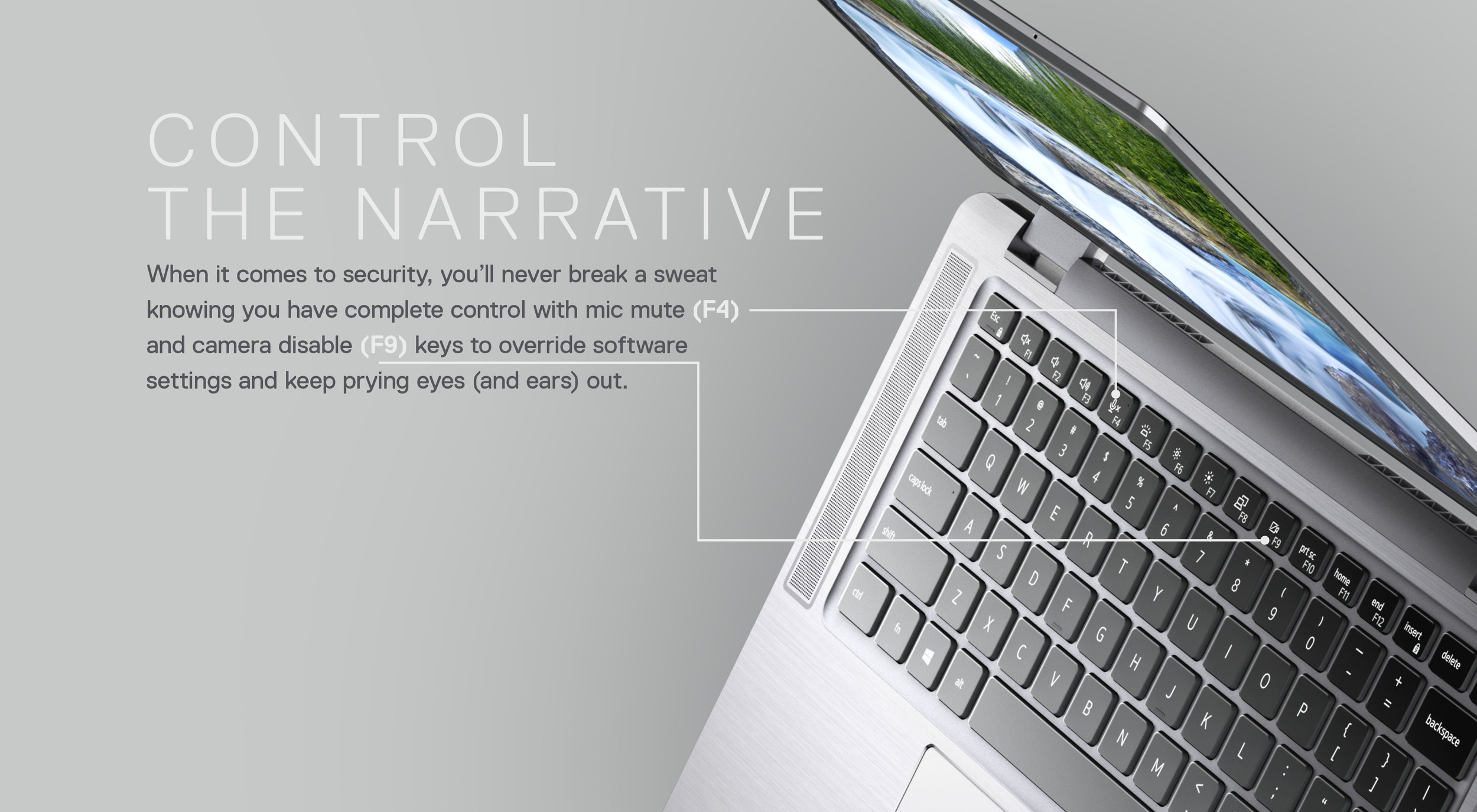
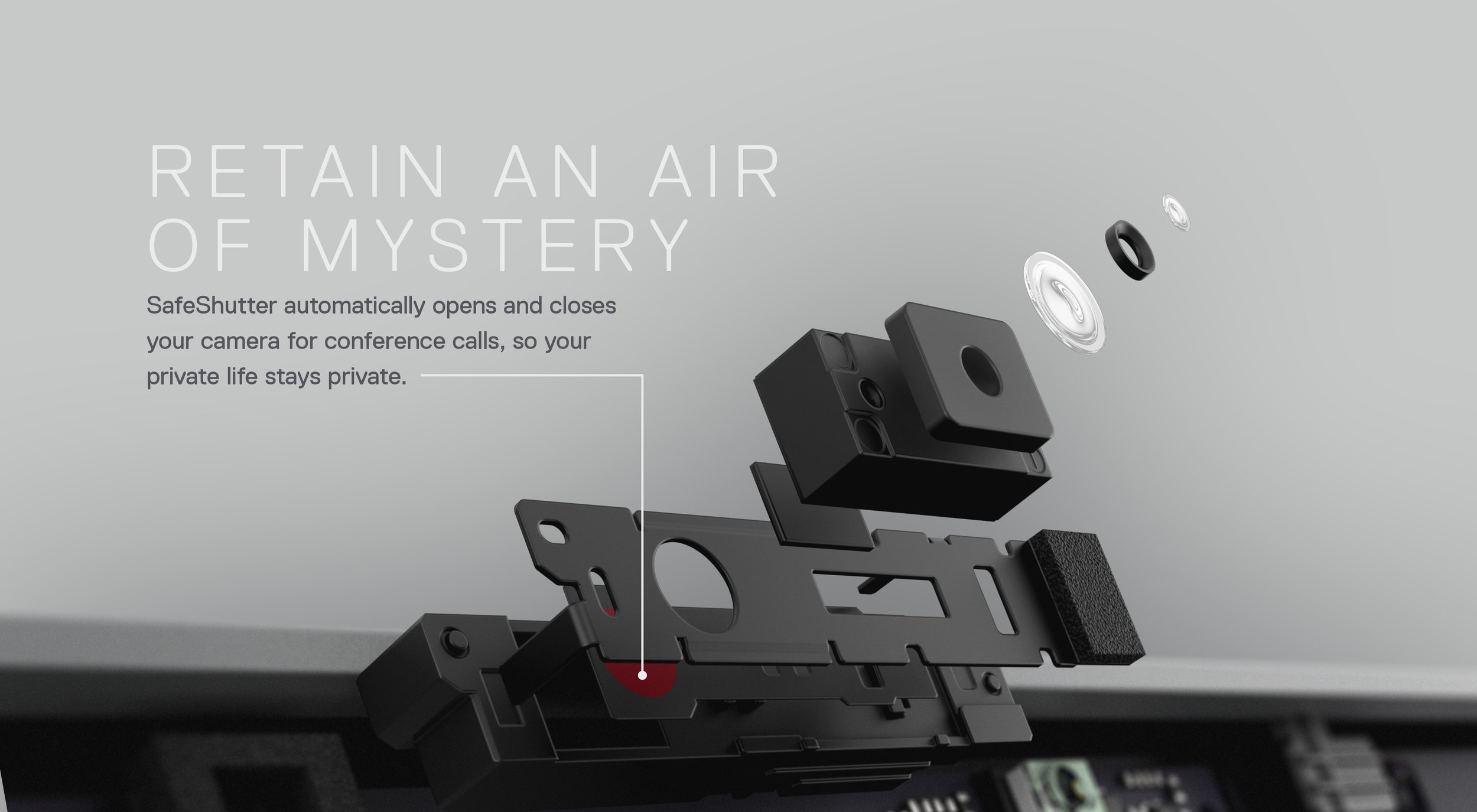
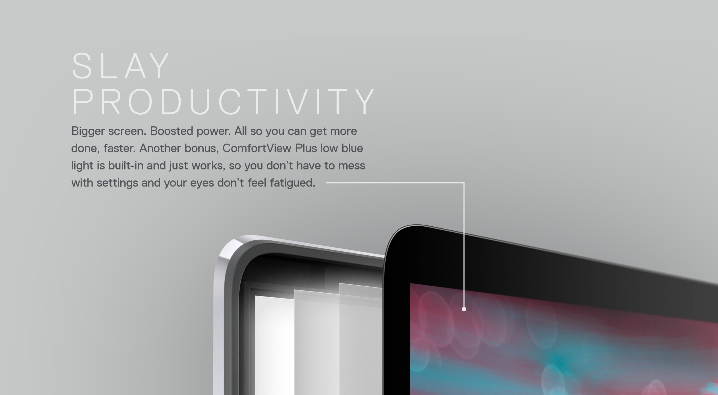
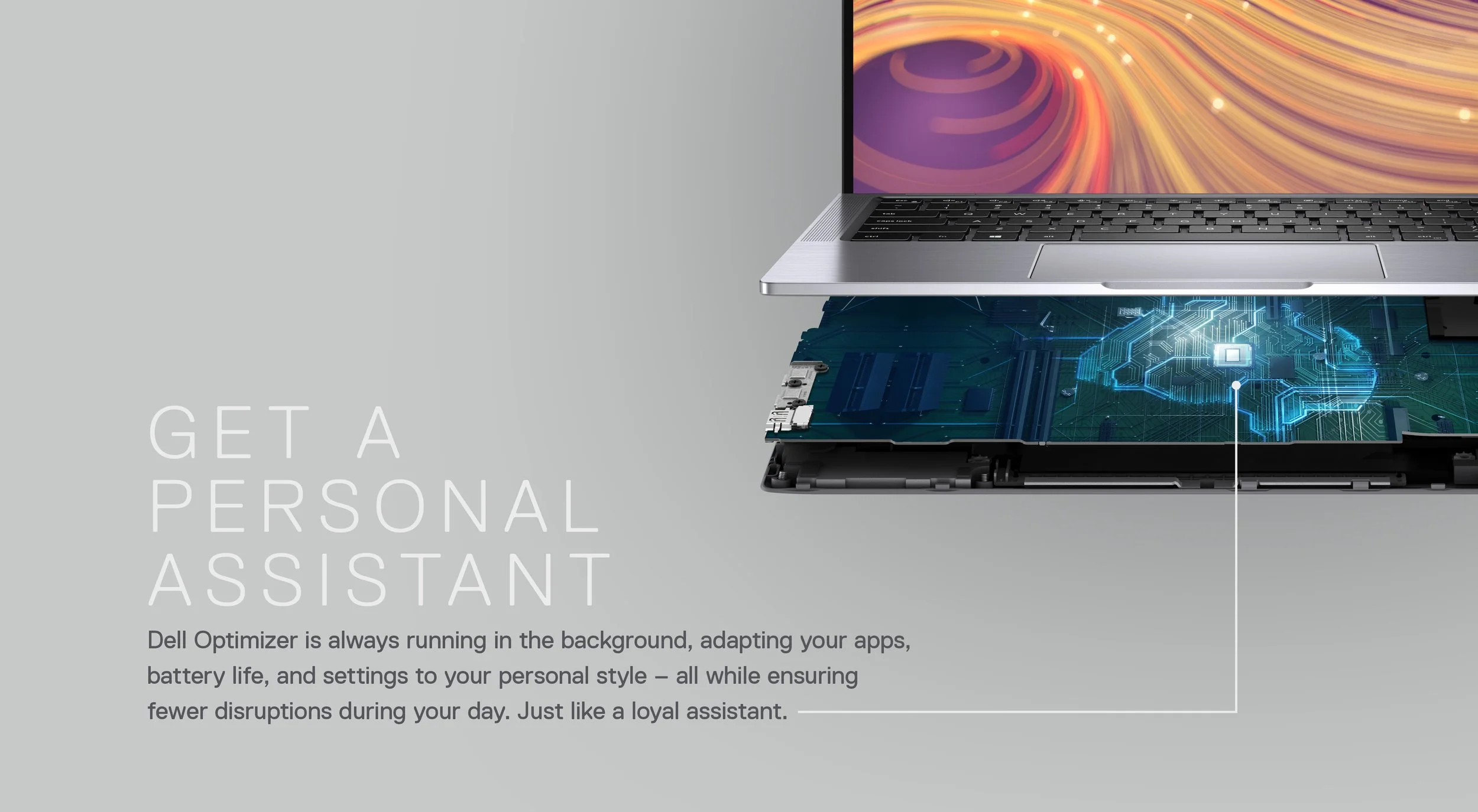
Presentation Slides
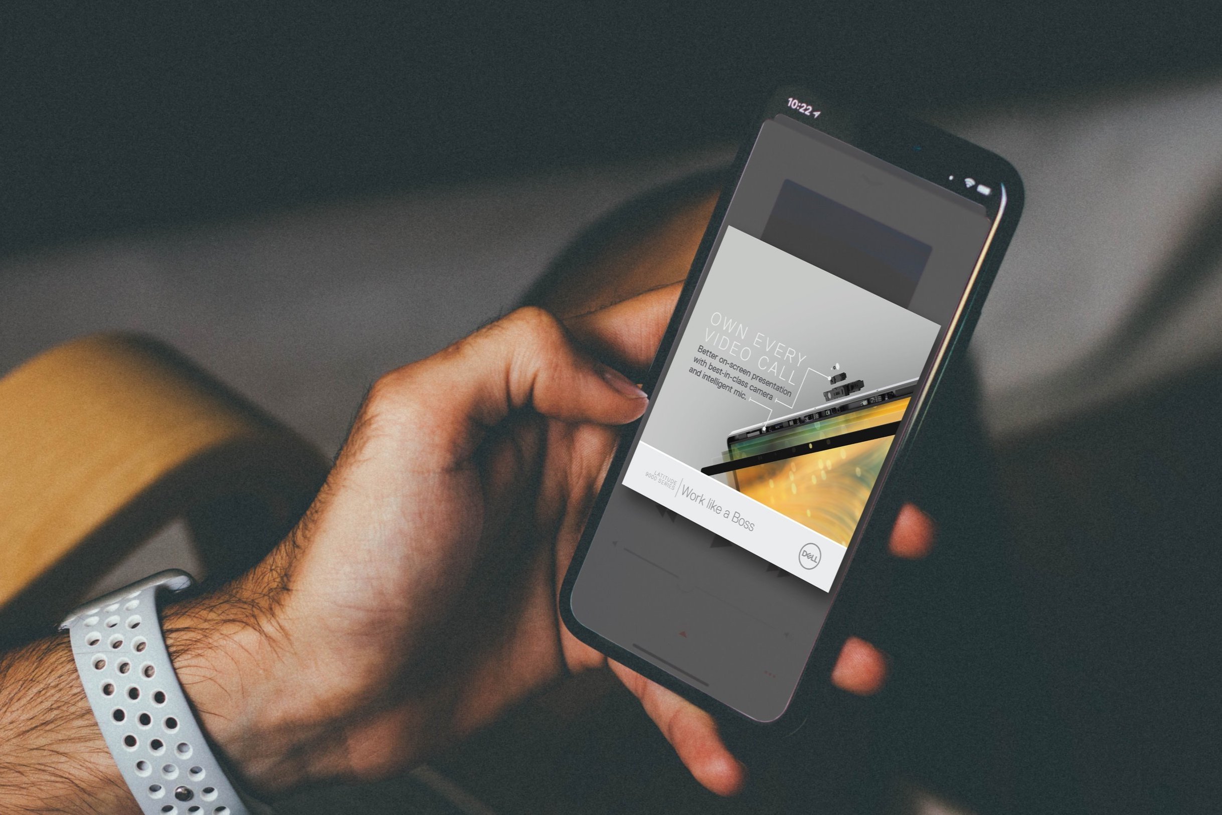
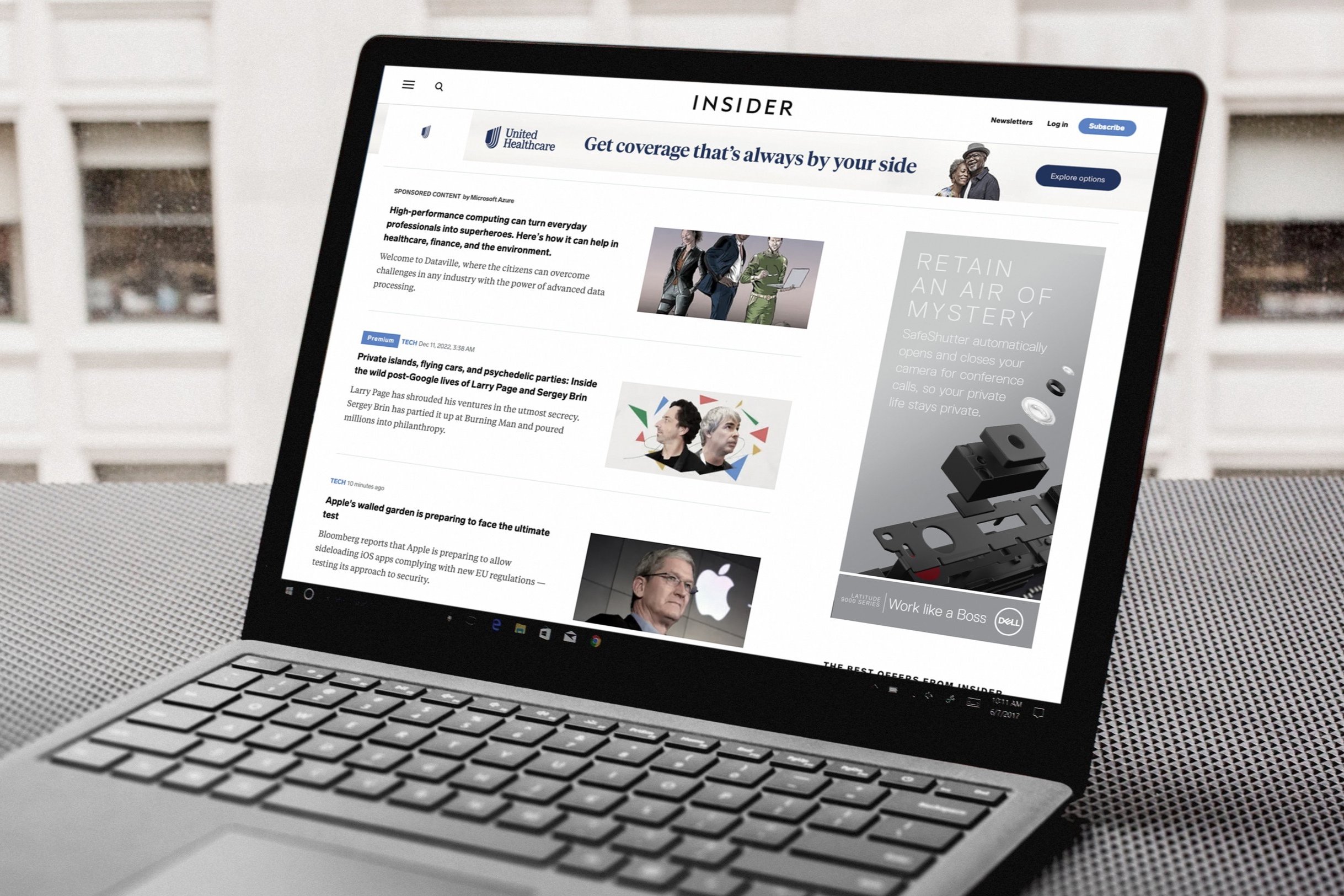
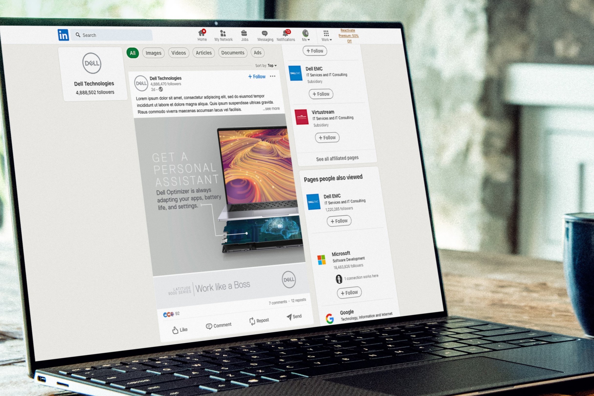
Breaking out the Latitude graphic collage into its’ separate building blocks helped to further explain how the Dell Latitude Series is built for the boss. These slides helped to further create a graphic language that would be used in communications from social media and digital ads to infographics and One-sheets.
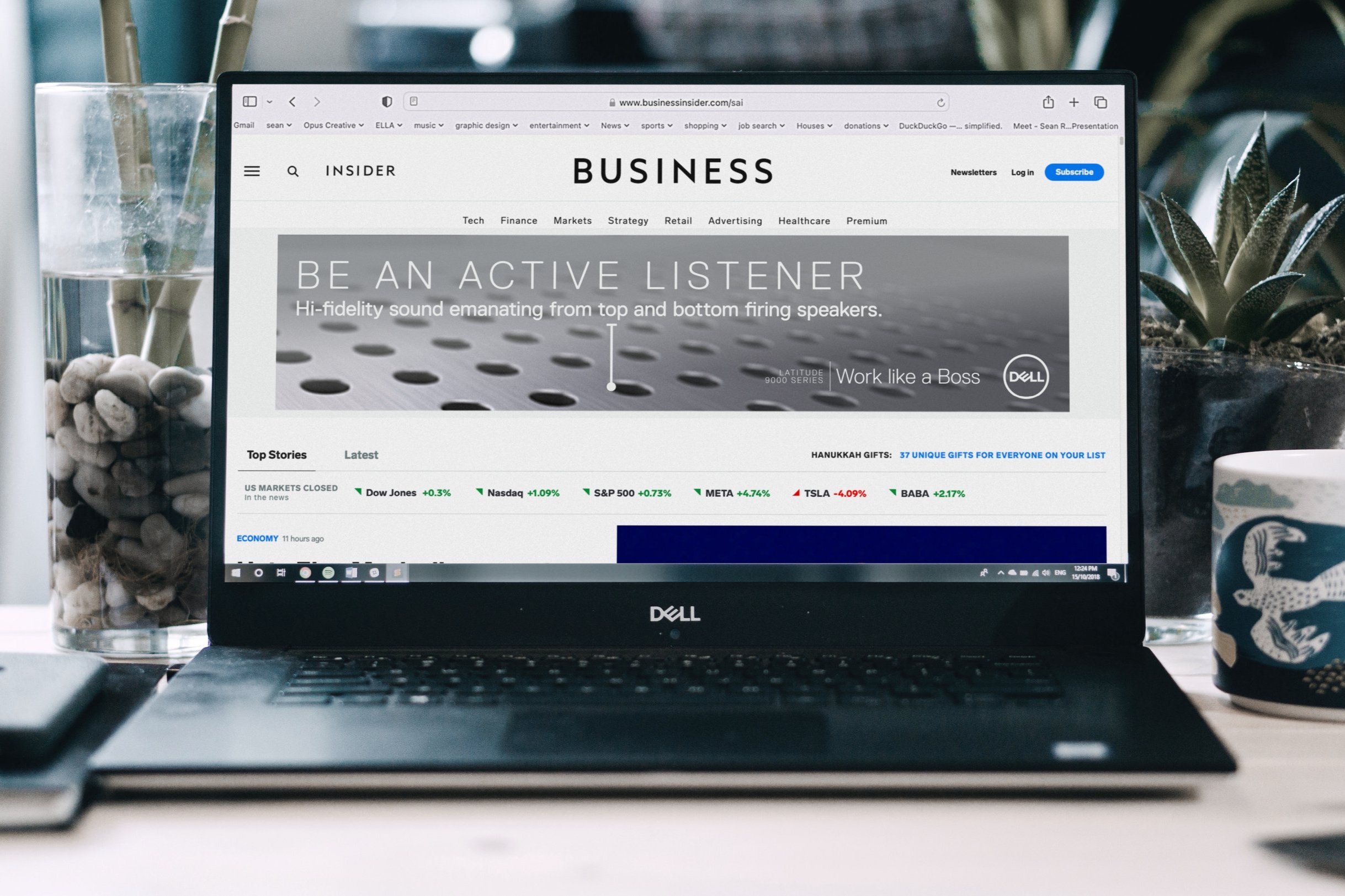
Selective Ad Buys
Know the audience and focus on the media that they use. People in the business field who have a need for quality and professional appearance. While the Latitude 9000 can be used by creatives, we focused on individuals who’ve been in the PC world for years and are looking for a device that is the Business alternative to a MacBook Pro.
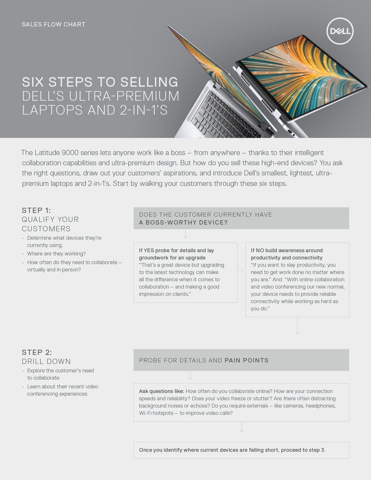
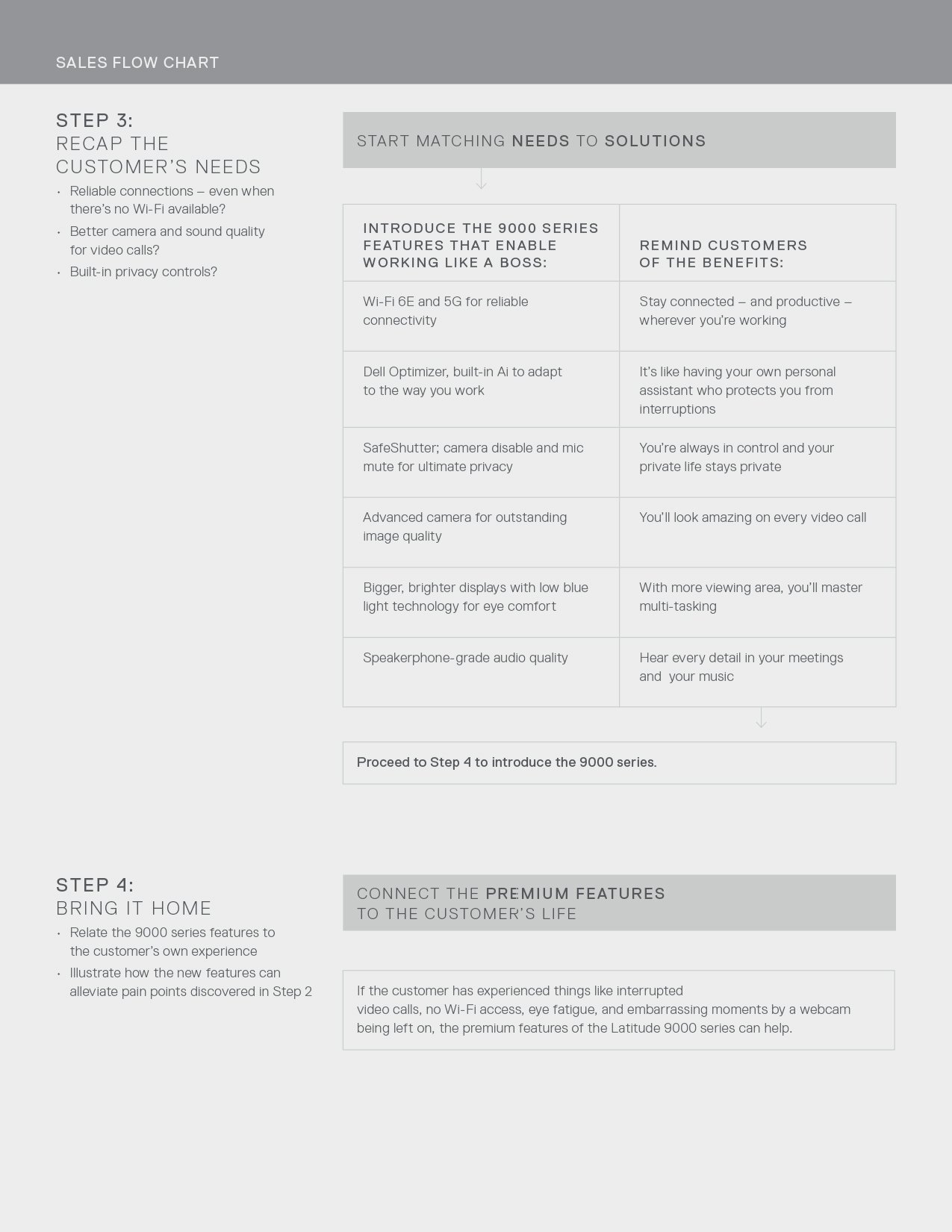
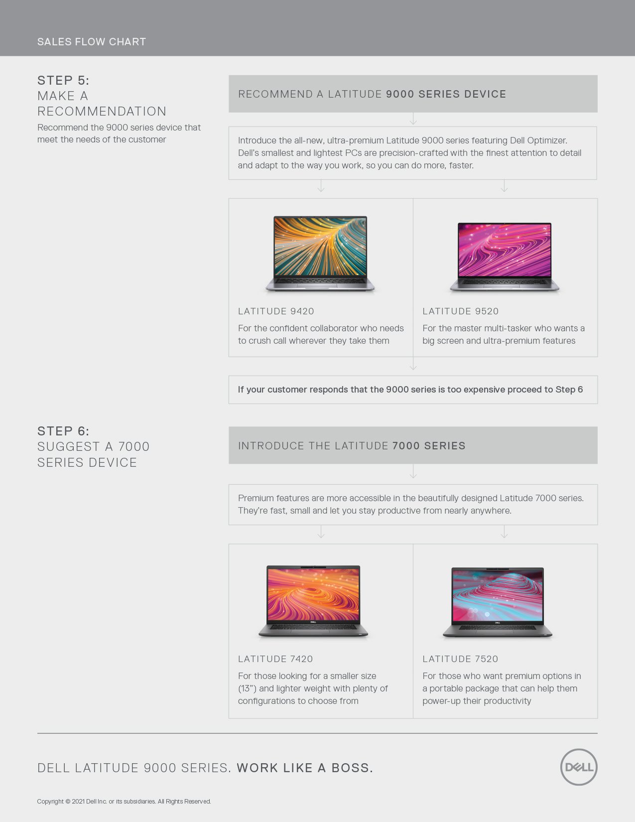
B2B2B Channel Marketing
A handful of the multitude of Channel communications that Opus produced to help educate resellers on language and talking points when selling Latitude 9000 series. This definitely isn’t the sexy stuff to create, but I do geek-out on infogrpahics and charts sometimes.

