Functionally Formed
A Close Inspection of Sean Raders' Mental State


Concept First.
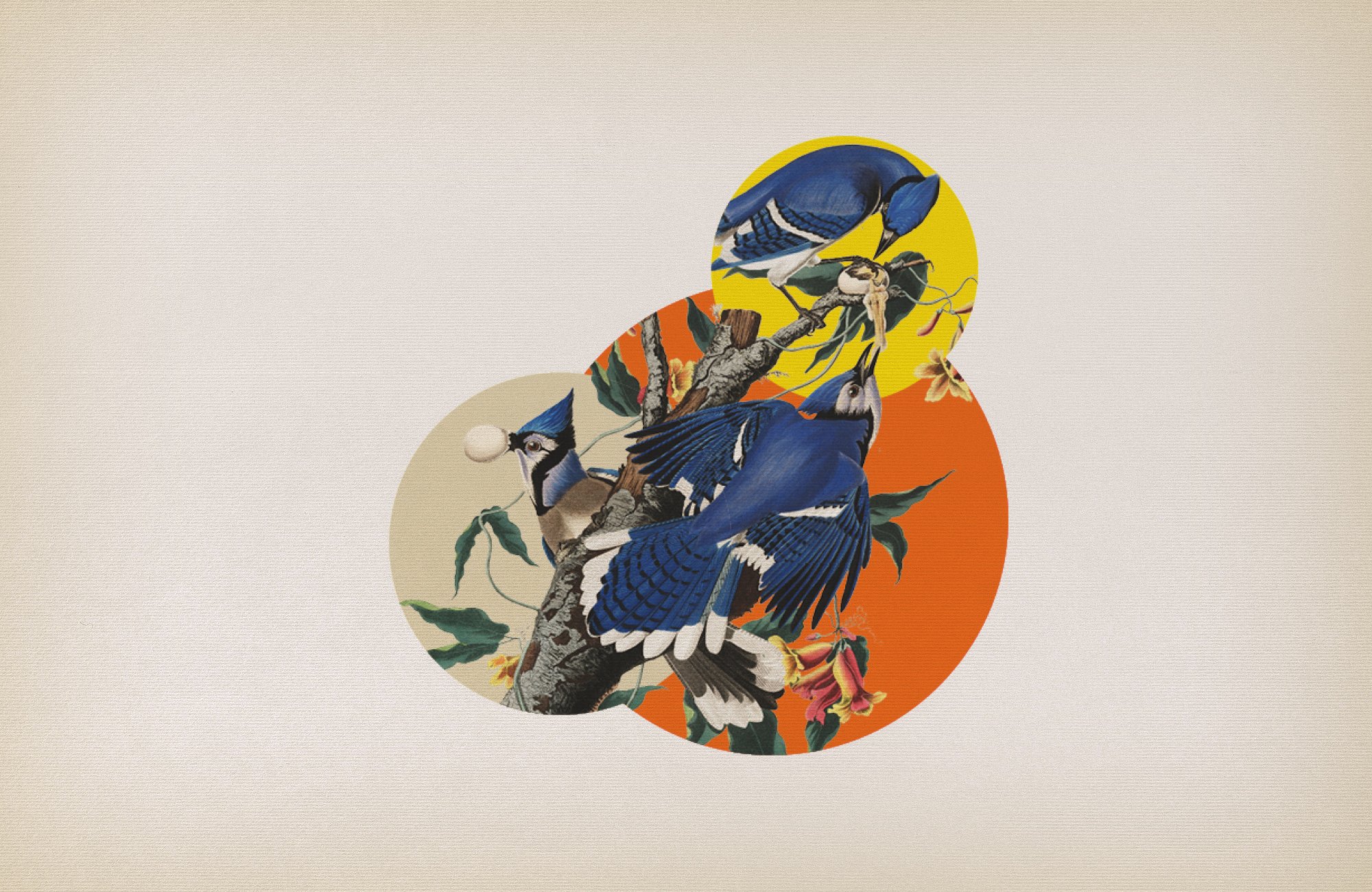
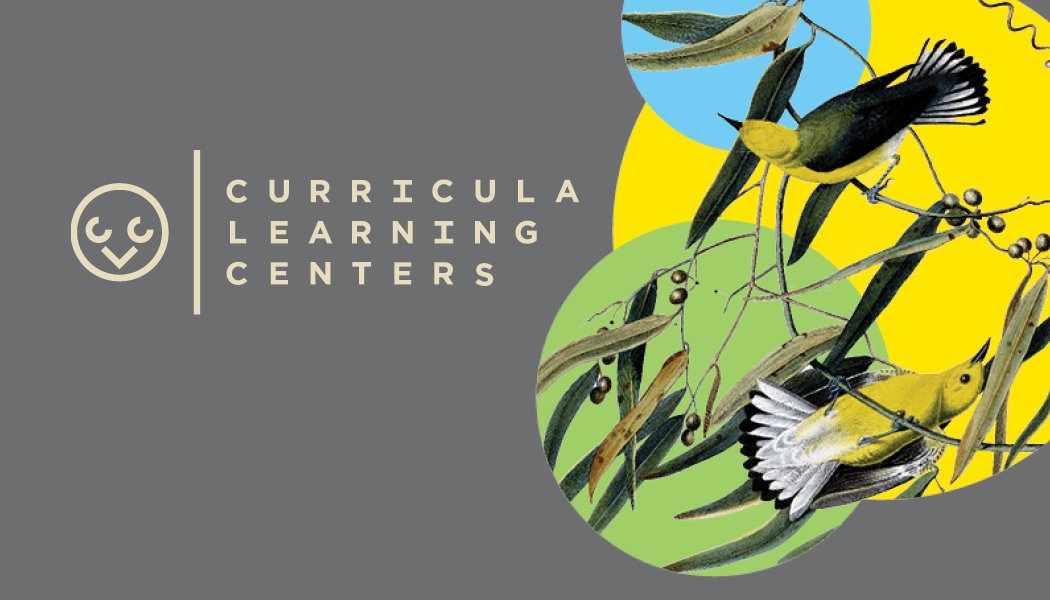
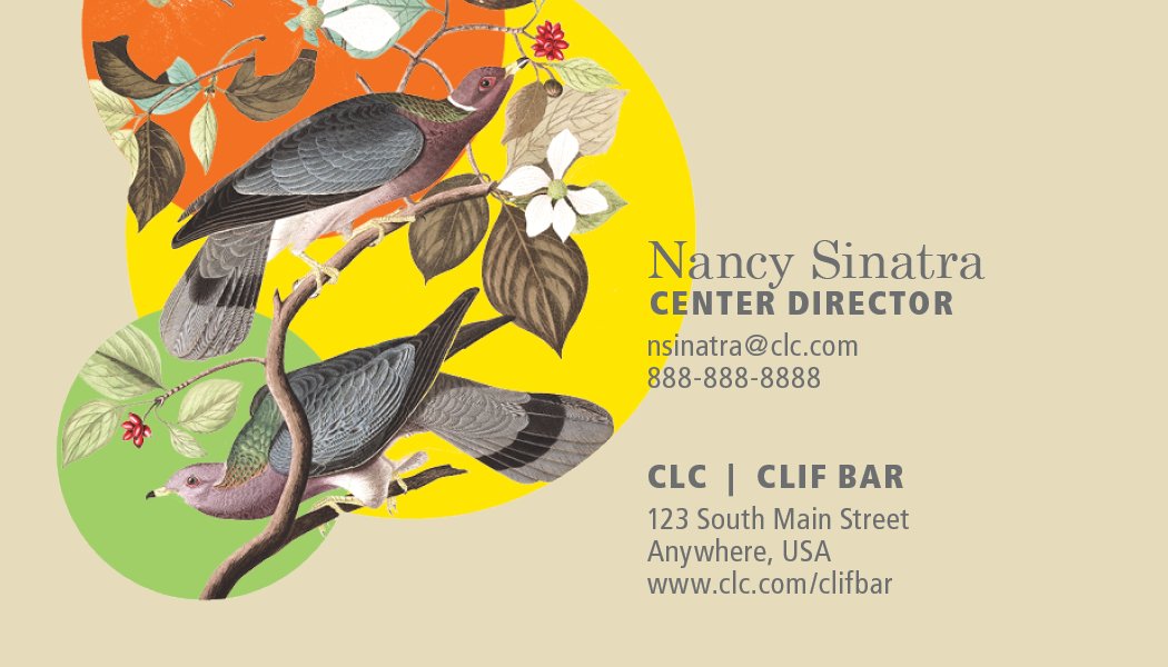
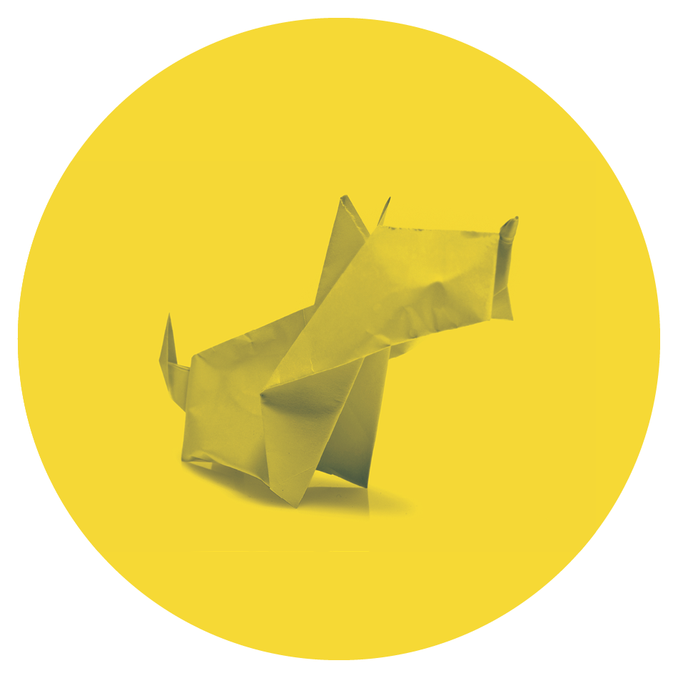
Happy accidents occur often when creating but they don’t always align so acutely as with the CLC logo and visual identity. I happened upon the the logo mark as discussions on imagery focused on the Corvidae(crows, jays, magpies) family of birds.
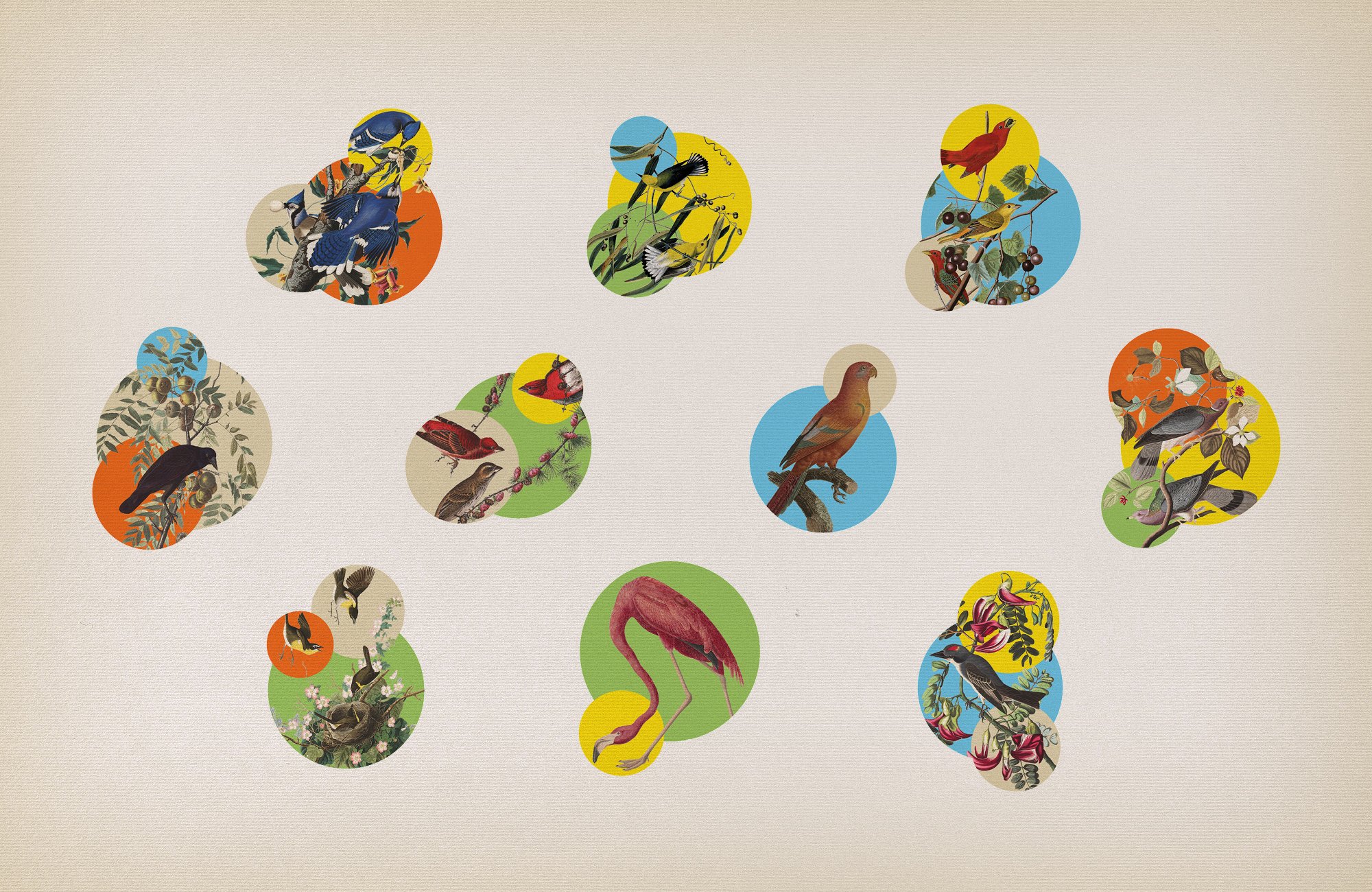
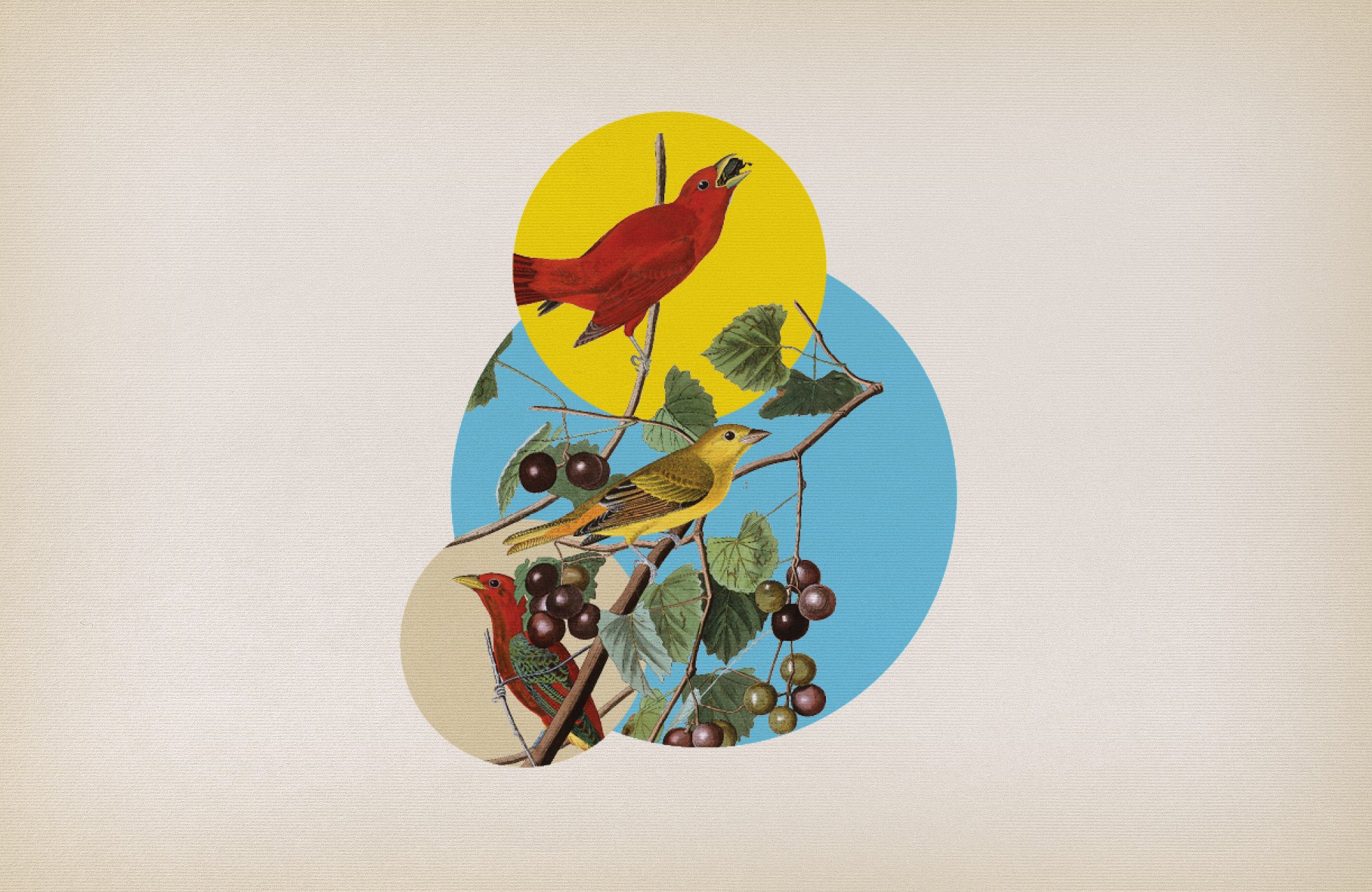
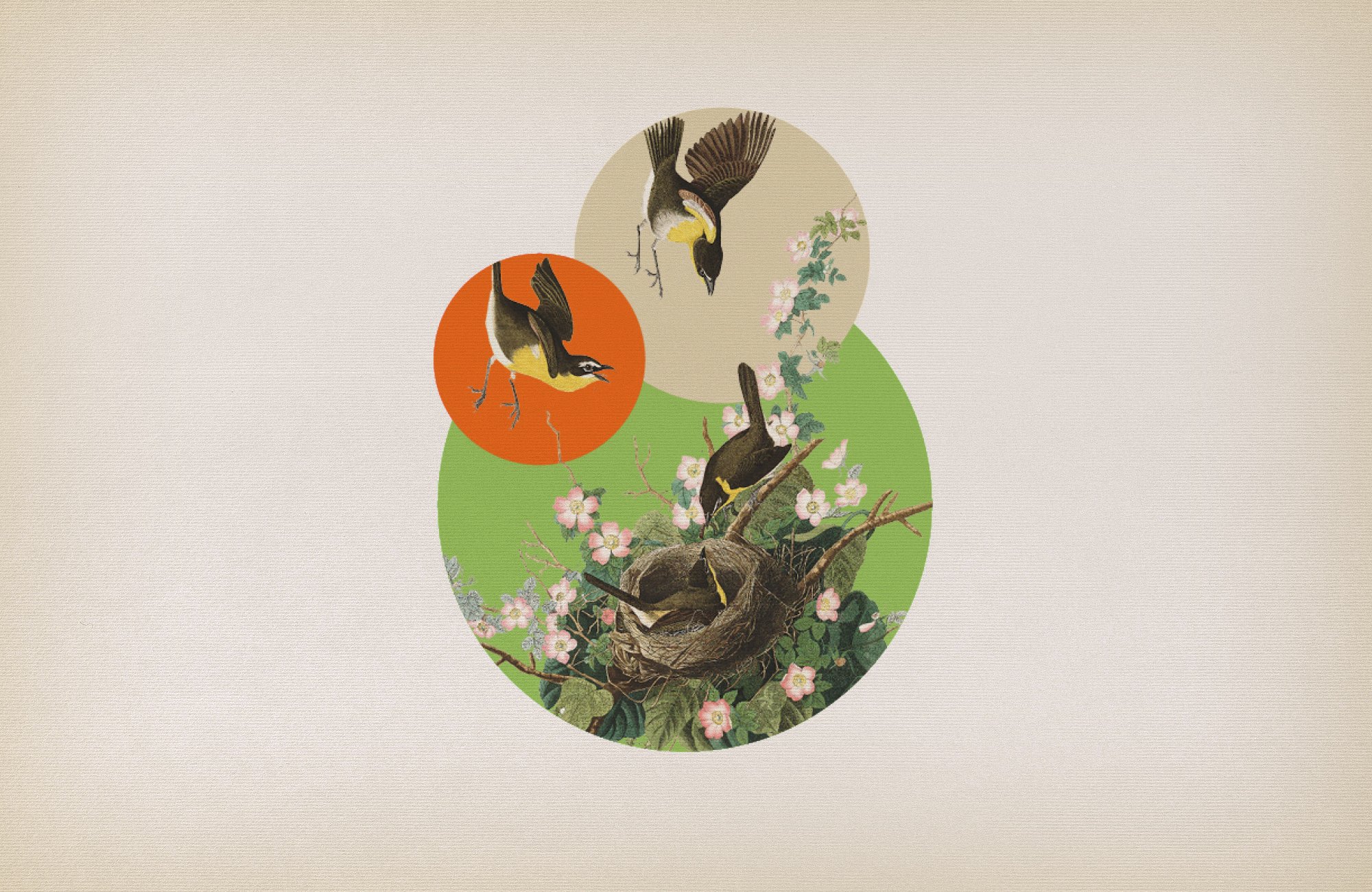
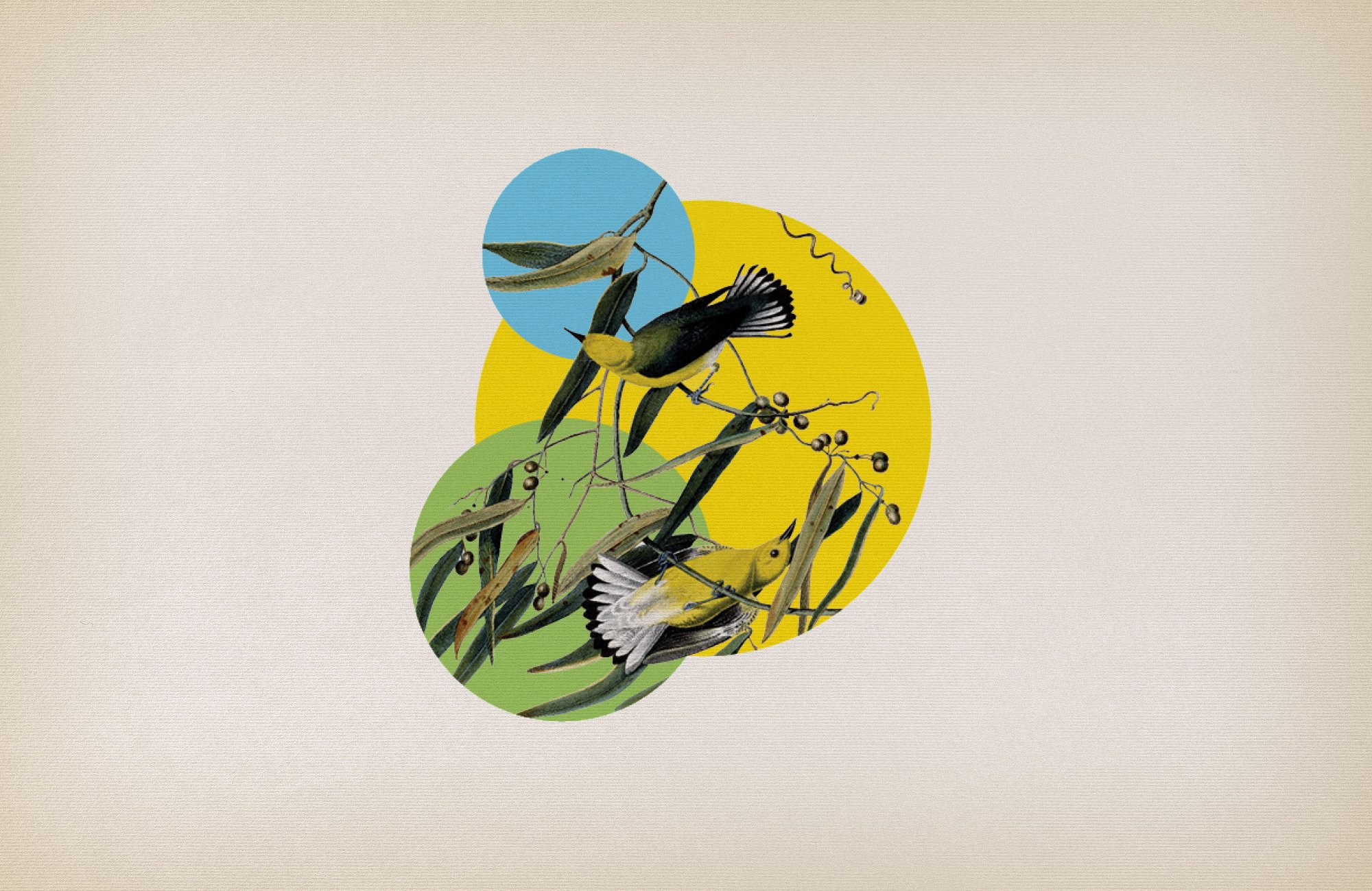
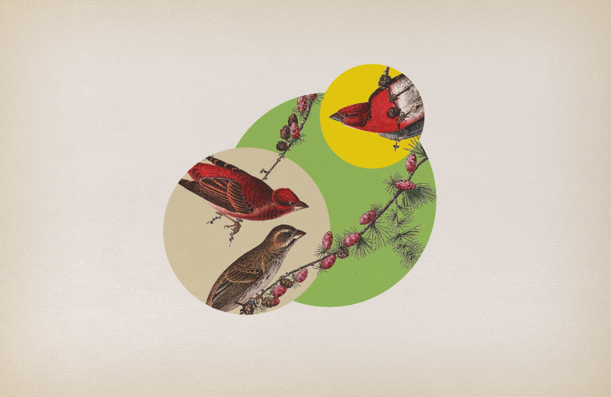
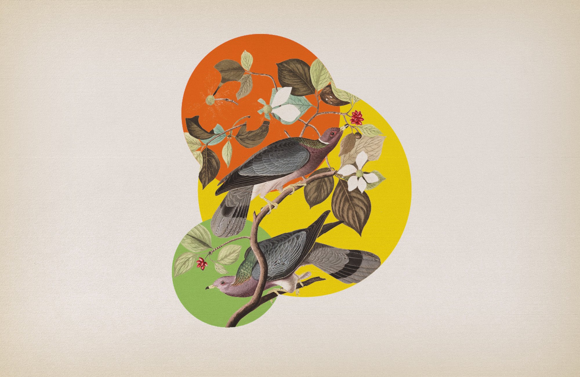
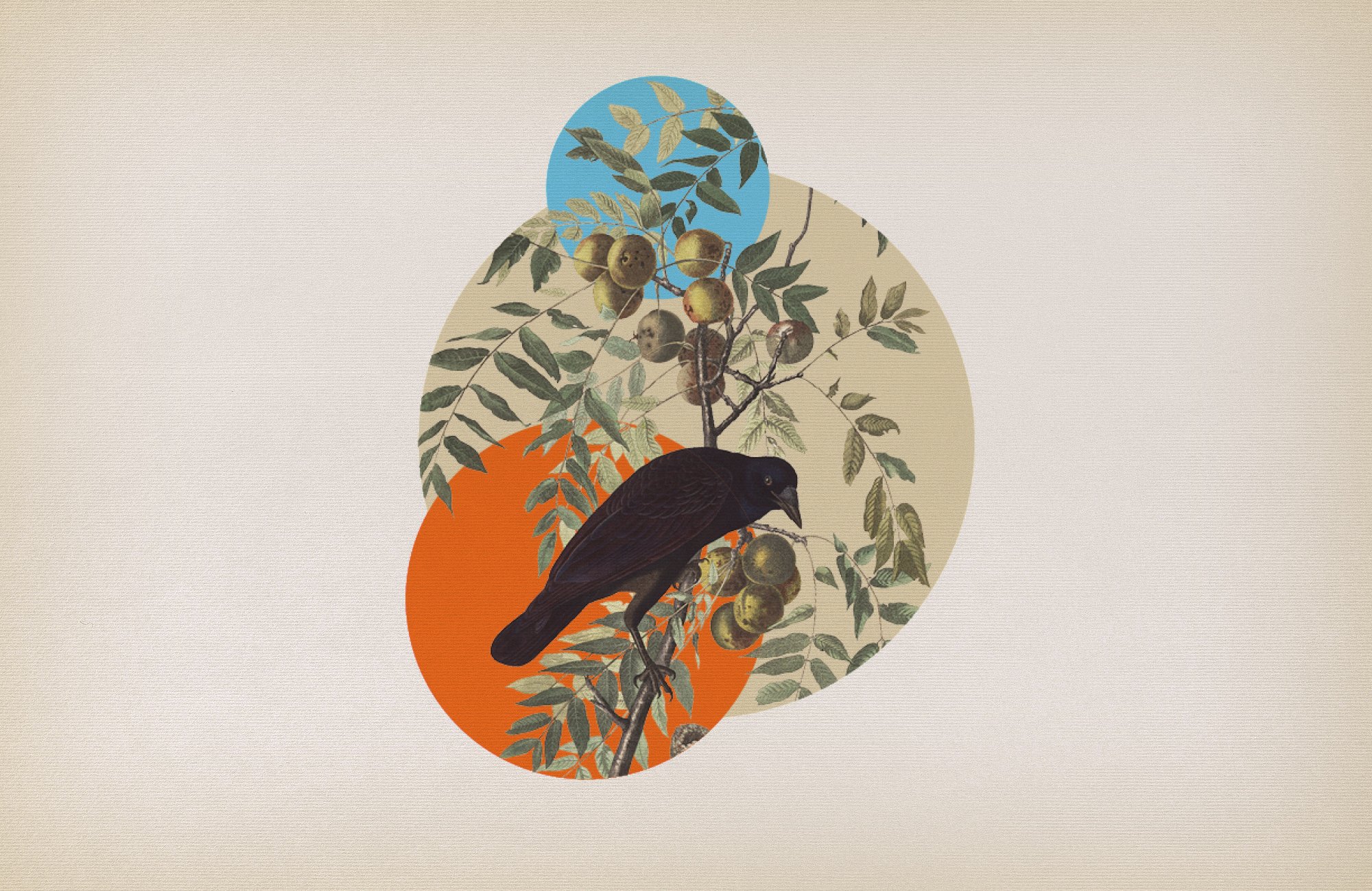
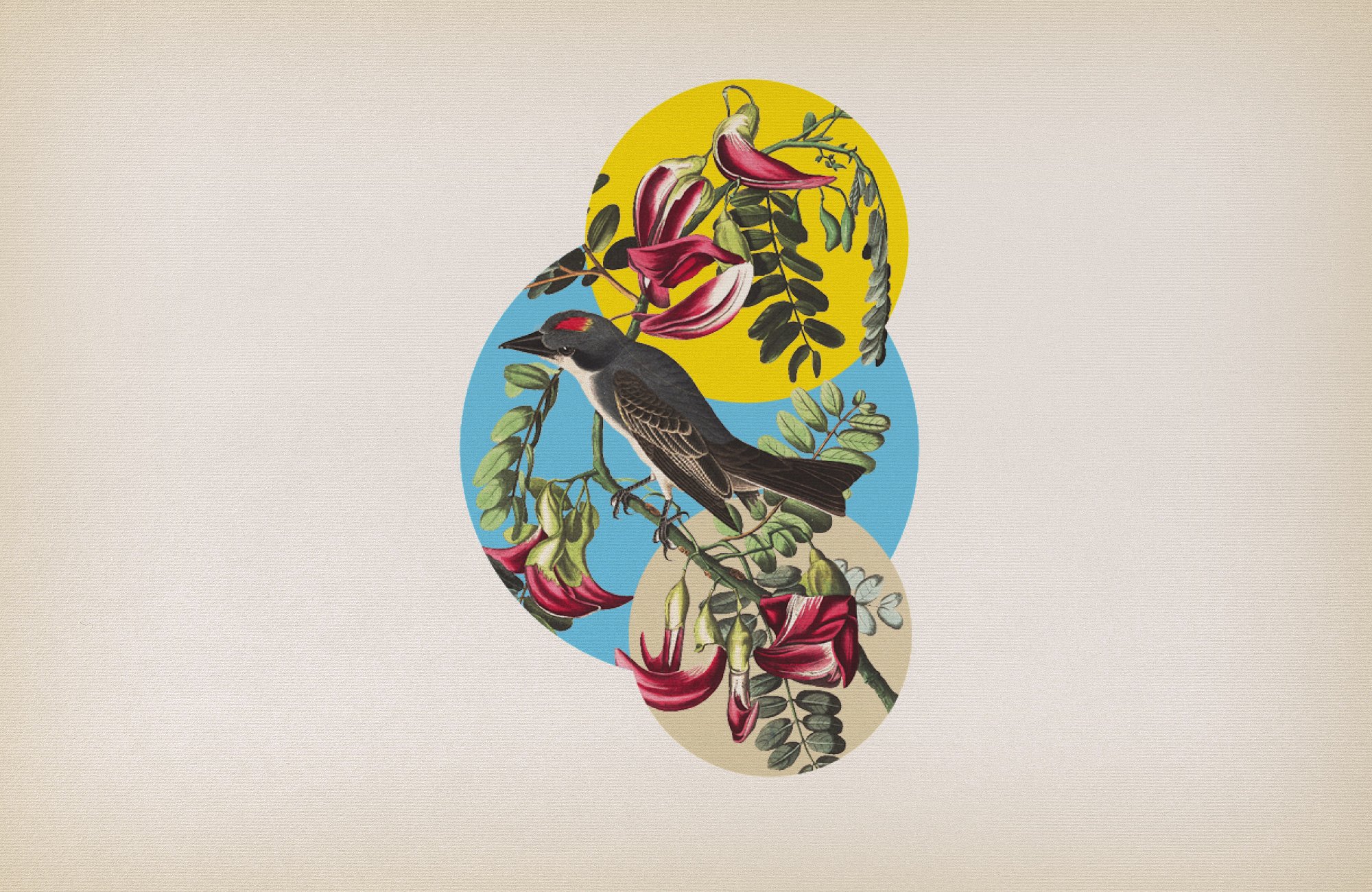


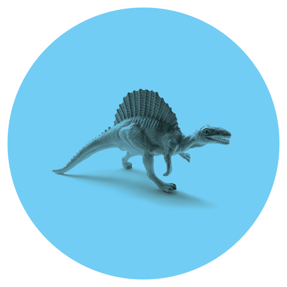
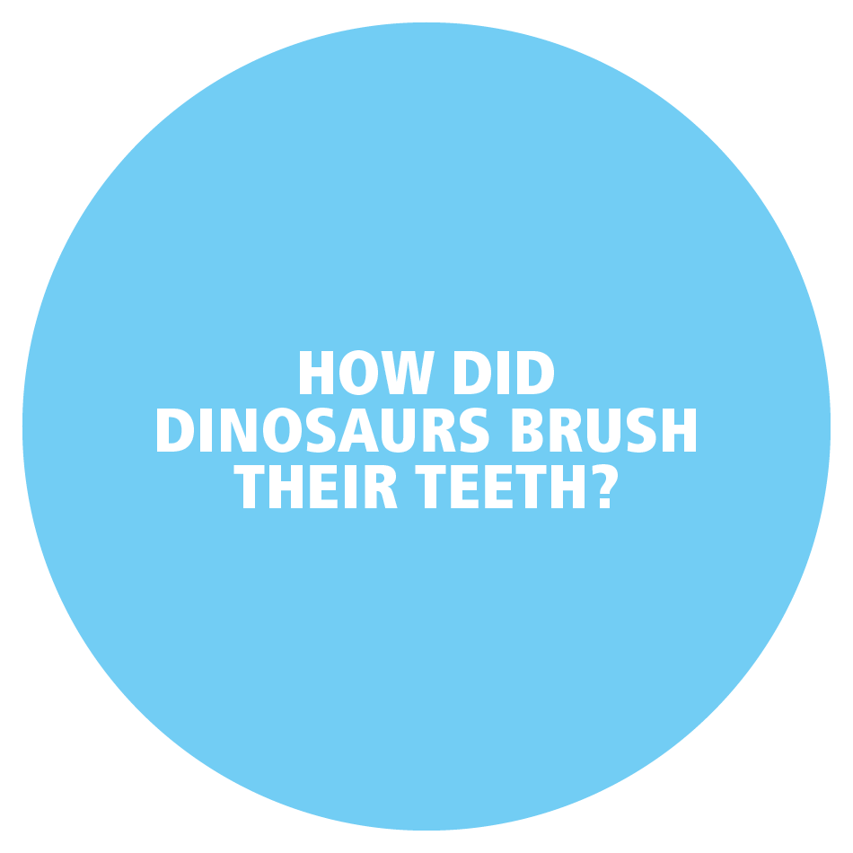
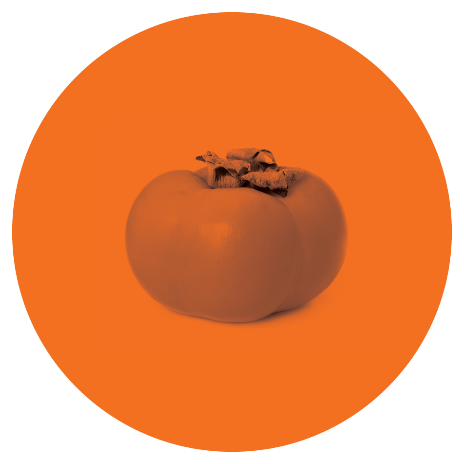
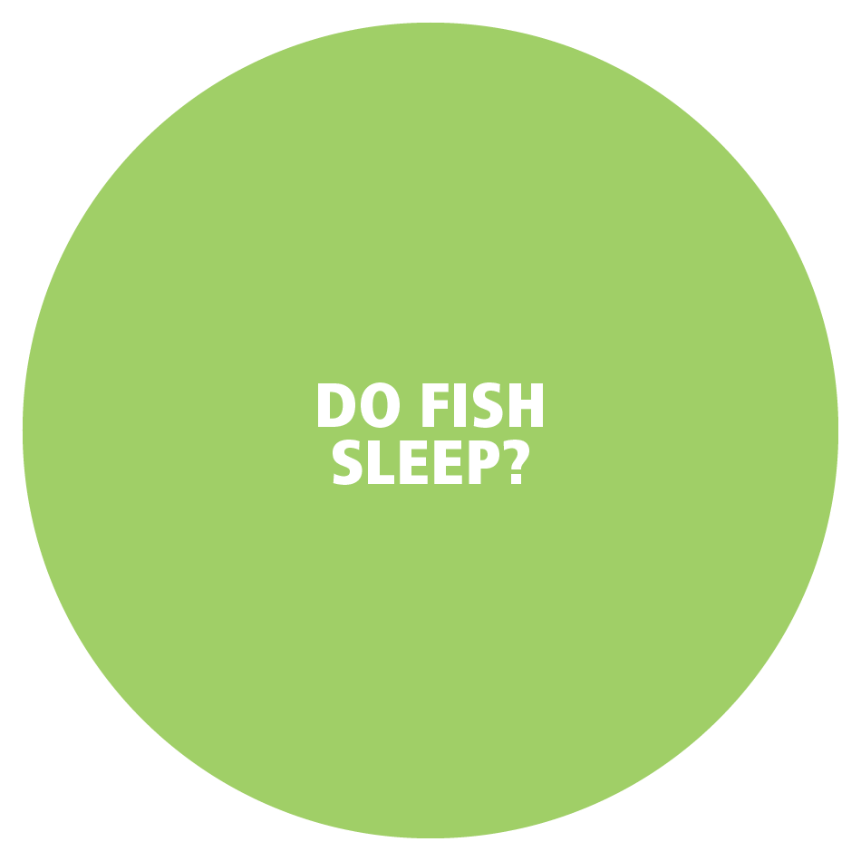
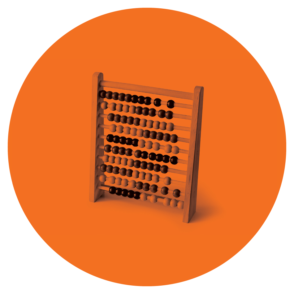
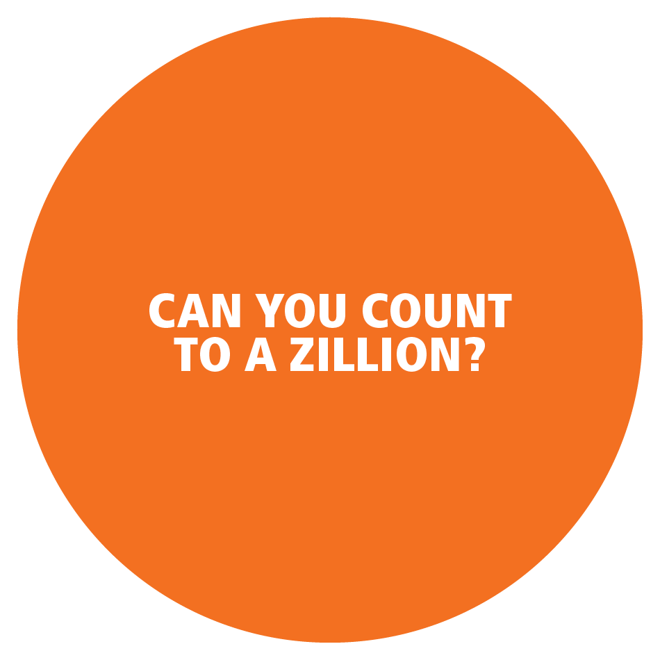
Circles, Circles, Circles.
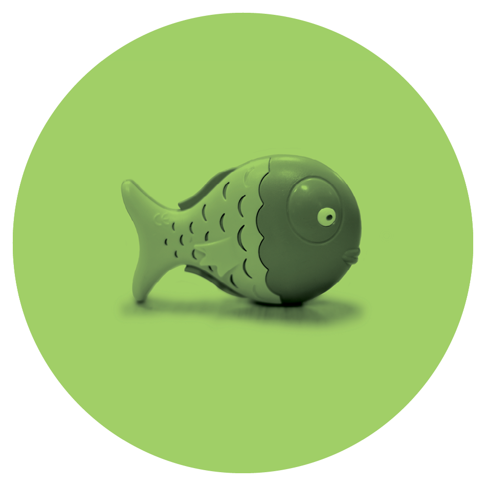
By bringing color, typography, photography, design elements, tone, and a lot of circles together, an uncluttered visual identity that stands out in a crowd of kiddie graphics is formed. The brand speaks to a parental audience that would recognize the illustrations and maybe grasp their meaning.
Center Design
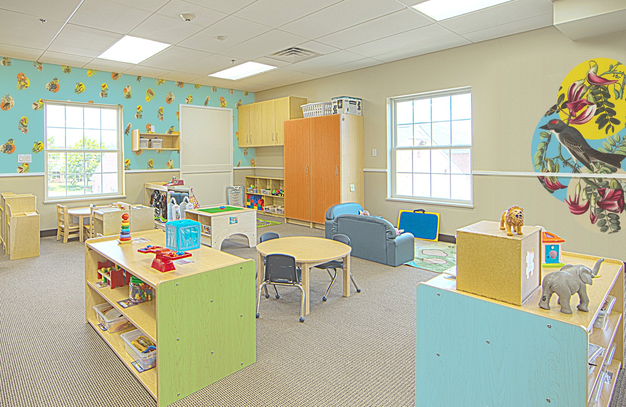
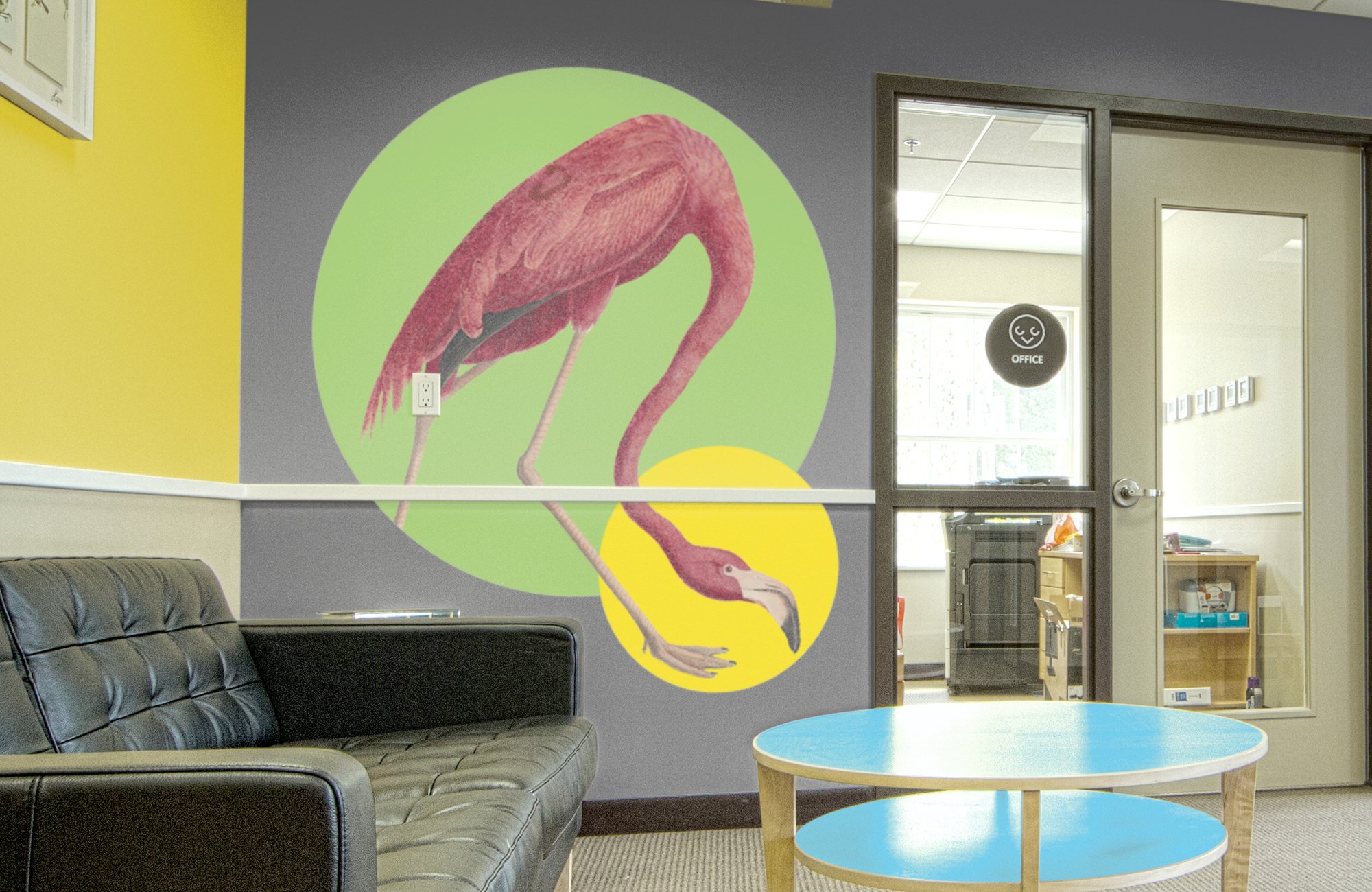
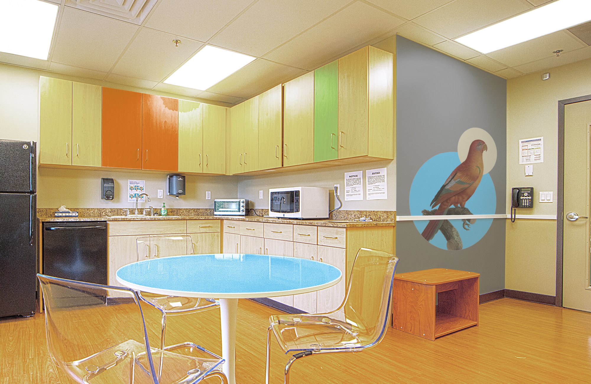
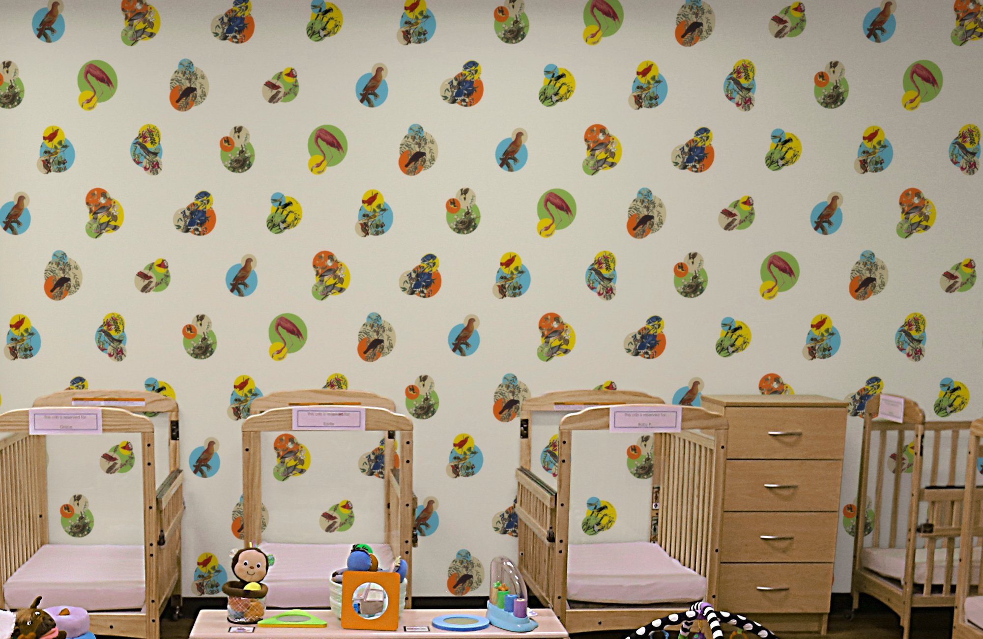
Every CLC building is different as they are not standalone centers but part of a larger community space. The team needed a way to bring those design elements into the centers easily. We worked with vendors to create wallpapers, vinyl wall decals, and translucent adhesives that would easily adhere to tables and cabinets.
Campaigns & Communications
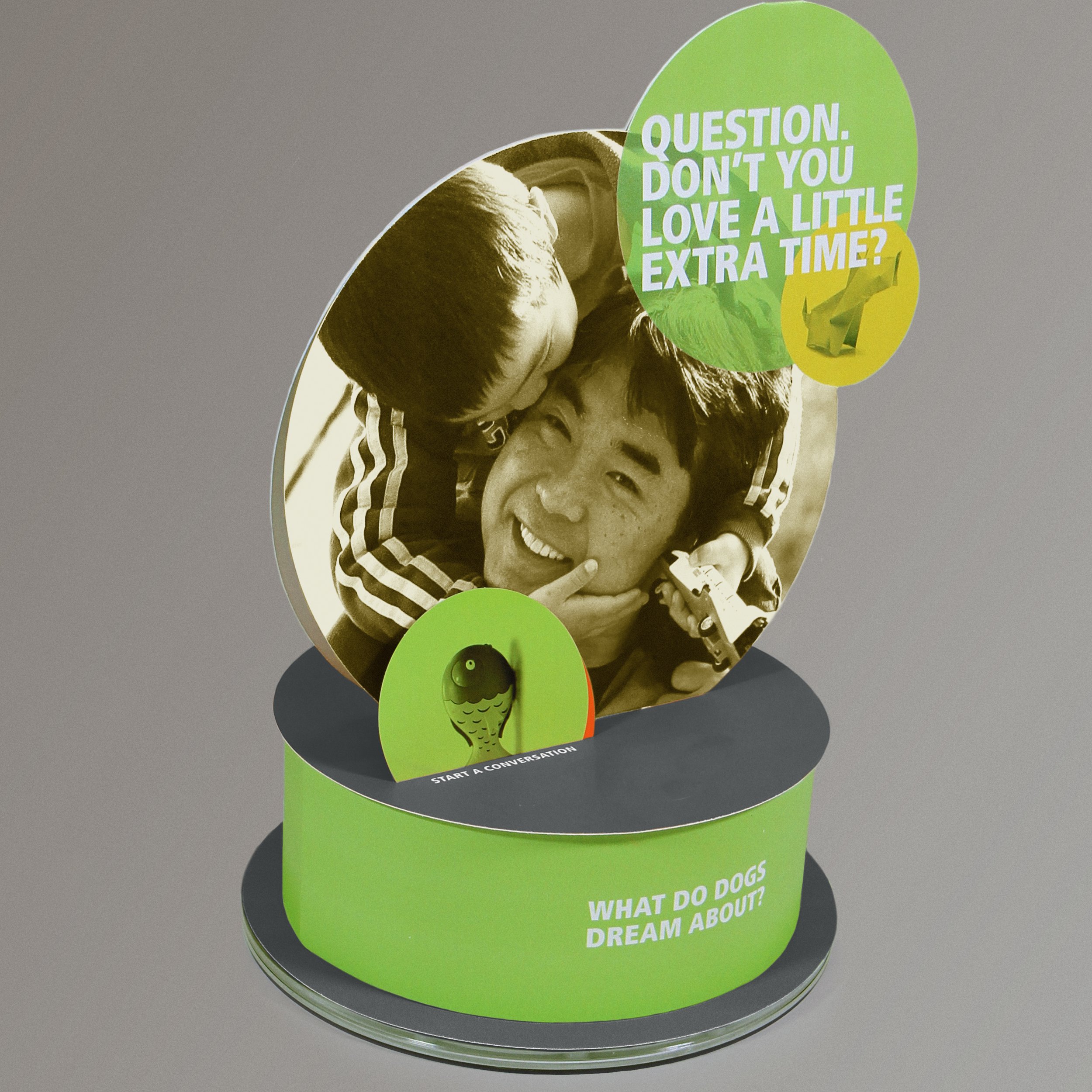
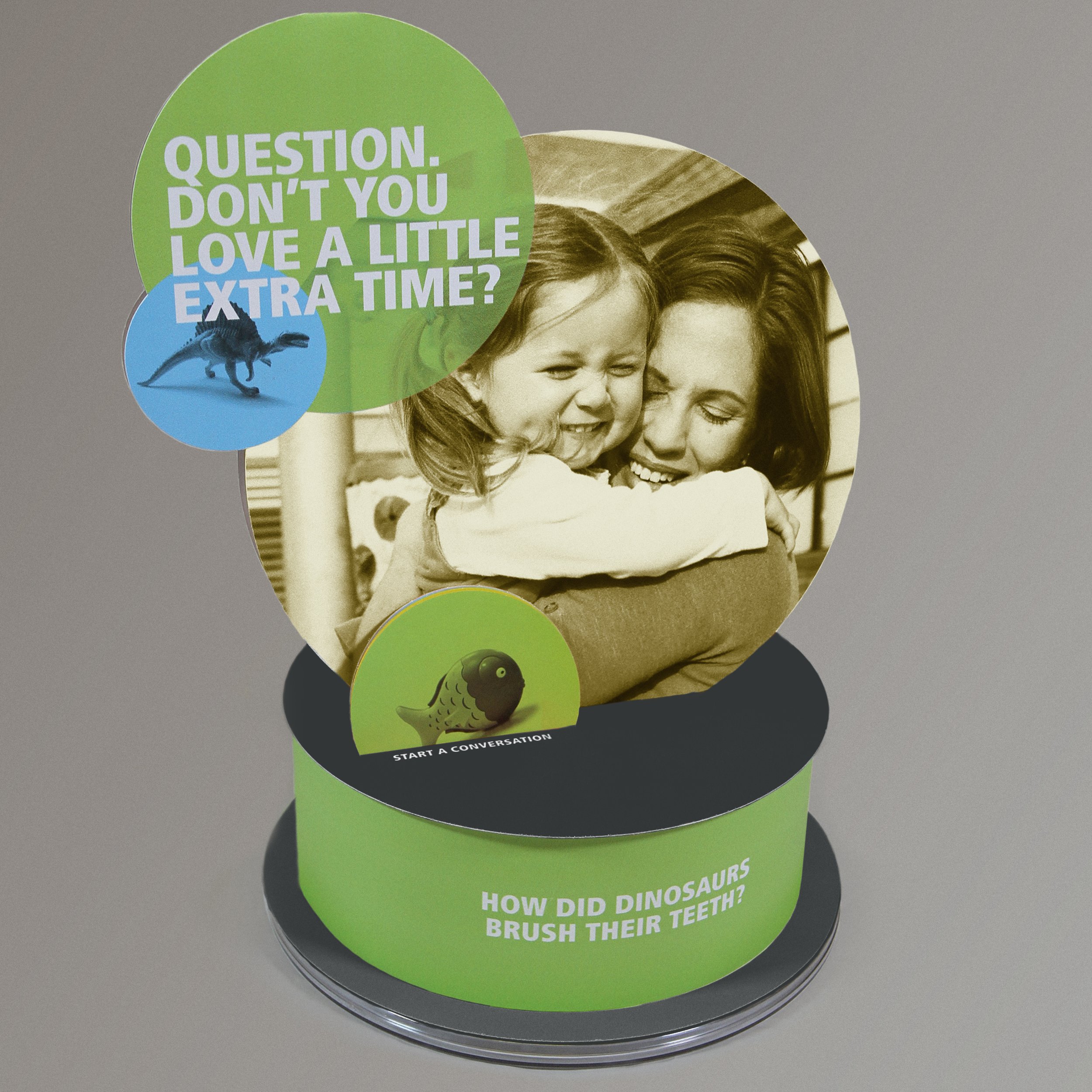
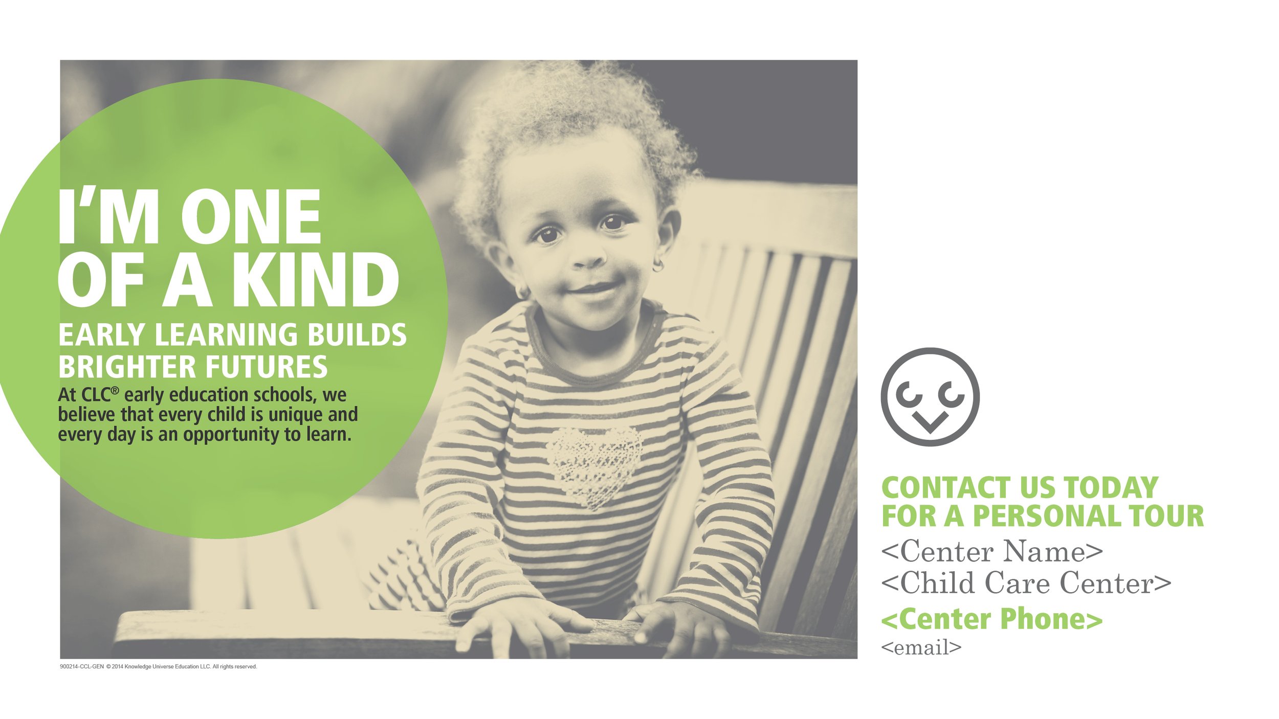
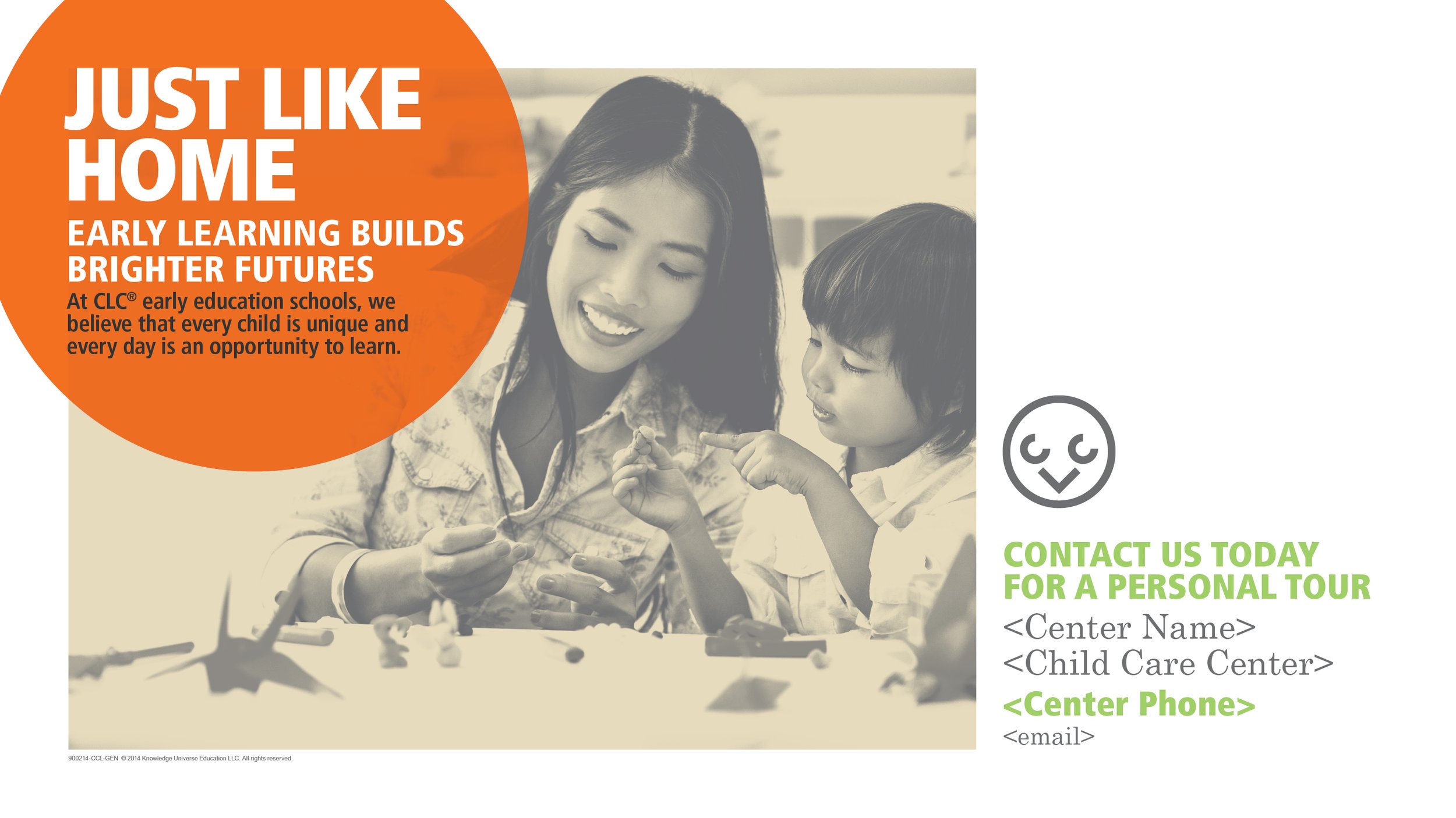
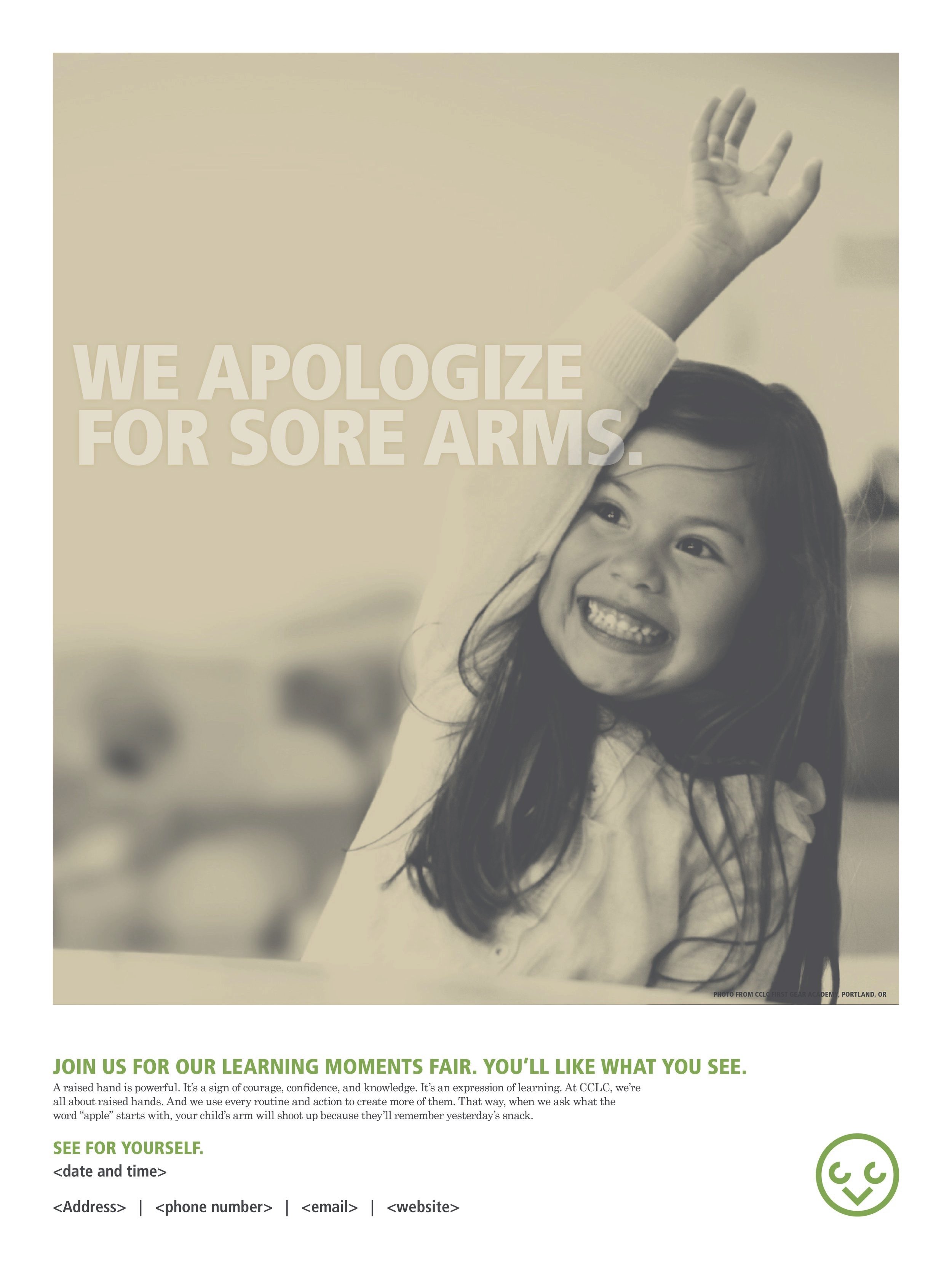
Creating a cool looking visual identity is one thing, but turning those aspects into marketing materials for back-to-school campaigns or other documents is a whole different story. When focusing on a more human centric campaign we had a few photoshots focusing on parents and their children during pickup and drop-off. That excitement that happens when a kid sees their parent and runs to them and capturing the results.
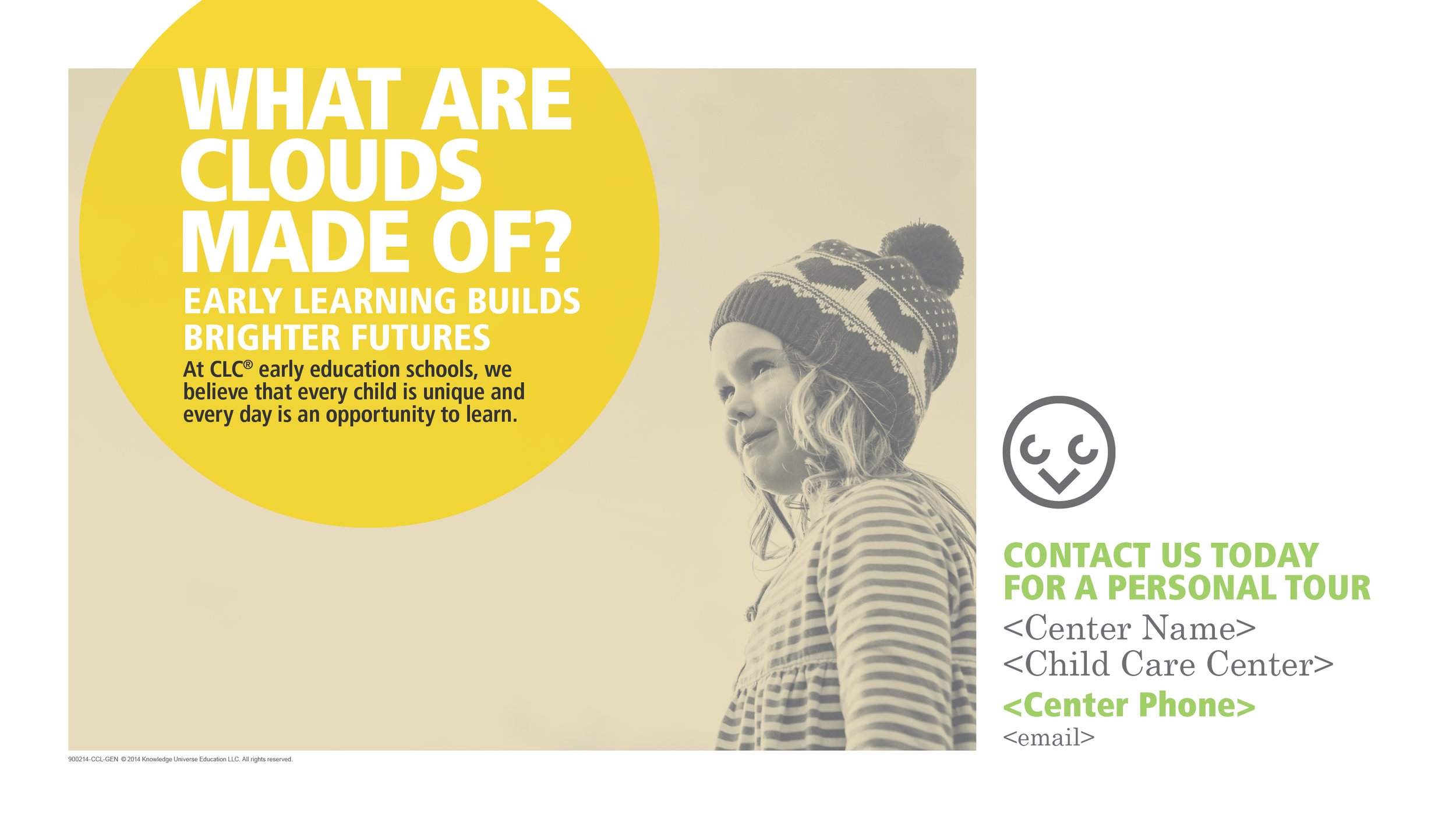
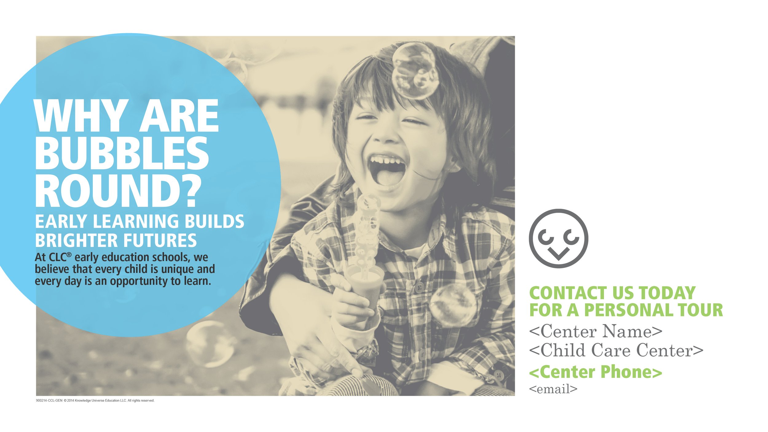
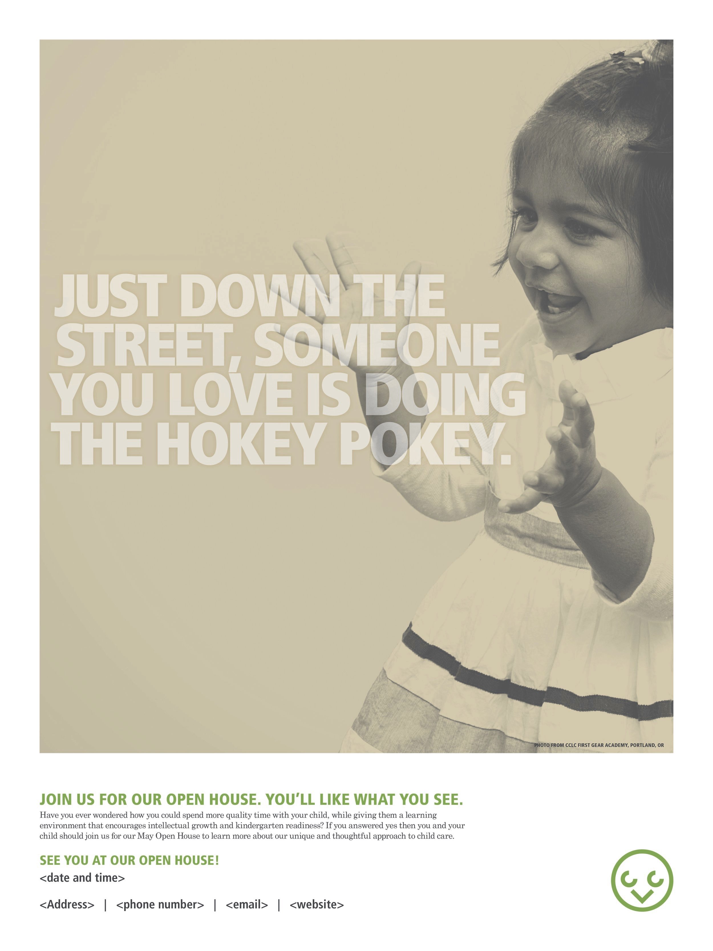
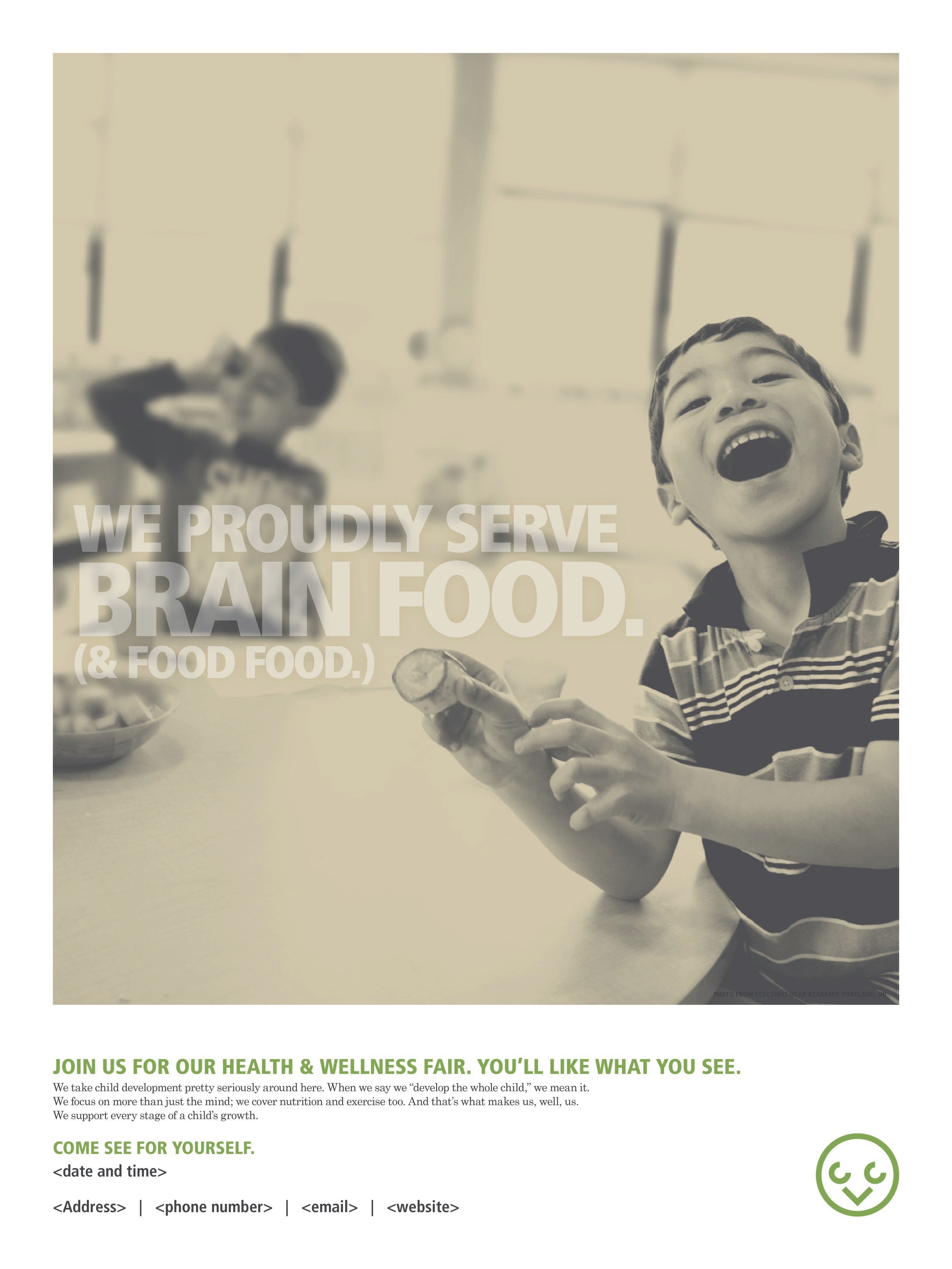
With communication materials that weren’t part of a campaign, we stripped down the approach to drive the message home. It needed to stand out in the center but retain the brand identity tone.
